I understand this may be a pure Electorn issue, but here we are.
Compare three Roboto 11 pt texts, top to bottom — Chrome, OneNote, Obsidian:
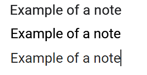
The Obsidian render is really thin and faded. It makes things hard to read and daily use for otherwise excellent product.
This isn’t specific to a font. All fonts look thin in Obsidian. The best looking font there is Comic Sans (I’m not joking) as it is thick enough to remain thick.
This also isn’t specific to font color. You can see Google’s font isn’t 100% #000000 too. (The theme in Obsidian is “Default”).
I know the issue with poor font rendering is super-common for Electron, one can find tales about “#fff” for “backgroundColor” and stuff like that to try fixing it. Though, I’m not profficient in its internals to understand how to deal with it.
Are there plans and/or advise to address the issue?
Thanks!
2 Likes
Is this happening with the default theme and with all snippets deactivated? If not, it’s an issue with your theme or one of your snippets.
This issue is still present, and I am not really sure why no one acknowledges it. Fonts look skinny and unpleasant to work with. I suggest a workaround involving setting a CSS snippet
p {
-webkit-text-stroke: 0.2px black;
text-stroke: 0.2px black;
}
This seems to enhance the font at least a little bit, although I am not really sure whether this will affect antialias or make fonts blurry. In any case, fonts rendered in browsers look more consistent.
It is also worth mentioning that Antialiasing - FXAA (NVIDIA control panel) worsens the font rendering, so I recommend turning it off.
1 Like
Same here. I use the iA Writer Quattro S font an macOS and it’s beautiful, but on Windows, it’s super thin and very hard on the eyes.
Have you tried using iA Writer Quattro V instead? I’m thinking that the variable font might improve the rendering.
iA Writer Quattro is my favorite writing font, too.