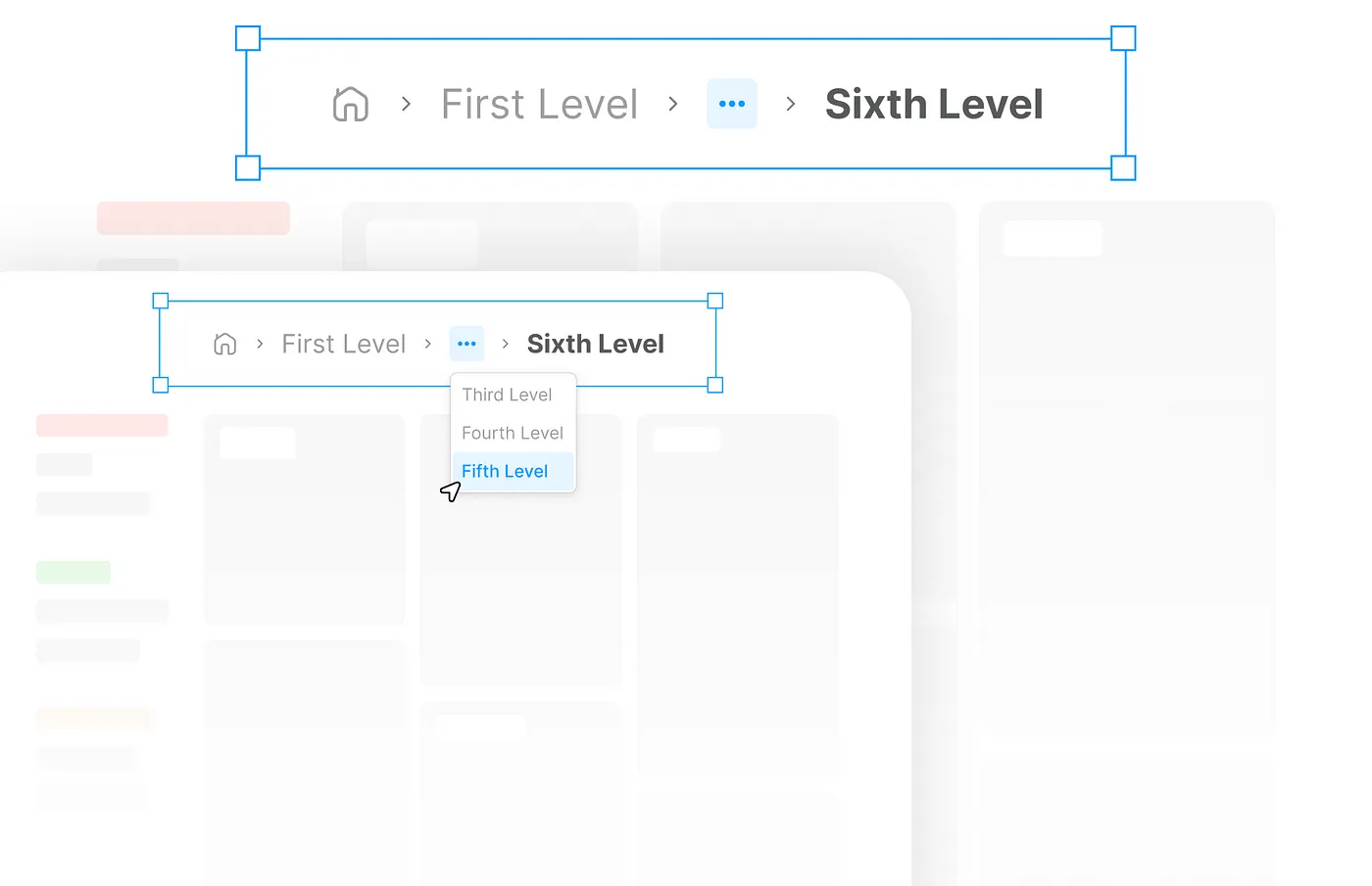
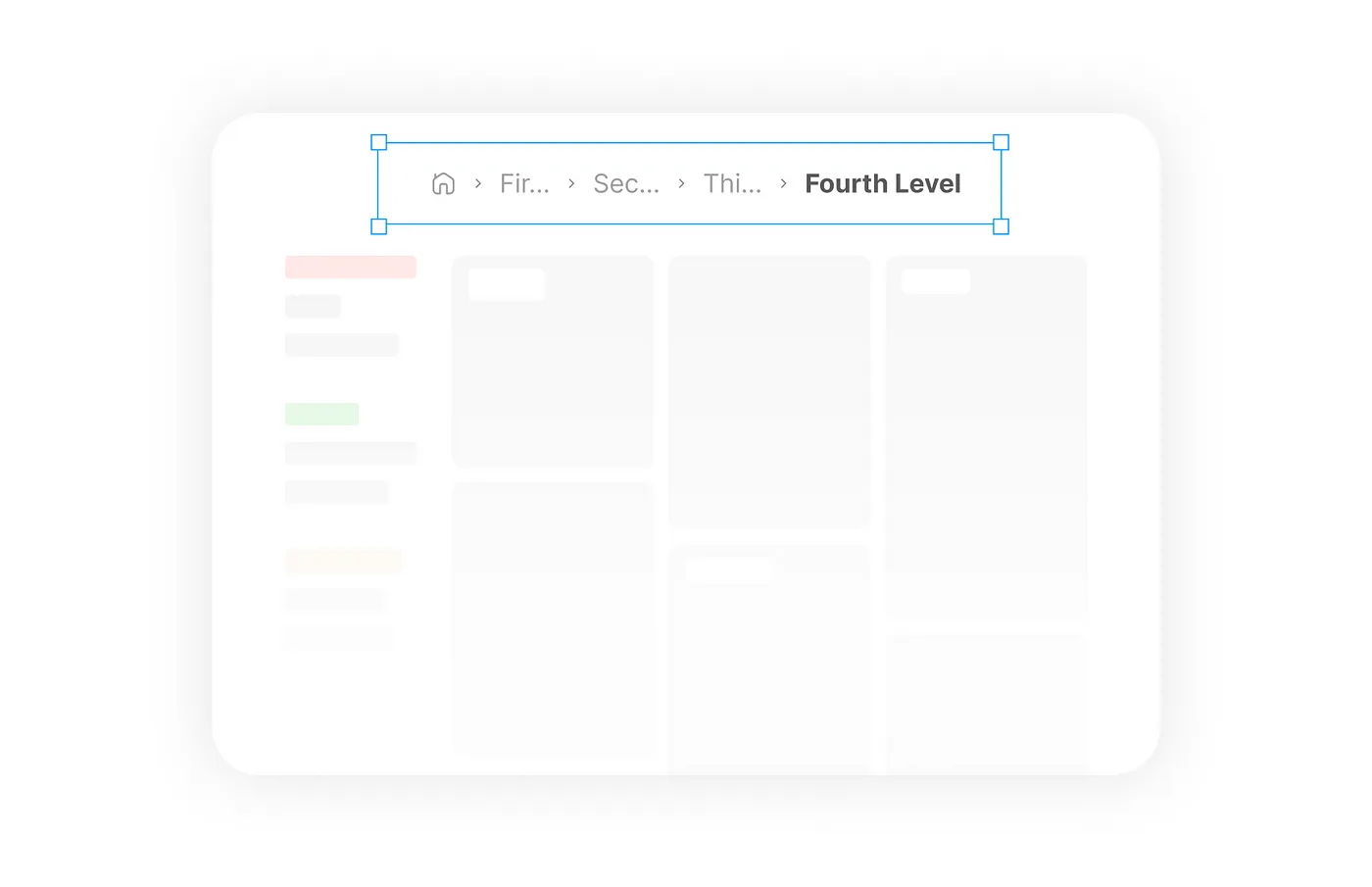
Use case or problem
File paths deeper than a few levels start breaking the file path UI in Obsidian. I’d like to be able to quickly view and navigate the folder tree with their full names instead of only a few letters + ellipsis.
My biology taxonomy folder is by far my most extreme edge case but it’s a problem most other places as well:

Proposed solution
Add a popover that contains any parts of the folder tree that are too long to display inline. It’s a pretty standard UI pattern for breadcrumbs like this.
See Collapsed Breadcrumbs vs Truncated Breadcrumbs at the end of this article: Breadcrumbs- UI Design Guide. Why Breadcrumb are Important? | by Gourisha Goel | Medium