
I am ThisTheThe. And this, is my theme.
Features:
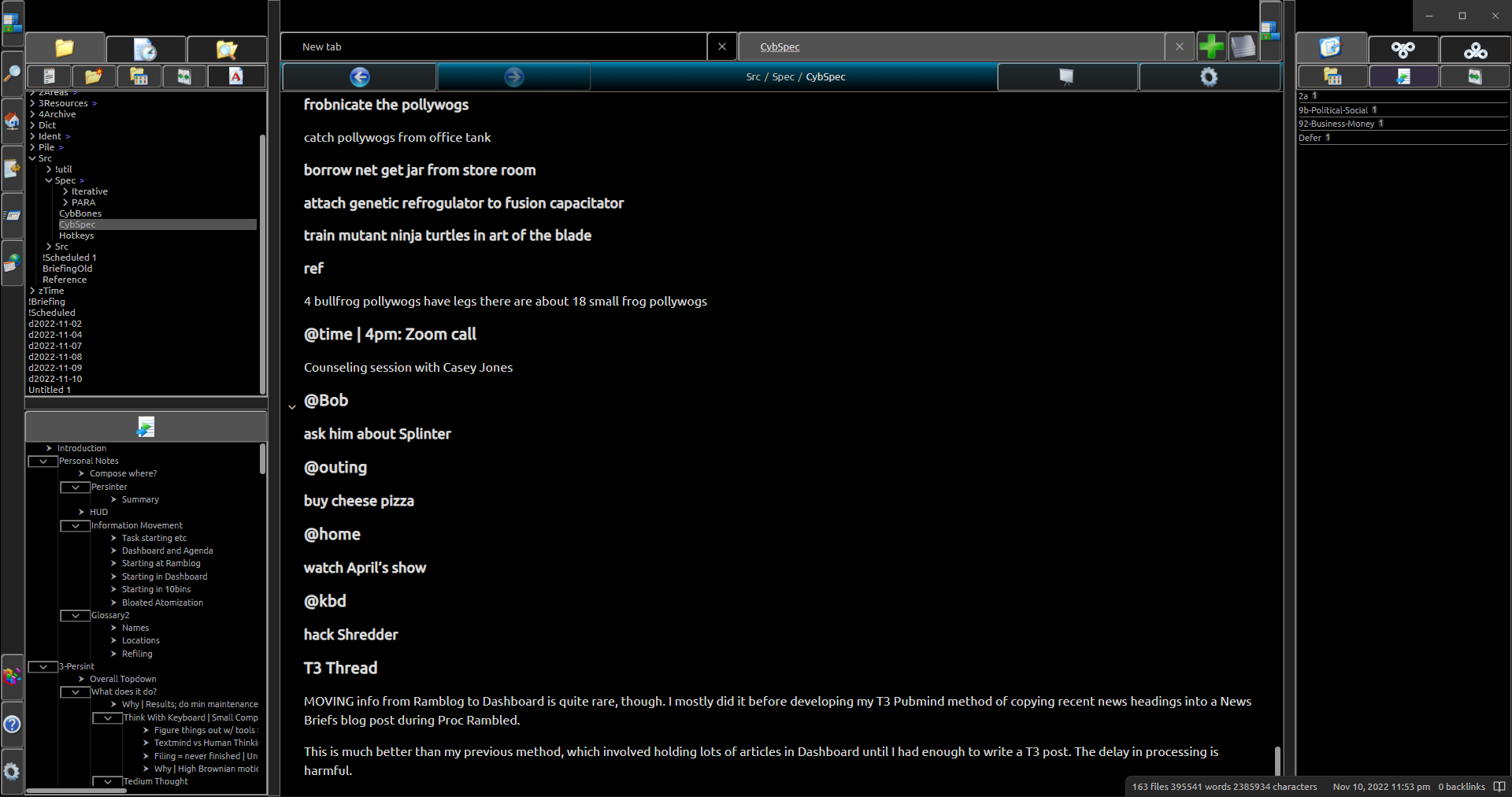
- Large buttons with clearly defined borders- you know exactly where you need to click, and it won’t make it difficult to do.
- Colorful icons to distinguish different functions.
- Small and high-density file viewer, outline, prompt, and tag view.
- Generous window drag regions on top (configurable!)
- You can click buttons with the cursor on the edge of the window.
- Left-aligned readable line length in editor. Less eye movement! Configurable region size.
- Heavily modified settings panel. Easy preview and easy exit.
- 20+ items at once in prompt, as well as ergonomic placement.
- Large, draggable sidebar resize bars.
- Supports Quick Explorer very well.
(this isn’t exhaustive)
In essence, this is a collection of UI design experiments on top of Obsidian. It isn’t going to out-polish the big contenders, but maybe it can put the right ideas in the right places.
Philosophy: Function > Style. Make it flow nicely - we’re a tool first, art second.
- Why waste space on padding? Let’s pack in everything we can, so the user can stop having to abuse his scroll wheel.
- Why make the buttons so small? Make the GUI easier to use with bigger ones. Little inconveniences add up - I’ve done what I can within the limits of CSS.
- Minimalism could take some lessons from the past. Buttons with borders are nice - along with much more easily identifiable skeuomorphic icons.
I’m particularly indebted to Obsidian Windows 98 Edition, of which this is a ship-of-theseus-ed version of, and Terminal, which I modified the prompt from.
I’ll develop this further as I find other features of interest. Configuration is an obvious weakness at the moment, but it’s a good baseline.
What do you think?