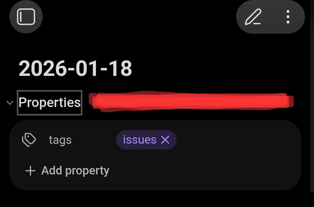
Toggling folds (Headings, Lists, and Properties) on mobile currently requires “pixel-perfect” precision on the tiny chevron/bullet icon. This is high-friction for one-handed use and slows down navigation in long notes.
Proposed solution
Expand the hit target for folding into a larger, invisible hotspot rectangle.
Implementation: Instead of just the icon, make a larger area (like the right margin) trigger the fold.
Scope: Apply this to Headings, Lists, and the Properties future iterations of the Mobile 2.0 UI refresh.
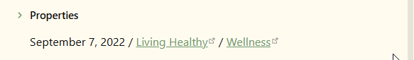
On desktop I have a hotkey set for Toggle fold properties in current file so it’s not that troublesome to trigger the hotkey, but on mobile with syncing and different OSes, etc., I usually end up with the properties (YAML) unfolded when opening a note though I want them to be folded as they were when I was last there.
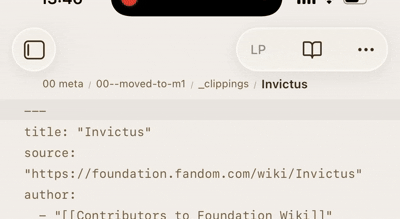
Source mode (and Properties in document set to Source) is a bit more tricky because it’s not an empty horizontal space we tap but a text line. Probably a better way, but 80% of the time I want to “tap to fold”, so this has been working for me. You may not like it, but worth a try.
Tap anywhere on the first line to fold the YAML when unfolded, tap the left chevron to unfold them when folded (same as the default behavior).
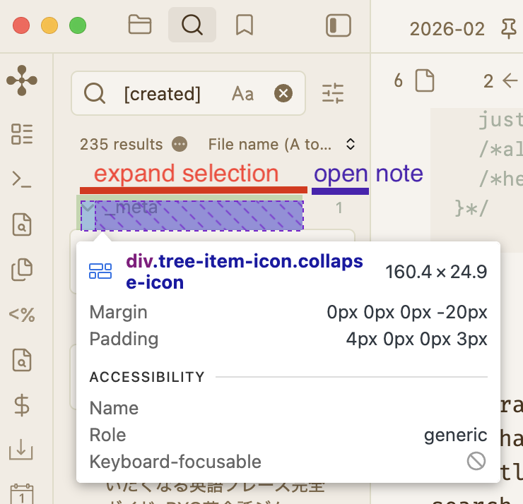
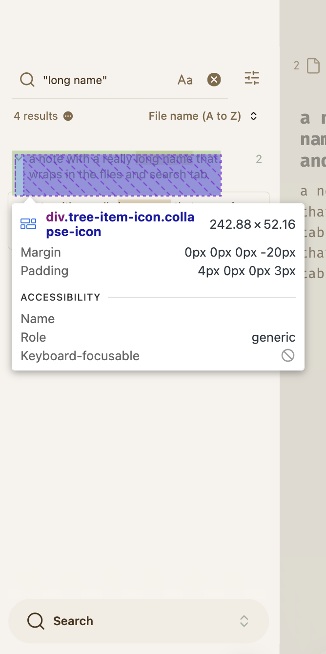
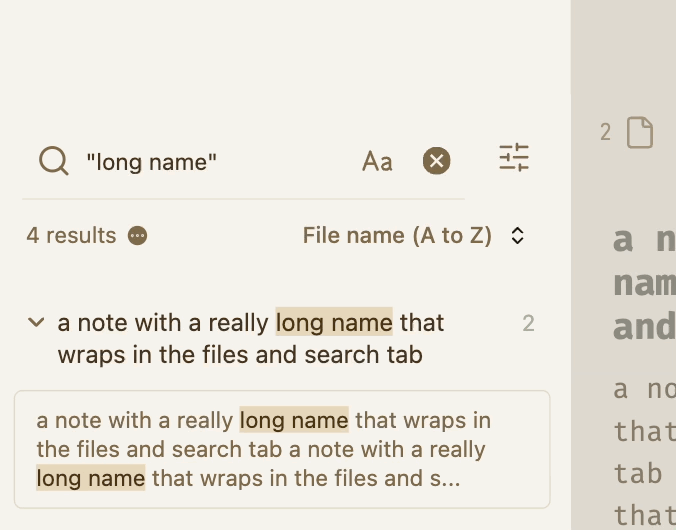
Here’s a good one that I’m quite happy to have in my vault. The original from sailKite was for the click area of Backlinks results, but adjusted it a bit to take care of all search results (Search tab, Backlinks, and embedded queries) and expanded the click area vertically for if there’s a long note name taking up multiple lines.
/* make search result arrow click behaviour appear to cover most of text */
.tree-item.search-result > .tree-item-self > .tree-item-icon {
  width: 80%;
  padding-left: 3px;
  justify-content: flex-start;
  height: 100%;
  align-items: flex-start;
  padding-top: 4px; /* adjust this until chevron aligns with the first line of text */
}
thanks, it’s cool how people customise stuff, I’m already seeing the glass as half full with your snippet.
Nice, my issue is with the up/down chevrons at the right , I end up navigating to the page instead of increasing the context . That hinders my workflow.
Do you know of a plugin/fix that provides better controls for this?
ivan-lednev/better-search-views has been a lifesaver (despite ~2 years no update) but I would always prefer core Obsidian to handle this for stability.