Editor changes appearance of lines with certain characters

I’ve been working with MarkDown in VSCode/VSCodium editors for a while and had no real issues after learning a few helpful rules like double spacing to do a line break. Of course these apps are meant to be code editors and use a monospace font by default, so there are no issues with anything being misaligned that shouldn’t be, especially in tables and indented MD “code” blocks that would also be monospace or otherwise forcibly aligned in the rendered preview.

Obsidian, on the other hand… has been pretty frustrating so far. It seems to want the editor view to be some sort of hybrid between being “raw” MD text and a fully rendered WYSIWYG. Lots of misalignment where I’m not used to there being any issue.

Some googling shows I’m not the only one who wishes the editor view (and ONLY the editor view) could be forced with a simple switch to use only monospace fonts, and behave more like a true code editor. There is apparently no super simple way to do this, other than messing with theme CSS files.

But even if that were fixed, there is another problem, and I’m looking for feedback on whether this could be considered a bug by the Obsidian developers, or if there is some plugin or setting that could stop this from happening.

Any line with a Grave character ( ` ) will take on a different appearance, as if it is some kind of “code” line. There’s nothing on that line surrounded by Grave (backtick) characters, there’s only one Grave. But everything after the Grave to the end of the line ends up having different spacing and highlighting.

The VSCode variations don’t care about this character when it’s alone, and don’t change the way that line is rendered in the editor view. They will of course change the syntax highlighting if you actually surround something with two Graves, as they should. But they ignore a lone Grave character.

I can bypass the issue by putting a backslash in front of the Grave character. But this introduces ugliness in an otherwise perfectly aligned MD table. And it’s unnecessary in VSCode variants.

A similar problem happens when placing a Left_Brace ( [ ) or Right_Brace ( ] )character by itself on a line, with a space after them. The VSCodes ignore them. Obsidian’s editor has a pretty bad spacing issue after the Left_Brace, and on another line treats the text differently before the Right_Brace. It seems to be changing the font when these characters are encountered.

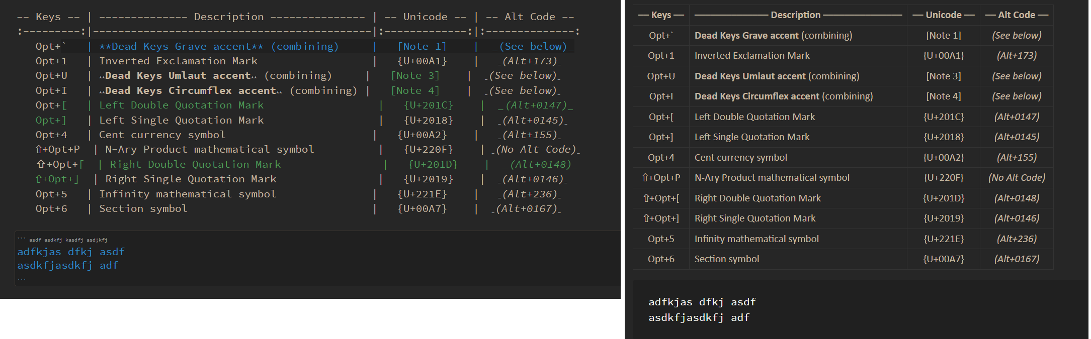
You might ask, why would I be putting these characters on a line by themselves, without wanting to pair them with a second one? They are part of a document listing keyboard shortcuts, which includes the Grave and Braces keys. There isn’t room in the MD table to spell out the name of the keys, so I just use the character.

Again, this has not caused any kind of problem when editing MarkDown in VSCode-based apps. And the rendered preview comes out fine in Obsidian whether I bother to escape these characters with backslashes or not. The editor view just ends up being really ugly in Obsidian, even when I try to use the same fixed-width font for the editor view as well as for the specific “Monospace Font” setting. Even though they are the same font, one seems to get shown in a different size, screwing up the raw text of the MD tables they are inside of.

If there is a plugin that can solve all this, I haven’t found it yet. I could submit a bug report, but the question is if anyone else, especially the developers, would agree that these are “bugs” just because it isn’t behaving as cleanly as VSCode in the editor view when I use some unusual characters that aren’t typically used by themselves.

Any thoughts, solutions or observations are welcome. I want to use Obsidian but it’s feeling very awkward compared to how I’ve been using MarkDown outside of Obsidian.

Looks like this comment editor supports MD tables, so here’s an example of the lines that are going screwy in Obsidian.

–– Keys –– ––––––––––– Description ––––––––––– –– Unicode –– –– Alt Code ––
Opt+` This line gets a darker background {U+000} n/a
Opt+A This line is fine {U+000} n/a
Opt+[ This line is messed up after the [ {U+000} n/a
Opt+B This line is fine {U+000} n/a
Opt+] This line is messed up before the ] {U+000} n/a

Make sure you do not have Live Preview turned on. That is an option to have the Markdown render as you type. The source mode will show the text as is until you switch to Reading Mode.

Make sure you do not have Live Preview turned on.

Thanks, but I don’t. It’s already been in “Source mode” for a while. I found that option fairly early on, and it makes the MD tables look a lot better in the editor. But the table rows that are getting messed up with these characters are still messed up in Source mode, with not just highlighting but spacing issues.

Make a table in the editor with one of those characters on the line and you should see what I mean.

Here is a direct link to one of the MD files that shows this issue in multiple tables, especially the “Note 1” table that displays an entire list of shortcuts that use the Grave key.

https://raw.githubusercontent.com/RedBearAK/optspecialchars/main/Option-key-characters_US.md

If there is no corresponding “closing” Grave or Brace character on the rest of the line, it seems that VSCode variants are set up to ignore those characters, while Obsidian reformats the rest of the line, then stops, interpreting the next line independently. This does not seem like the correct way of parsing unpaired “enclosing” type characters. Especially within the columns of a MD table.

You sound like someone who might appreciate reading the relevant bits of the “commonmark” spec that Obsidian builds off of, which does mostly treat unended enclosing characters as extending as far as possible. However, “commonmark” does not contain any specification for tables - that comes from GitHub-Flavored-Markdown (GFM) which has a spec which is a short extension to “commonmark”. I forget if the GFM spec mentions what should happen in this “inline code” vs “table column” case: I certainly remember it being frustratingly vague on something closely related that I was looking at a few weeks ago!

My previous experience staring at that spec combination was enough for me, but if you can figure out whether the precedence is specified here, I would be curious to know! (And I am sure it would help Obsidian devs debug / file a bug against whatever Markdown parser they are using if there is evidence that it is going against the spec…)

1 Like

I see. Well, that’s a bit disheartening, if that’s really what the commonmark spec wants to do with unterminated enclosing characters.

I’ve just been using whatever comes with the VSCodes, with maybe “Dark Github Markdown Pack” on top of it. Both seem focused on GFM. But there is at least one line outside of a table with the Grave character, and it acts just like any other line in the VSCodes.

All I really know for sure is that VSCodes seem to act more logically and give me super clean raw MarkDown files that are easy to look at and work with, even if I use every bit of punctuation available on the keyboard.

It doesn’t seem worth it to file a bug report if there’s no strong argument that the VSCode parsing method would be more “correct”. The way Obsidian is doing it is just ugly.

Problem with the font size mismatch is that even after finding something that seems to control the font size of part of the messed up lines, the portion of the line prior to the Grave character is separately mismatched in size! It’s the inconsistency that’s driving me up the wall. Seems nearly impossible to get complete control of the editor font sizes collectively.

I have a similar problem. In Obsidian you can not count on a space to be character width if it follows an indentation (while using a monospaced font). I don’t know why, but if you copy/paste this…

	||||||||||||
	|    |     |
	|          |

…and you delete the first pipe of line 2 or 3 you will see that the other characters do not move a full character width toward you (one even moves away), and if you then add a space it will again not be a full character width.

To me this really is a bug, two different levels of indentation are imposible to align.
This messes the little ASCII charts I keep in my notes. This issue can be avoided making the code block using ‘’ ``` ‘’ instead of four spaces.

1 Like

I found that the theme Typewriter solves this issue (and OP’s issue). I wish I had a CSS snippet for this.

1 Like

Didn’t work for me. I am fairly sure that I just found and applied the same Typewriter theme you refer to, and the editor view came out far worse than with Minimal plus a couple of tweaks from the Minimal theme style plugin. Lots of alignment issues just like before I started adjusting the Minimal theme.

The main issue remaining after tweaking the Minimal theme is the different rendering of the highlight color and background, slightly different spacing, and the way the affected lines will “wrap” even if they are part of a table row, whereas all the other lines in the table will not word wrap if the view is too narrow.

I consider this result of treating entire lines differently just because a certain character appears somewhere on the line to be very bug-like.

1 Like

You are right, I hadn’t checked with your tables. I stitched some together showing like five different issues, so people can see what we mean:

This is for the Typewriter theme, but all themes I tried change character sizes in the editor view to shrink the markdown markup and what not. But some of these interactions have to be unintended.
Time to learn CSS I guess…

1 Like

I think this should be what you want.
You can check out my recent post.

This topic was automatically closed 90 days after the last reply. New replies are no longer allowed.