Disable Tabs Altogether

Tabs sucks. We can’t we disable them?

1 Like

Just chiming in to say that I’m yet another user who is really saddened by tabs. I loved this tool, but it now unintentionally leads to the annoying anxiety of tab hell, what is so annoying in web browsers already. Why does obsidian suddenly not care about being customizable anymore? That was it’s main selling point by far.

I’m also extremely disheartened by the moderation of this thread, there is a constant tone of knowing better what it’s users need than they do, and challenging the legitimacy of a (clearly quite common) dislike of this forced feature.

I shouldn’t have to fight with moderators on whether or not a feature is something I can live with, if you create customizable software and an entire ecosystem of people building workflows on top of it, please make it the highest priority to not force change in what is possible upon them, and LISTEN to your users when they tell you this makes them less happy.

3 Likes

I want to chime in here that my intention was not to knowing better but to explain alternative ways to do X or understand what the user really wants to do and add a FR specific for that (for example the hotkey for opening a note in the current tab, or customizable mouse actions).

We understand that every change is going to make fraction of people unhappy, it’s almost inevitable. We believe that addition of tabs has been a net positive. The dev team listens, but doesn’t execute every single FR. This FR is still open.

2 Likes

Tabs is a nice addition only if it’s an option disabled by default. Otherwise it’s a regression IMO. I will explain why.

And I say that even if I’m a new (but now obsessed) Obsidian user, so I barely used the program before v1.0, when there were no tabs.

PANES are what make the Obsidian UI great and super efficient. It is super useful to be able to display / work on two or three notes at the same time on screen. Without mentioning the other panels (links, outline, local graph…) that can be activated and placed as desired.

TABS, however, are much less useful, because they just add one more way to navigate between notes in a panel, i.e. to change the note displayed on the panel. But there are already so many ways to do that quickly and efficiently without using tabs:

  • by clicking a link in the note (outgoing / backlinks). Of course…
  • with Navigate back <> Navigate forward
  • with the quick switcher
  • with starred notes
  • by clicking a note node in the local graph
  • from a search result
  • in the Files panel
  • with a shortcut
  • countless ways with plugins…

Navigation with tabs is in fact VERY difficult to do with efficiency. There are too many parameters to handle that make the whole process laborious, cumbersome, often not predictable:

  • some commands open in the active tab but some other in a background tab (and, if you have pinned a tab…)
  • a “navigate back” and “navigate forward” different for each tab (far too complicated to use)
  • names of the notes truncated in the tab header (especially when several tabs are open), so barely readable, so we click randomly in several tabs to find a note…
  • we have to clean (close) the open tabs frequently to clean the place because it always ends to become a mess
  • navigation between tabs not efficient: Cltr+tab or Ctrl+Shift+Tab several times, or with the mouse have to go all the way to the top of the window, click, click…
    Really, I tried very hard to be efficient with tabs in browsers. But I HATE tabs actually. At the end of the day it is always nothing but a mess. The feeling to be in control of nothing.

TABS are good for just one thing (mentioned by someone before in this topic): when you have a specific project to work on with several documents, more than 3 or 4 (because otherwise it is often more practical to use PANES to display them on screen at the same time). In this case you can open the first documents in panes, then the rest in tabs. So in this case indeed tabs are efficient during the working session on the project, because the tabs don’t change! But this use case is probably quite rare for the average user.

Disable tabs by default in Obsidian is IMO desirable. Firstly to encourage users to use all the better ways available to navigate through notes (LINKS, PANES, etc.) Secondly because yes, tabs clutters the UI. Panes + tabs + panels… this becomes too much. For the average person, the UI has became quite complicated / overwhelming with the addition of tabs. I think I can’t suggest Obsidian to my old Mum and Dad anymore…

With tabs I have the feeling that Obsidian has became a browser for notes and I really don’t like that. I’m really tired of browsers and tabs. I want something else. If I’ve chosen Obsidian it is for LINKS, for PANES, for TAGS, for DATAVIEW. For something different, clever, that doesn’t promote / adhere to the navigation with tabs which is far to be efficient. When I see that there are now several new feature requests about tabs in the forum, all the usual package of bs requests about tab behavior, this makes me a bit sick…

4 Likes

Here is a screenshot of available settings in Vivaldi regarding tabs:

Now that tabs have been introduced in Obsidian, you’ll have endless feature requests for new tab options and behaviors, like these (not exhaustive):

You’ll have endless feature requests about tab grouping, tab stacking, tab searching, tab syncing, workspaces, cycling behavior, shortcuts and mouse gesture with tabs, etc. And with the addition of panes (tab groups), edit and view modes, that will make the feature requests exponential.

With the introduction of the tabs you have opened the Pandora’s box. The feature request will be endless because as users we are almost always frustrated with the use of tabs. So we think it’s necessarily because there is a missing option that when will be implemented will improve our control and workflow with tabs.

Vivaldi is certainly the more “advanced” browser regarding tab management. I can say that I have spent dozens of hours (spread over several years) testing all the settings with tabs, improving tab configuration to suite my needs, with mouse gesture and keyboard shortcuts. And although I know that all the tab settings in Vivaldi are now configured the exact way I want, I’m still very frustrated with the use of tabs. Because with all the offer possibilities (grouping, stacking, searching, syncing, cycling, juxtaposing, open page in a new tab or current page, navigation back and next…) as soon as I browse on the Internet all these features become totally overwhelming, I never know how I have to do things to be the most efficient. You know, I just want to enjoy the browsing, not to always having to think: wait here, you want to open a page? Do you know there are dozens of ways to do it? Which one do you choose?

So I’ve come to the conclusion that the problem what not mine but the entire navigation approach with tabs, and that the human brain is not able to be efficient with tabs most of the time. The problem is that the vast majority of users don’t realize that at all. They are very frustrated and they think it’s because of a missing tab option, so they become addict of tons of tab options. Stop! it is not about options, it is about the tabs that are not a great way to navigate, and your brain that need, when it is focused on something, a SIMPLE workflow.

Here is the contextual menu of a tab in Vivaldi:

…totally overwhelming, exhausting to use on a daily basis. As a power user, a tech guy, I love this. As a user how just want to use, I’m totally confused and desperate in front of this. What the hell, leave me alone, I just want to browse the Internet!

So with, the introduction of tabs, Obsidian is on a slippery slope. The tab addicts will never be satisfied and will always ask for more. I really think the dev team have to realize that and put strong decisions about tabs:

  • don’t put forward the usage of tabs anymore. Disable the (future I really hope) tab core plugin by default would be a great, strong, message that Obsidian doesn’t encourage the usage of tabs on a daily basis.
  • put forward all the more clever ways to navigate through notes, to think and work differently. Explain it gently to the tab addicts. No, Obsidian will not be a browser, it is a different beast than Google Chrome or Vivaldi. Make the effort to do things differently than in your browser, you won’t be disappointed.
  • keep it to a very minimum regarding available tab options. Don’t add any other options from this point. Leave all the requests for the community plugins, they will manage the addicts. Let the dev team focus on more useful aspects.
5 Likes

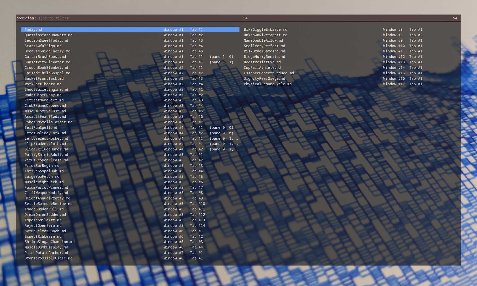
I’m good to take on more tabs. Send me your extra ones

Around one year ago was the last time I used Obsidian. Right now I’m using it again and I’m surprised that it is not possible to disable tabs. Please make it possible to disable those tabs.

4 Likes

As useful as tabs are, they accumulate quickly and slow down our thinking , distract and clutter our interface, a perfect circumstance to practice procrastination . See estonia’s screenshot above, this outcome is so typical.

Now, i am not totally against tabs, but
prefer stacked tabs. Anyway, to handle better all these tabs on screen, their title needs to be shortened But readable (eg “title abc…”) there is just no point to show super compressed tabs , their place should be in the in dropdown button at the end of the tab row

After selecting a tab from this dropdown button our tab would go ( visually ) replacing the 2nd last tab in the visible tab row

I just wrote a quick snippet, minimal and maximal width of tabs got new values (adjust them, if necessary) , accumulated tabs reappear if you scroll left or right with the shift button pressed, now working for both tab and stacked tab view.

.workspace .mod-root .workspace-tab-header {
    width: 0;
    min-width: 130px;
    max-width: 200px;
}

.workspace-tab-header-new-tab {
    margin-left: 8px;
}

.workspace .mod-root .workspace-tabs.mod-stacked .workspace-tab-container .workspace-tab-header {
  min-width: initial;
}
2 Likes

Off topic:
Is there some CSS hack to cause the last (rightmost) stacked tab to come fully in view because it’s always missing a half-inch or so? It’s so frustrating having to drag the scroll bar on the bottom to get full view.

Agreed, this is annoying
One way is to click on your note title bar
To answer your question, maybe yes.

Clicking on the title bar doesn’t entirely bring the last tab into view. It’s okay with those in the middle.
It would also be nice to grab them by the bar and flick them aside, or something.

Ops, i forgot about, i already implemented this in my own theme Dune

But you are quicker if you add the css rule from this post:

1 Like

Sweet. I’ll have a look.

Cheers

I’m using Obsidian on macOS.

There might be a bug in the Obsidian. In my old vault, after updating the app, I had this pesky problem that when I have clicked a note file, it opened in a new tab. The result was that after a few hours of browsing notes in the Obsidian I had tens of tens tabs opened.

Now, I have closed the old vault and created a new vault. And while having this new vault opened I have opened the old one beside it.

Now it appears as if the note files open in the same tab that is already selected. No more multiple tabs. Is the problem solved? I do not know if this behavior will stay or revert back after some time, but just wanted to share.


Also I have noticed, that although I’m using the same version of the app, when I go to the settings inside the new test vault and the old one, the options in the Quick switcher differ.

In the old one I have three options available. In the new one there are only two visible.

Just trash Obsidian and install a brand new copy; the internal updater works well for smaller bugfixes and smaller updates but fails to update properly with breaking changes.

For everyone still looking for a way to disable tabs:

I have created a simple plugin that replaces the current tab when creating a new note.

The plugin won’t close pinned (or manually created) tabs which means that you can still use tabs when you need them.

You can find the No Tabs plugin under Community Plugins.
Source Code: No Tabs

2 Likes

I have two panels open: source code and view mode. When creating a new note 1) a new tab opens 2) the link between these two panels is lost. Your plugin solves the first problem. It would be great if plugin also link the two panels together.

1 Like

Please have any third party plugin talk in a separate convo in share and showcase.

On a side note, in since v1.2.7 there’s in a built in command to create new note in the current tab.

Thank you! From the context menu now works as I wanted. However, the button on the toolbar still opens a new tab.

that’s not gonna change.

1 Like