I want to create this data view and then populate each “Priority X” column with notes that I tag by those Priorities. This I know how to do myself, but I do not know how to structure the table in this way and was wondering if I can get some help to get me started. I can do without the “Impact/Effort” Columns, or figure out a way to add them without adding more complexity to the table view.
Maybe I should just create a separate dataview for each Priority and tag each note with the priority and the status “Important, Not Important, Urgent, Not Urgent”?
Is this going to be a one time table, or do you foresee to use this on various projects. If used in many different settings, how do you think you’ll differ between those?
Have you considered doing this as a dv.view() thing instead of a pure table? That would allow for you to construct the table on a different level possibly with better options for styling the table.
Good question. I didn’t think of that. I think that if this works out, I might want to use it for different projects.
Is dv.view() a javascript thing? Im not familiar with that. I just started with Obsidian a few months ago and am now learning Dataview. I have a CSS/HTML background but dont do much javascript programming.
Im looking at the dataview documentation and I am thinking that I dont need this layout… I might just put it all in one tablet with a priority column and sort by priority… Unless there is a better Idea… Can I group by a tag?
See Codeblock Reference - Dataview. It’s a way using javascript in combination with dataview to build output dynamically.
In combination with dv.table() or other of the dataview tools, you should be able to tune and fit the solution to match your needs.
From a general point of view, when seeing your use case, I think I would have used inline fields for the various sections in a given note, and then give that note to such a dv.view() script for presentation. This would allow for more in depth description of the various section in that note, and you could add it to as many notes as you liked.
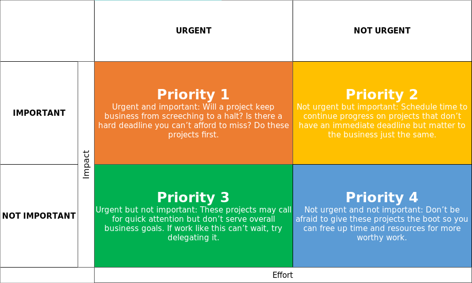
Urgent-Important:: all the must haves

With explanations, as to why...

Urgent-NotImportant:: All the really want to have

NotUrgent-Important:: Should have this

NotUrgent-NotImportant:: Why even bother?!

...

`$= dv.view("myJs/PriorityMatrix", "ThisProject")`
Right. I would want to at least group notes by priority and then sort by that. That way I could see at a glance which sections I need to look at in order of priority… Im going to see how this works. Thanks for the help. I want to keep this as simple as possible :D.
Can you sort by metadata, and then by date so that I can order the items by date created, then group by priority?