The dark mode text and the light mode text (especially Mathjax) appear in different thickness.
When looking at the font-weight property in CSS, both are the same. But the visual difference seems striking to me:
Especially when it comes to the equations, the equations seem a lot less clear in dark mode. When directly comparing the pixels, e.g. on the T of TD in the equation or just the first normal letter i. The interpolation seems to behave in a way that makes the characters look more bold in general.
Things I have tried
I have tested this on an isolated Vault and the behavior is still the same:
Here it does not seem as drastic, as I have upscaled my math to make it readable. But the same issue still holds.
I have also tried to directly edit the font-weight property. Even though this would work for the text, I am unable to change the weight of the equation. As I am using many equations and I have a hard time reading the equations in dark mode, I would consider completely switching to light mode. But as I have used the dark mode for over a year, I would like to not do that (
Thus I am looking for help if there is any way to change the font or the boldness of the equations in a way that works for me in dark mode.
You could try to experiment with plugins, maybe they render equations sharper than the default implementation.
Just go to the plugin repo and search for “math”, you’ll get a long list to choose from.
Alternatively, try with diff themes too if you’re not used / bound to a specific theme.
Try searching here and/or Discord for how to style MathJax and/or LaTEX. I know the question arises occasionally but I don’t remember the answers (if any) because I don’t use it myself.
I think the reason for the effect you’re seeing is that the iris of the eye contracts more when viewing dark text on a light background, which affects how text looks in light mode versus dark mode. Dark Mode vs. Light Mode: Which Is Better?
Thanks for the replies!
I have looked through the plugins and did not directly find what I am looking for. But as long as I find a way to style MathJax it should be possible. If I find any concrete solution I will let you know
Sure, thanks in advance already, here is some sample expressions + text:
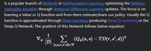
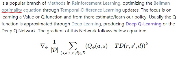
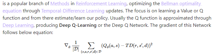
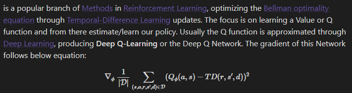
Usually the Q function is approximated through [[Deep Learning]], producing **Deep Q-Learning** or the Deep Q Network. The gradient of this Network follows below equation:
$$
\nabla_{\phi} ~\frac{1}{|\mathcal{D}|} \sum_{(s,a,r,s',d) \in \mathcal{D}} (Q_{\phi}(a,s) - TD(r,s',d))^2
$$
Where $\mathcal{D}$ is the Data collected through [[Off-policy vs On-policy#Replay Buffer vs Replay Memory|Replay Memory]].
$TD(\cdot)$ is the temporal difference update, which is done differently dependent on the architecture. In a standard DQN it would look like:
$$
TD(s',r,d) = \left(r + \gamma (1 - d) \max_{a'} Q_{\phi}(s',a') \right)
$$
Paste my code in a new note in Obsidian, context click and pick the option to focus your note on disk, then rename your note extension from .md to.css
Then open Obsidians preferences>appearance>snippets and click the nearby folder icon to open your snippet folder. Move your snippet in there, refresh the snippets and activate the new snippet.
Thanks for the detailed description.
I did some more digging as it did not work directly for me. Turns out this is only a problem on my Windows 11 device and my Ubuntu 22.04 works fine even without. Changing the antialising there also affects the visual.
For Windows the only option that visually effected anything was brightness.
However all -webkit-font-smoothing values do not seem to make a difference for me. I also tried with -moz-font-smoothing: antialiased; and -o-font-smoothing: antialiased; but none made any change. (I guess Obsidian is not even using the last two)
Even changing the text-rendering property does not change anything visually for me. I disabled the antialising on Windows in general, which has a huge impact on the normal font. But Obsidian does not change. So it seems there is something Windows is doing differently than Ubuntu in these regimes that changes the rendering of Obsidian
Oh okay, I had to restart all Obsidian windows to take effect for the Windows settings. Just restarting a single Vault did not work.
So by using SystemPropertiesPerformance.exe and disable Smooth edges of screen fonts the math equations looked a lot more crisp, no more smeary edges. But the whole system now looks very shit.
But it shows that those settings are the issue. I will try to dig around more and see if I can find something that works in my case
Yeah, better not to touch system font smoothing, fonts will look bad.
I’d tried different font properties and antialising worked as requested on my Mac. I didn’t assume there were these font issues bw platforms. Glad you don’t need extra code for Linux. Unfortunately i can’t test on Win, i only have a Mac
Anyway, Thank you for your help. Now I have a deeper understanding of what the actual issue is and it should help to figure out a solution specific for Windows. Maybe some Windows specific configurations can solve this. I will see if I find anything and can post it here. But thanks to your help it seems that I will be sticking to dark mode, I would have given up and switched otherwise ^^