Custom CSS to modify the placeholder text of a property

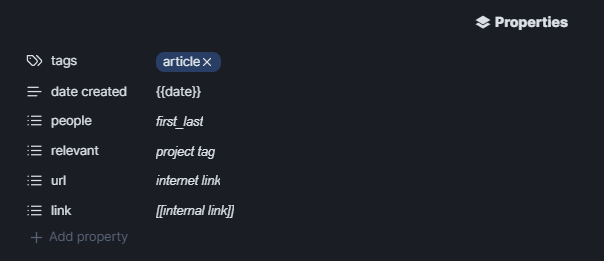
I dug into Obsidian’s Inspector and found the lines elements that create each of the Properties and with the help of ChatGPT made the following CSS snippet to modify the placeholder text with improved type hints. Hope someone else finds it useful.

image

/* Custom placeholder for 'people' property */
div.metadata-property[data-property-key="people"] .multi-select-input:empty::before {
    content: "first_last";  /* Placeholder text for 'people' */
    color: currentColor;  /* Placeholder text color */
	font-family: Arial, sans-serif;  /* Change font to Arial */
    font-style: italic;  /* Remove the italic style */
}

/* Custom placeholder for 'relevant' property */
div.metadata-property[data-property-key="relevant"] .multi-select-input:empty::before {
    content: "project tag";  /* Placeholder text for 'relevant' */
    color: currentColor;  /* Placeholder text color */
	font-family: Arial, sans-serif;  /* Change font to Arial */
    font-style: italic;  /* Remove the italic style */
}

/* Custom placeholder for 'url' property */
div.metadata-property[data-property-key="url"] .multi-select-input:empty::before {
    content: "internet link";  /* Placeholder text for 'url' */
    color: currentColor;  /* Placeholder text color */
	font-family: Arial, sans-serif;  /* Change font to Arial */
    font-style: italic;  /* Remove the italic style */
}

/* Custom placeholder for 'link' property */
div.metadata-property[data-property-key="link"] .multi-select-input:empty::before {
    content: "[[internal link]]";  /* Placeholder text for 'link' */
    color: currentColor;  /* Placeholder text color */
	font-family: Arial, sans-serif;  /* Change font to Arial */
    font-style: italic;  /* Remove the italic style */
}

/* General styles for the multi-select input */
div.multi-select-input {
    position: relative;
    color: currentColor;  /* Color of the actual input text */
}

div.multi-select-input:empty::before {
    display: block;
}

I created a CSS file called custom-placeholders.css and placed it in the snippets folder and activated it per the norm. I tweaked it to get the color and font as I like, notes are off to the side for help.

2 Likes

Update

I am not sure what happened since I posted the above but the snippet now limits me to one manually entered (i.e., typed in) tag and then only selecting from a partial list of existing tags. I disabled this for now. Until I can solve it.

A given element, in my case first: looks different nowadays:

<div class="metadata-property" tabindex="0" data-property-key="first" data-property-type="text">
  <div class="metadata-property-key">
    <span class="metadata-property-icon" aria-disabled="false">
      <svg ... >   </svg>
    </span>
    <input class="metadata-property-key-input" autocapitalize="none" enterkeyhint="next" type="text" aria-label="first">
  </div>
  <div class="metadata-property-value">
    <div class="metadata-input-longtext mod-truncate" placeholder="Empty" contenteditable="true" tabindex="0"></div>
    <div class="metadata-link" style="display: none;">
      <div class="metadata-link-inner"></div>
      <div class="metadata-link-flair">
        <svg ... >   </svg>
      </div>
    </div>
  </div>
  <div class="clickable-icon metadata-property-warning-icon" aria-label="Type mismatch, expected Text" style="display: none;">
    <svg ... >   </svg>
  </div>
</div>

So you’ll need to rework the seletors some, and figure how something clever to make it disappear when you want to start typing in the field again…

Here is some CSS to get you started again:

.metadata-property-key:has(.metadata-property-key-input[aria-label="first"]),
.metadata-property-key:has(.metadata-property-key-input[aria-label="second"]),
.metadata-property-key:has(.metadata-property-key-input[aria-label="third"]){
  background-color: yellow;

  && + :has(.metadata-input-longtext:empty) {
    background-color: green;
    /* visibility: hidden; /* */
    &&::before {
      visibility: visible;
      content: "Before";
    }
    &&::after {
      visibility: visible;
      content: "After";
    }
  }
}

For a list of first, second, third and fourth in the properties, where only the second had a value, it outputs as:

I’ll give this a try and see what happens. Thanks.