This is a custom CSS for the Obsidian Digital Garden plug-in.
Link to plugin
This CSS will effect the published website not Obsidian the app.
Read here for details on how to set this up.
Reason I am posting it here is I spent a lot of time trying to customise the default appearance of the published pages. Overall it did not suite my purpose and as such I am posting it here so that some one else might benefit from it and take over from it to complete it.
Disclaimer: I am not a coder and the CSS is rudimentary. I can only hope the next person will take it over and make it all the more awesome. This CSS is still incomplete.
Anyone who is interested can use this plug-in for browser Live editor for CSS, Less & Sass - Magic CSS to apply the CSS temporary while they work on it, I have found this very useful instead of saving the CSS file every time to your repo and publishing it to see the results.
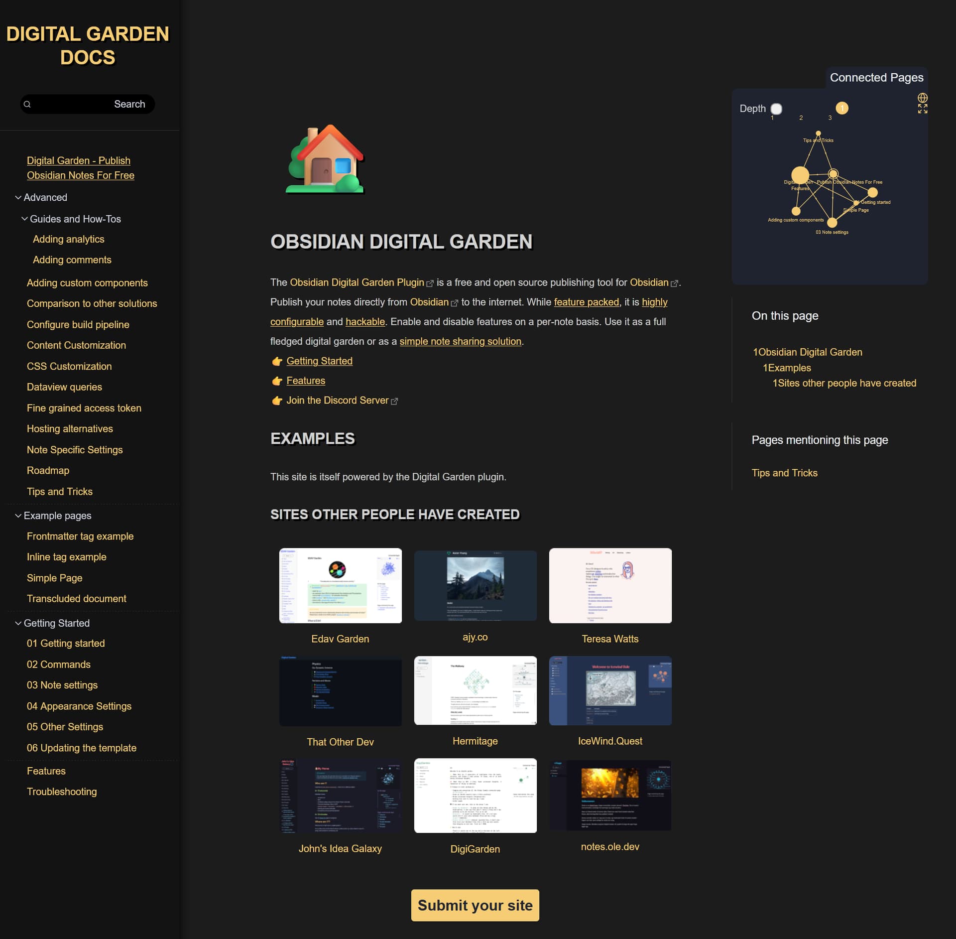
Here is the CSS code as applied to the Obsidian Digital Garden docs website
And here is the collapsed menu
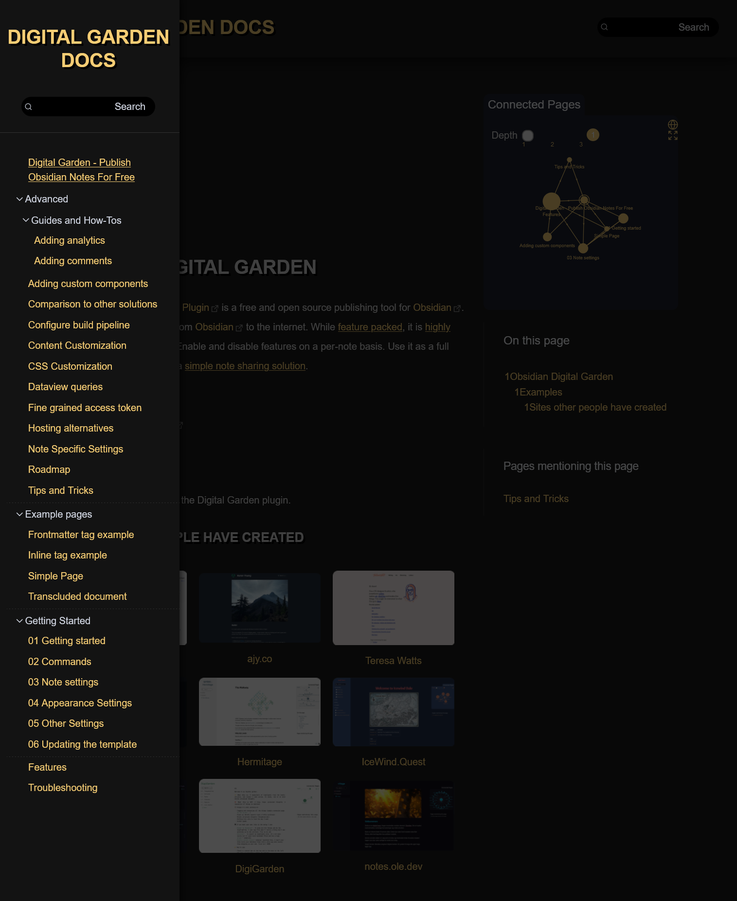
There is additional work to be done as you can see that the search function, pop over notes etc are not themed.
/*
  Sanitize CSS
*/
*,
*::before,
*::after {
    box-sizing: border-box;
}
/*
  2. Remove default margin
*/
* {
    margin: 0;
}
/*
  Typographic tweaks!
  3. Add accessible line-height
  4. Improve text rendering
*/
body {
    line-height: 1.5;
    -webkit-font-smoothing: antialiased;
}
/*
  5. Improve media defaults
*/
img,
picture,
video,
canvas,
svg {
    display: block;
    max-width: 100%;
}
/*
  6. Remove built-in form typography styles
*/
input,
button,
textarea,
select {
    font: inherit;
}
/*
  7. Avoid text overflows
*/
p,
h1,
h2,
h3,
h4,
h5,
h6 {
    overflow-wrap: break-word;
}
/*
  8. Create a root stacking context
*/
#root,
#__next {
    isolation: isolate;
}
/*
  Custom CSS
*/

* {
    font-family: Helvetica, Arial, Verdana, Tahoma;
}

html {}
.css-settings-manager {
    background: #1c1c1c;
    padding-bottom: 5rem;
}

.content {
    max-width: 700px;
    margin-left: 400px;
}
.cm-s-obsidian {
    font-size: 1rem;
}
header h1 {
    text-shadow: 5px 5px 0rem rgb(0,0,0);
    font-size: 2.5rem;
    line-height: 3rem;
}

h1,
h2,
h3,
h4,
h5,
h6 {
    font-size: reset;
    color: white;
    padding-top: 1rem;
    padding-left: 1rem;
    padding-bottom: 1rem;
    text-shadow: 0.2rem 0.2rem 0rem rgb(0,0,0);
    text-transform: uppercase;
    color: #ffffff
}


/*404 page*/
.font-bg {
    display: none;
}
.centered,
.centered h1,
.centered p {
    margin: 0;
    padding-left: 0;
}

P,
.task-list-item,
.content,
label {
    line-height: 2rem;
    color: lightgray;

}
label {
    padding-left: 0.2rem;
}

ul.task-list {
    margin: 0;
    padding-left: 1rem;
}

ul {
    margin: 1rem;
    padding-left: 1rem;
}

.tag {
    cursor: pointer;
    background: #000000;
    padding: 0.5rem 0.5rem;
    border-radius: 1rem;
}

p {
    padding-left: 1rem;
}
.task-list-item p {
    padding-left: 0;
}
a:link {
    text-decoration: none;
}
a:visited {#b93b#b73a3a
    text-decoration: none;
}
a:hover {
    text-decoration: underline;
}
a:active {
    text-decoration: underline;
}
table {
    width: 100%;
    border-collapse: collapse;
    background-color: #131313;
}

th,
td {
    padding: 0.2rem 0.2rem 0.2rem 1rem;
    vertical-align: top;
}
th {#846262#8463#843838
    background-color: #000000;
    border: 1px solid;
    border-color: #333333;
}
td {
    border: 1px solid;
    border-color: #333333;
}

hr {
    height: 1px;
    border-width: 0;
    background-color: #333333;
    margin-top: 2rem;
    margin-bottom: 2rem;
}
tr:nth-child(even) {
    background-color: #131313;

}
tr:hover {
    background-color: #000000;
}
.callout {
    border-radius: 1rem;
}

.referred {
    border-left: 2px solid;
    border-right: none;
    border-top: none;
    border-bottom: none;
    border-color: var(--text-accent);
    padding-top: 1rem;
    padding-left: 1rem;
    padding-bottom: 1rem;
    margin-left: -3px;
}

.filetree-sidebar {
    background: #131313;
    width: 300px;
    padding: 0;
    filter:drop-shadow(0 0 .5rem rgb(0,0,0));
}
.filetree-sidebar .search-button {
    width: 100%;
    background: #000000;
    border: none;
}
.filetree-sidebar .search-keys {
    display: none;
}
.align-icon {
    justify-content: space-between;
}
.filetree-sidebar h1 {
    text-transform: uppercase;
    font-size: 1rem;
    padding: 2rem 1rem 1rem;
    background: #131313;
}
.filetree-sidebar .search-text {
    padding-right: 1rem;
}
.filetree-sidebar .lucide-search {
    padding-left: 0.3rem;
}

.filetree-sidebar > div {
    padding-bottom: 1rem;
    border-bottom: 1px solid;
    border-color: #333333;
    background: #131313;
}
.filetree-sidebar > .folder {
    border-bottom: none;
    padding: 2rem 0 2rem 1rem;
    background: #131313;
}
.filetree-sidebar > .folder > div > .folder {
    border-bottom: 1px dashed;
    border-color: #333333;
}

.filetree-sidebar > .folder > div > .notelink {
    margin: 0;
    padding-left: 2.2rem;
}

.filelist {
    margin: 0;
    padding-left: 0;
}

.filename {
    margin: 0;
    padding-right: 2rem;
}

.notelink.active-note {
    background-color: #131313;
    transform: translateX(0px);
    text-decoration:underline;
}

.sidebar {
    position: absolute;
    max-width: 300px;
    min-width: 300px;
    left: 1200px;
    top: 110px;
    height: 0;
}
.sidebar-container {
    display: table;
    padding: 0;
}

.toc {
    border-radius: 0;
    padding: 0;
    background: #1c1c1c;

}
.toc-title-container {
    border-left: 1px solid;
    border-color: #333333;
    background: #1c1c1c;
    padding: 1rem 1rem 1rem 2rem;
}
.toc-title {}
.toc-title-container .toc-title {
    padding: 0;
    border-radius: 0;

}
.toc-container {
    border-color: #333333;
    display: table;
    padding: 1rem 1rem;
    margin-bottom: 2rem;

}
.toc ol {
    border: none;
    padding: 0;
    counter-reset: list-number;
}
.toc-container li::before {
    content: "" !important;
}
.toc li {
    padding-left: 1rem;
    padding-top: 0.5rem;
}

.toc li ol {}

.toc li ol a {}

.toc-container li a {
    padding-left: 0.1rem;
    list-style-type: none;
    counter-increment: list-number;
}
.toc-container li a:before {
    content: counter(list-number);
    content: counters(list-number, ".") ". ";
}

.backlinks {
    border-left: 1px solid;
    border-color: #333333;
    border-radius: 0;
    padding: 0;
    margin: 0;
    background: #1c1c1c;
}
.backlink-title {
    background: #1c1c1c;
    padding: 1rem 1rem 1rem 2rem;
}
.backlinks .backlink-title {
}

.backlink-list {
    border-left: none;
    padding: 0 1rem 1rem;
    border-left: none;
    display: table;
}
.backlink-card .backlink {
    margin: 0;

}
.backlink-card {
    border-radius:0;
    margin: 0;
    padding-left: 1rem;
    padding-top: 0.5rem;
    padding-bottom: 0;
}

pre[class*=language-] {
    background-color: #000000;
    border-radius: 1rem;
}

.lucide-link {
    display: none;
}
.notelink svg {
    display: none;
}

.fullpage-overlay {
    position: fixed;
    top: 0;
    left: 0;
    width: 100%;
    height: 100%;
    background: #000000;
    opacity: 0.7;
}

@media (max-width: 1400px) {
    .content {
        max-width: 700px;
        top: 5rem;
        margin: 50px;
    }
    .navbar {
        z-index: 5;
        background: #1C1C1C;
        filter:drop-shadow(0 0 1rem rgb(0,0,0));
        height: 100px;

    }
    .toc {
        display: table;
    }

    .sidebar {
        background: #ffffff;
        border: none;
        margin-left: -400px;
        top: 150px;
    }

    .sidebar-container {}

    .navbar .search-keys {
        display: none;
    }

    .navbar .lucide-search {
        padding-left: 0.3rem;
    }

    .navbar .search-text span {
        padding-right: 1rem;
    }

    .search-button {
        background: #000000;
        border: none;
        min-width: 200px;
    }

    .navbar .align-icon {
        border: none;
    }

    .navbar h1 {
        font-size: 2rem !important;
    }
}
@media (max-width: 1150px) {
    .content {
        max-width: 1200px;
        margin: 2rem;
        top: 5rem;
        margin-bottom: 2rem;
    }
    .toc {
        display: none;
    }
    .sidebar {
        display: none;
    }

}

@media (max-width: 800px) {
    .filetree-sidebar h1{
        display: table;
        width:100%;
    }
    .filetree-sidebar .search-button {
	margin: 10px 40px;
    }
    .navbar .align-icon{
        display: none;
    }
}
.toc > ol > li > a{

    counter-increment: list-number;
}
.toc > ol > li > a:before{
    content: counter(list-number);
}

.toc > ol > li > ol > li > a{

    counter-increment: list-number;
}
.toc > ol > li > ol > li > a:before{
    content: counter(list-number);
}


.toc > ol > li > ol > li > ol > li > a{
    counter-increment: list-number;
}
.toc > ol > li > ol > li > ol > li > a:before{
    content: counter(list-number);
}


.toc > ol > li > ol > li > ol > li > ol > li > a{

    counter-increment: list-number;
}
.toc > ol > li > ol > li > ol > li > ol > li > a:before{
    content: counter(list-number);
}

.toc > ol > li > ol > li > ol > li > ol > li > ol > li > a{

    counter-increment: list-number;
}

.toc > ol > li > ol > li > ol > li > ol > li > ol > li > a:before {
  content: counter(list-number);
}

li li li li li li a{

  counter-increment: list-number;
}

li li li li li li a:before {
  content: counter(list-number);
}