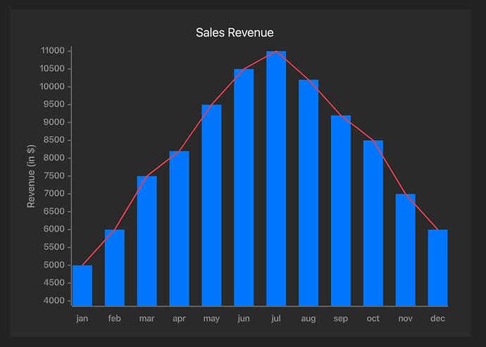
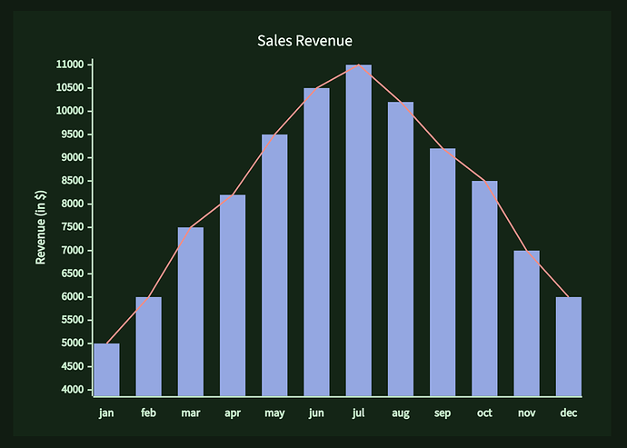
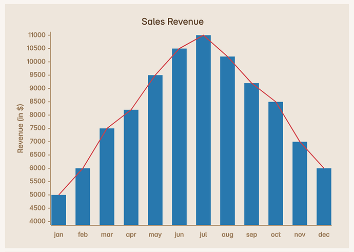
I noticed, that the line chart didn’t show in Obsidian’s default rendering of the example. (Bug?) So I experimented a bit more.
.mermaid svg[aria-roledescription="xychart"] {

  /* add spacious Obsidian background */
  padding: 1rem 2rem 1rem 1rem;
  background-color: var(--background-secondary);

  & g.main {

    /* hide Mermaid background */
    & rect.background {
      opacity: 0;
    }

    & g.plot {

      /* bar chart */
      & rect {
        fill: var(--color-blue) !important;
      }

      /* line chart */
      & path {
        stroke: var(--color-red) !important;
      }
    }

    /* choose color for axes */
    & g.bottom-axis,
    & g.left-axis {

      & path,
      & g.label text,
      & g.title text {
        stroke: var(--text-faint) !important;
      }
    }

    /* no ticks on bottom axis */
    & g.bottom-axis g.ticks{
        display: none;
    }
  }
}
It turns out that Obsidian’s HTML has more useful selectors than I remembered. ![]()
Note that no color is hard-coded. I use Obsidian’s variables.
The screenshots show the same CSS with different theme settings. The first shows Default theme in dark mode, the second Prism theme in dark mode with color scheme Pine, the third Primary theme in light mode.
The chart data is the same as in OP’s question.


