Hi everyone,
I do a lot of my academic reading and annotating directly in Obsidian, often using plugins like PDF++. The desktop experience is perfect, but I struggled to get a comfortable reading experience on my phone.
The Problem
When viewing a PDF on mobile, the screen width is small, and either the lines in the pdf are not fully visible or the text is too small (or both!), see for example:

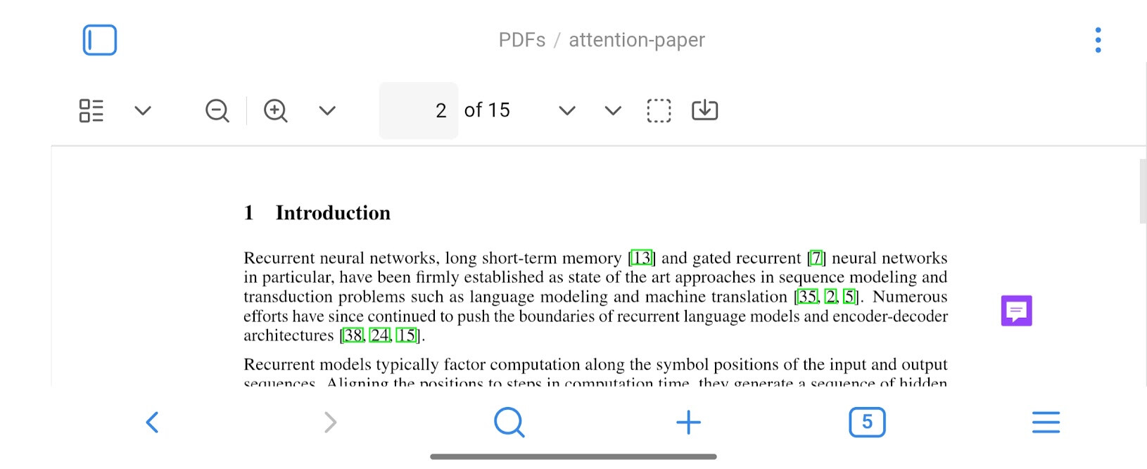
The natural solution is to rotate the phone to landscape mode for a wider view, but then the available vertical screen space becomes very limited. The combination of:
- The PDF viewer’s top toolbar
- The active note/pane header
- The main mobile bottom navigation bar
…leaves only a small slice of the screen for the actual PDF content. See this screenshot:
The Goal
I wanted a way to automatically hide these non-essential UI elements to create a “zen mode” for reading, but only under specific conditions: on a mobile device, and primarily when in landscape mode. The layout on my desktop needed to remain completely unaffected.
The Solution
After some trial and error, here is a CSS snippet that achieves this perfectly.
/*
 * CSS Snippet: Maximize PDF Reading Space on Mobile (in Landscape)
 *
 * This code hides the PDF toolbar, the active pane header, and the main
 * mobile navigation bar to create an immersive reading experience.
 * It only activates in landscape mode on devices with a limited vertical height.
*/

@media (orientation: landscape) and (max-height: 600px) {

    /* Hides the PDF top toolbar */
    div.pdf-toolbar {
        display: none !important;
    }

    /* Hides the header of the active pane/tab on mobile */
    .workspace-leaf-header {
        display: none !important;
    }

    /* Hides the mobile bottom navigation bar */
    .mobile-navbar {
        display: none !important;
    }
}
Now, the mobile shows the desired outcome:

How to Use It
- Create a new plain text file and name it something like
mobile-pdf-view.css. - Copy and paste the code above into the file.
- Move the file into your vault’s
.obsidian/snippetsfolder. - In Obsidian, go to Settings > Appearance, scroll down to the “CSS snippets” section, and enable the snippet by clicking the toggle next to its name.
Now, when you rotate your phone to view a PDF, the toolbars will disappear, giving you a clean, full-height reading view. The portrait mode still shows all the elements.
Hope this is helpful for others!