Thanks.
This line is not supposed to be used as is, right?
> [!grid-2 grid-3 grid-4 grid-5 grid-6 grid-7 grid-8 card]
This is awesome !
Here are some fixes and additions:
- customize opacity and color of border and background
- added options:
bgto add background color. It is used by default withcard- vertical alignment with
middle,top,bottom
- [fix] if using multiple grids in a row, add some gap between them (:30)
- [fix] add greater gap in the bottom (:22)
- [experimental] by default lists and other elements in callouts have too much margin-block, avoid that (:59)
/* [Callout] simple grid-card.	css */
/* how to use this: https://forum.obsidian.md/t/css-hack-to-display-markdown-content-in-grids-without-html/95117 */
/* Callout grid */

body {
	--x-grid-padding: 0.6em;
	--x-grid-border-width: 1px;
	--x-grid-border-radius: var(--callout-radius, 3px);
	--x-grid-border-opacity: 80%;
	--x-grid-bg-opacity: 15%;
	--x-grid-border-color: hsla(200, 15%, 39%, var(--x-grid-border-opacity));
	--x-grid-bg-color: hsla(200, 15%, 39%, var(--x-grid-bg-opacity));
	--x-grid-gap: 0.75rem;
}

:is(.el-div, .markdown-rendered) {
	/* Hide callout and main background */
	& > .callout[data-callout*="grid"] {
		background-color: transparent !important;
	}

	/* add margin bottom */
	&:has(> .callout[data-callout*="grid"]) {
		&:has(+ *:not(.el-div, .el-hr)) {
			margin-block-end: 2rem;
		}
	}
}

/* add margin between multiple grid callouts */
.el-div:has(.callout[data-callout*="grid"]) + .el-div {
	margin-block-start: var(--x-grid-padding);
}

.callout[data-callout*="grid"],
.callout[data-callout*="grid"] > .callout-content {
	padding: 0;
	margin: 0;
	border: 0;
	background-color: transparent;
}
.markdown-source-view.mod-cm6 .callout-content .callout[data-callout*="grid"] {
	margin: 0;
}
.callout[data-callout*="grid"] > .callout-title {
	display: none;
}

/* display grid */

.callout[data-callout*="grid"]:not(
		[data-callout*="grid-item"],
		[data-callout*="grid-auto"]
	)
	> .callout-content {
	display: grid;
}

/* by default lists and other elements in callouts have too much margin-block, avoid that */
.callout[data-callout*="grid"]
	> .callout-content
	> [data-callout="grid-item"]
	> .callout-content
	> :is(ul, ol, p) {
	/* margin: 0 !important; */
	margin-block: var(--x-grid-padding) !important;
}

/* Same width */

.callout[data-callout*="grid"] {
	--x-grid-sizing: auto;
}

.callout[data-callout*="grid"]:is(
		[data-callout*="same-width"],
		[data-callout*="grid-card"]
	) {
	--x-grid-sizing: 1fr;
}

/* grid : specific number of columns */

.callout[data-callout*="grid-1"] > .callout-content {
	grid-template-columns: var(--x-grid-sizing);
}

.callout[data-callout*="grid-2"] > .callout-content {
	grid-template-columns: var(--x-grid-sizing) var(--x-grid-sizing);
}

.callout:is([data-callout*="grid-3"], [data-callout*="grid-card"])
	> .callout-content {
	grid-template-columns: var(--x-grid-sizing) var(--x-grid-sizing) var(
			--x-grid-sizing
		);
}

.callout[data-callout*="grid-4"] > .callout-content {
	grid-template-columns:
		var(--x-grid-sizing) var(--x-grid-sizing) var(--x-grid-sizing)
		var(--x-grid-sizing);
}

.callout[data-callout*="grid-5"] > .callout-content {
	grid-template-columns:
		var(--x-grid-sizing) var(--x-grid-sizing) var(--x-grid-sizing)
		var(--x-grid-sizing) var(--x-grid-sizing);
}

.callout[data-callout*="grid-6"] > .callout-content {
	grid-template-columns:
		var(--x-grid-sizing) var(--x-grid-sizing) var(--x-grid-sizing)
		var(--x-grid-sizing) var(--x-grid-sizing) var(--x-grid-sizing);
}

.callout[data-callout*="grid-7"] > .callout-content {
	grid-template-columns:
		var(--x-grid-sizing) var(--x-grid-sizing) var(--x-grid-sizing)
		var(--x-grid-sizing) var(--x-grid-sizing) var(--x-grid-sizing) var(
			--x-grid-sizing
		);
}

.callout[data-callout*="grid-8"] > .callout-content {
	grid-template-columns:
		var(--x-grid-sizing) var(--x-grid-sizing) var(--x-grid-sizing)
		var(--x-grid-sizing) var(--x-grid-sizing) var(--x-grid-sizing) var(
			--x-grid-sizing
		)
		var(--x-grid-sizing);
}

@media screen and (min-width: 750px) and (max-width: 1000px) {
	.callout[data-callout*="grid-tablet-1"] > .callout-content {
		grid-template-columns: var(--x-grid-sizing);
	}

	.callout:is([data-callout*="grid-tablet-2"], [data-callout*="grid-card"])
		> .callout-content {
		grid-template-columns: var(--x-grid-sizing) var(--x-grid-sizing);
	}

	.callout[data-callout*="grid-tablet-3"] > .callout-content {
		grid-template-columns: var(--x-grid-sizing) var(--x-grid-sizing) var(
				--x-grid-sizing
			);
	}

	.callout[data-callout*="grid-tablet-4"] > .callout-content {
		grid-template-columns:
			var(--x-grid-sizing) var(--x-grid-sizing) var(--x-grid-sizing)
			var(--x-grid-sizing);
	}

	.callout[data-callout*="grid-tablet-5"] > .callout-content {
		grid-template-columns:
			var(--x-grid-sizing) var(--x-grid-sizing) var(--x-grid-sizing)
			var(--x-grid-sizing) var(--x-grid-sizing);
	}

	.callout[data-callout*="grid-tablet-6"] > .callout-content {
		grid-template-columns:
			var(--x-grid-sizing) var(--x-grid-sizing) var(--x-grid-sizing)
			var(--x-grid-sizing) var(--x-grid-sizing) var(--x-grid-sizing);
	}

	.callout[data-callout*="grid-tablet-7"] > .callout-content {
		grid-template-columns:
			var(--x-grid-sizing) var(--x-grid-sizing) var(--x-grid-sizing)
			var(--x-grid-sizing) var(--x-grid-sizing) var(--x-grid-sizing) var(
				--x-grid-sizing
			);
	}

	.callout[data-callout*="grid-tablet-8"] > .callout-content {
		grid-template-columns:
			var(--x-grid-sizing) var(--x-grid-sizing) var(--x-grid-sizing)
			var(--x-grid-sizing) var(--x-grid-sizing) var(--x-grid-sizing) var(
				--x-grid-sizing
			)
			var(--x-grid-sizing);
	}
}

@media screen and (max-width: 750px) {
	.callout:is([data-callout*="grid-mobile-1"], [data-callout*="grid-card"])
		> .callout-content {
		grid-template-columns: var(--x-grid-sizing);
	}

	.callout[data-callout*="grid-mobile-2"] > .callout-content {
		grid-template-columns: var(--x-grid-sizing) var(--x-grid-sizing);
	}

	.callout[data-callout*="grid-mobile-3"] > .callout-content {
		grid-template-columns: var(--x-grid-sizing) var(--x-grid-sizing) var(
				--x-grid-sizing
			);
	}

	.callout[data-callout*="grid-mobile-4"] > .callout-content {
		grid-template-columns:
			var(--x-grid-sizing) var(--x-grid-sizing) var(--x-grid-sizing)
			var(--x-grid-sizing);
	}

	.callout[data-callout*="grid-mobile-5"] > .callout-content {
		grid-template-columns:
			var(--x-grid-sizing) var(--x-grid-sizing) var(--x-grid-sizing)
			var(--x-grid-sizing) var(--x-grid-sizing);
	}

	.callout[data-callout*="grid-mobile-6"] > .callout-content {
		grid-template-columns:
			var(--x-grid-sizing) var(--x-grid-sizing) var(--x-grid-sizing)
			var(--x-grid-sizing) var(--x-grid-sizing) var(--x-grid-sizing);
	}

	.callout[data-callout*="grid-mobile-7"] > .callout-content {
		grid-template-columns:
			var(--x-grid-sizing) var(--x-grid-sizing) var(--x-grid-sizing)
			var(--x-grid-sizing) var(--x-grid-sizing) var(--x-grid-sizing) var(
				--x-grid-sizing
			);
	}

	.callout[data-callout*="grid-mobile-8"] > .callout-content {
		grid-template-columns:
			var(--x-grid-sizing) var(--x-grid-sizing) var(--x-grid-sizing)
			var(--x-grid-sizing) var(--x-grid-sizing) var(--x-grid-sizing) var(
				--x-grid-sizing
			)
			var(--x-grid-sizing);
	}
}

/* grid-auto : auto number of columns */

.callout[data-callout*="grid-auto"] > .callout-content {
	display: flex;
	flex-direction: row;
	flex-wrap: wrap;
}

/* Padding */

.callout[data-callout*="grid"]:is(
		[data-callout*="padding"],
		[data-callout*="card"]
	)
	> .callout-content
	> .callout[data-callout*="grid-item"]
	> .callout-content {
	padding: 0 var(--x-grid-padding, var(--p-spacing));
}

/* Background color */

.callout[data-callout*="grid"]:is([data-callout*="bg"], [data-callout*="card"])
	> .callout-content
	> .callout[data-callout*="grid-item"] {
	background-color: transparent !important;
	& > .callout-content {
		background-color: var(--x-grid-bg-color) !important;
	}
}

.callout[data-callout*="grid"]:not([data-callout*="bg"], [data-callout*="card"])
	> .callout-content
	> .callout[data-callout*="grid-item"],
.callout[data-callout*="grid-item"] > .callout-content {
	background-color: transparent !important;
}

/* Border */

.callout[data-callout*="grid"]:is(
		[data-callout*="border"],
		[data-callout*="card"]
	)
	> .callout-content
	> .callout[data-callout*="grid-item"]
	> .callout-content {
	border-radius: var(--x-grid-border-radius, 0);
	border: var(--x-grid-border-width) solid var(--x-grid-border-color) !important;
}

/* Gap */

.callout[data-callout*="grid"]:is([data-callout*="gap"], [data-callout*="card"])
	> .callout-content {
	grid-gap: var(--x-grid-gap);
}

/* Same height */

.callout[data-callout*="grid"]:is(
		[data-callout*="same-height"],
		[data-callout*="grid-card"]
	):not([data-callout*="grid-item"])
	> .callout-content
	> .callout[data-callout*="grid-item"]
	> .callout-content {
	/* Takes parent size */
	height: 100%;
	width: 100%;
}

/* Same height in all rows */

.callout[data-callout*="grid"][data-callout*="same-height-all"]
	> .callout-content {
	grid-auto-rows: 1fr;
}

/* Center */

.callout[data-callout*="grid"][data-callout*="center"]
	> .callout-content
	> .callout[data-callout*="grid-item"]
	> .callout-content {
	text-align: center;
}
.callout[data-callout*="grid"][data-callout*="center"]
	> .callout-content
	> .callout[data-callout*="grid-item"]
	> .callout-content
	> :is(.callout, pre, [class*="block-language"]) {
	/* Don't align text center inside nested callouts / code blocks */
	text-align: left;
}
.callout[data-callout*="grid"][data-callout*="center"]
	> .callout-content
	> .callout[data-callout*="grid-item"]
	> .callout-content
	> :is(ul, ol) {
	/* Center lists */
	display: table;
	margin-right: auto;
	margin-left: auto;
}

/* Right */

.callout[data-callout*="grid"][data-callout*="right"]
	> .callout-content
	> .callout[data-callout*="grid-item"]
	> .callout-content {
	text-align: right;
}
.callout[data-callout*="grid"][data-callout*="right"]
	> .callout-content
	> .callout[data-callout*="grid-item"]
	> .callout-content
	> :is(.callout, pre, [class*="block-language"]) {
	/* Don't align text right inside nested callouts / code blocks */
	text-align: left;
}
.callout[data-callout*="grid"][data-callout*="right"]
	> .callout-content
	> .callout[data-callout*="grid-item"]
	> .callout-content
	> :is(ul, ol) {
	/* Align right lists */
	display: table;
	margin-left: auto;
}

/* Middle : vertical align */

.callout[data-callout*="grid"][data-callout*="middle"]
	> .callout-content
	> .callout[data-callout*="grid-item"]
	> .callout-content {
	display: flex;
	align-items: center;
}

/* Bottom : vertical align */

.callout[data-callout*="grid"][data-callout*="bottom"]
	> .callout-content
	> .callout[data-callout*="grid-item"]
	> .callout-content {
	display: flex;
	align-items: end;
}

/* Top : vertical align */

.callout[data-callout*="grid"][data-callout*="top"]
	> .callout-content
	> .callout[data-callout*="grid-item"]
	> .callout-content {
	display: flex;
	align-items: baseline;
}

/* Hide PC / Tablet / Mobile */

@media screen and (min-width: 1000px) {
	.callout[data-callout*="grid"]:is(
			[data-callout*="hide-on-pc"],
			[data-callout*="tablet-only"],
			[data-callout*="mobile-only"]
		) {
		display: none;
	}
}

@media screen and (min-width: 750px) and (max-width: 1000px) {
	.callout[data-callout*="grid"]:is(
			[data-callout*="hide-on-tablet"],
			[data-callout*="pc-only"],
			[data-callout*="mobile-only"]
		) {
		display: none;
	}
}

@media screen and (max-width: 750px) {
	.callout[data-callout*="grid"]:is(
			[data-callout*="hide-on-mobile"],
			[data-callout*="tablet-only"],
			[data-callout*="pc-only"]
		) {
		display: none;
	}
}
Example
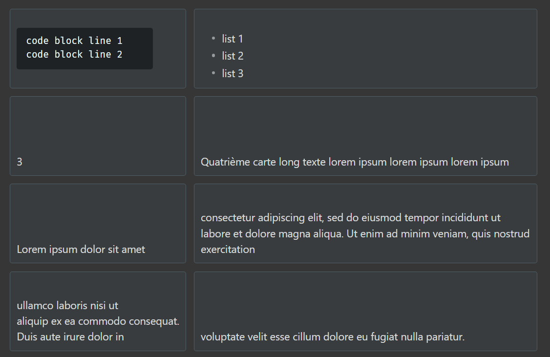
!grid-2 bg gap: bg adds the background color defined in the snippet
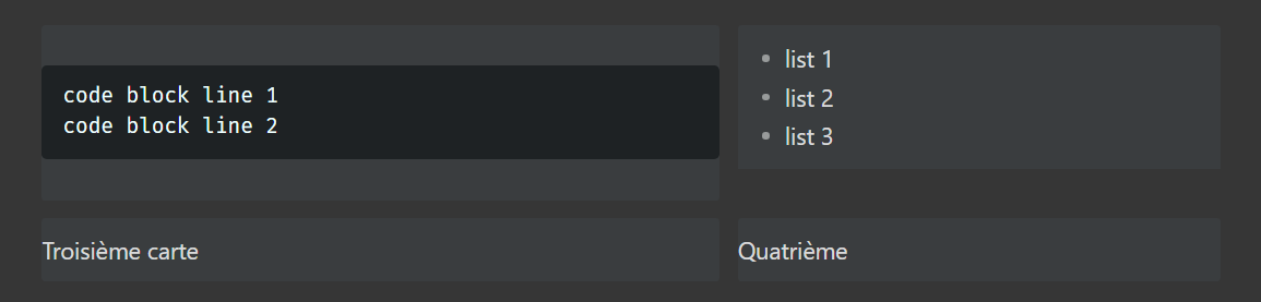
!grid-2 card middle same-height-all , align content vertically. Possible values: middle , top , bottom.

!grid-2 card bottom same-height-all , example with bottom.
IMPORTANT
If background color of block code and other custom things don’t display as expected in callout, add this line to this snippet or the one you might use to customize your callouts:
body {
	--callout-blend-mode: normal !important;
}