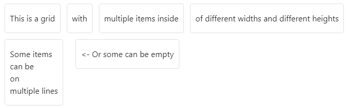
Made a big CSS file to make a lot of different CSS grids using only callouts.
Works in live preview, reading view and in published obsidian website.
Features
- Grids
- Grid items as list or callouts or invisible callouts
- Nested grids
- Specify up to 8 columns
- Change all or individual columns sizes
- Grid items span in columns and rows
- Grid items alignment
- Customization : borders, gap, padding, background
- Options for mobile and tablet
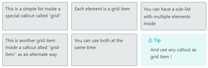
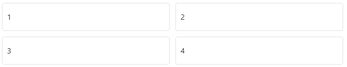
Simple grid
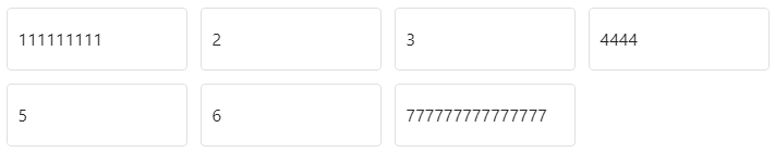
Here is a first example :
Show code
> [!grid-card]
> - This is a simple list inside a special callout called "grid"
> - Each element is a grid item
> -
> 	- You can have a sub-list
> 	- with multiple elements inside
>
> > [!grid-item]
> > This is another grid item inside a callout alled "grid-item" as an alternate way
>
> - You can use both at the same time
>
> > [!tip]
> > And use any callout as grid item !
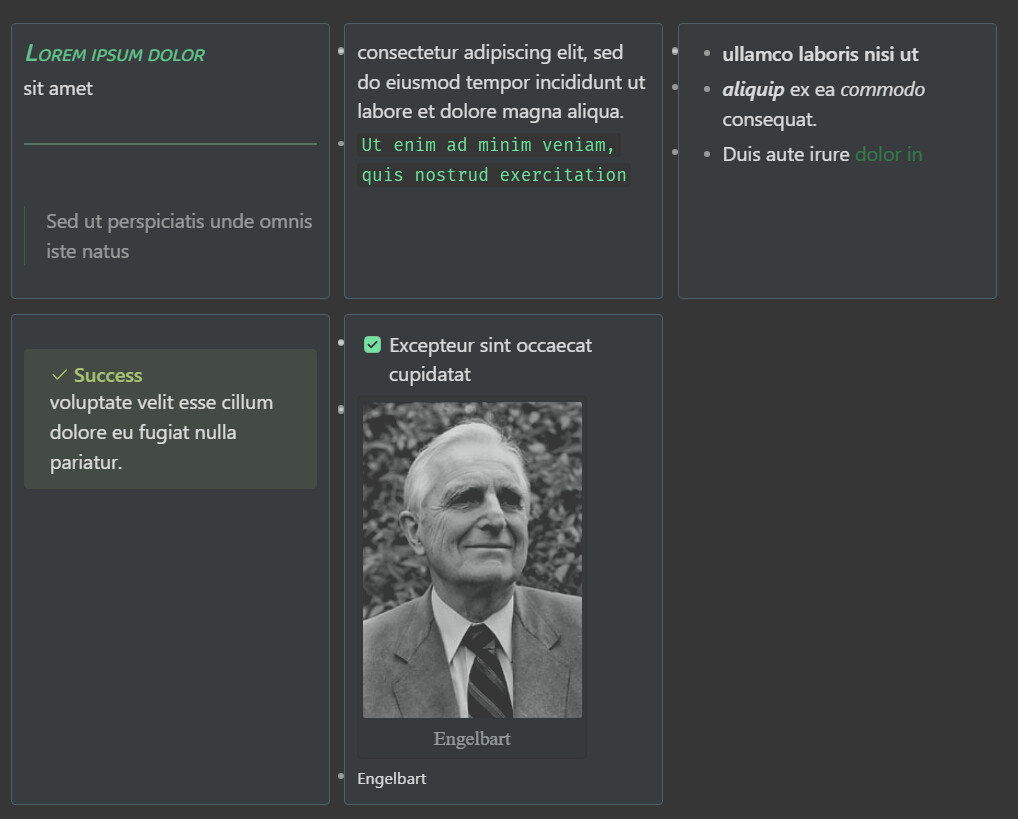
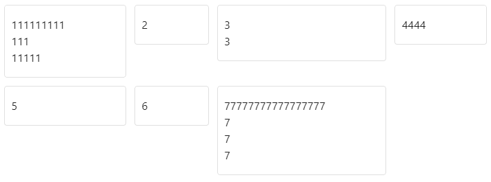
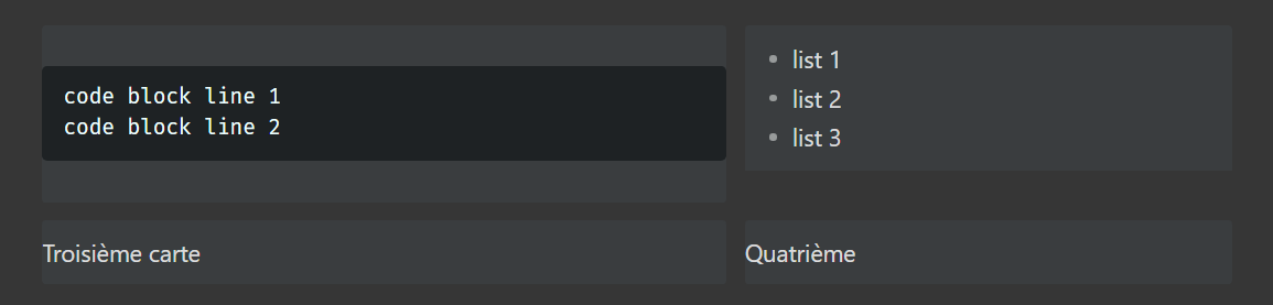
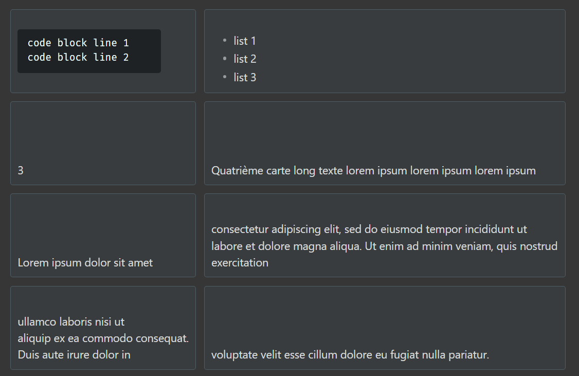
And a second one a little more complex
Show code
> [!grid-card]
> > [!grid-item]
> > ### Lorem ipsum dolor
> > sit amet
> >
> > ---
> >
> > > Sed ut perspiciatis unde omnis iste natus
>
> > [!success]
> > consectetur adipiscing elit, sed do eiusmod tempor incididunt ut labore et dolore magna aliqua.
> > ```
> > Ut enim ad minim veniam, quis nostrud exercitation
> > ```
>
> -
> - **ullamco laboris nisi ut**
> - ***aliquip*** ex ea *commodo* consequat.
> - Duis aute irure [[dolor in]]
>
> > [!grid-item]
> > > [!success]
> > > voluptate velit esse cillum dolore eu fugiat nulla pariatur.
>
> > [!grid-item]
> > - [x] Excepteur sint occaecat cupidatat
> >
> > 
> > <small>Engelbart</small>
>
> > [!grid-card-2]
> > - This
> > - is
> > - a nested grid
> > - 🤯
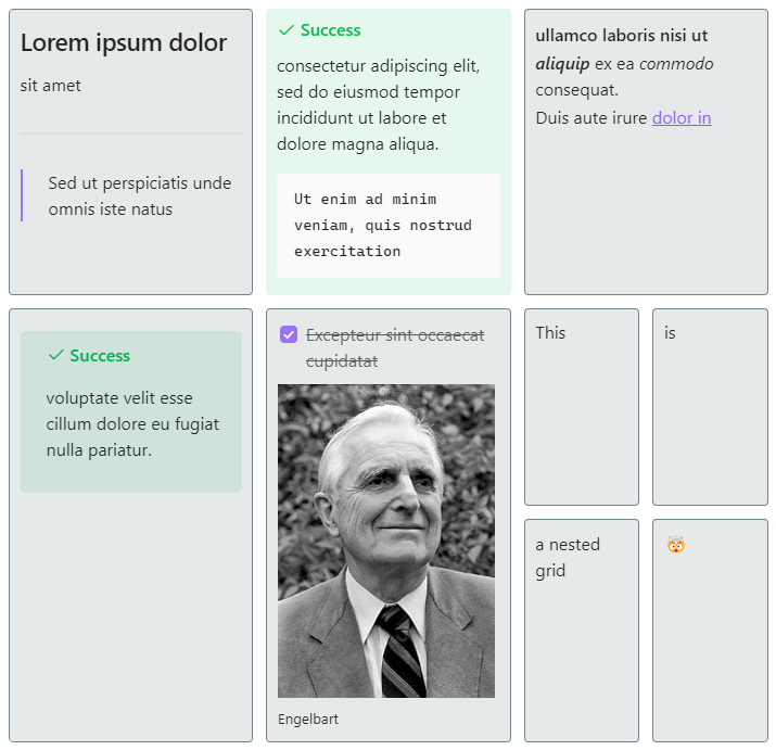
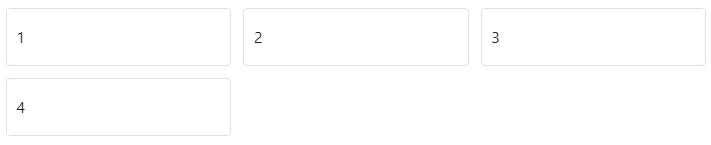
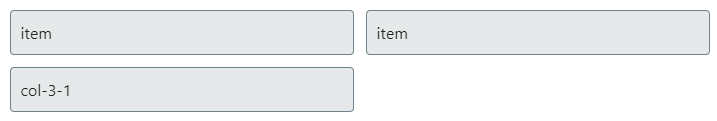
Grid items
Grid items
3 ways to have grid items :
- Simple lists
- The special callout called “grid-item”
- Any other callout
> [!grid-card-3]
> - This is an item
>
> > [!grid-item]
> > This is another item
>
> > [!info]
> > And this is another item
Options
To customize a grid, add keywords after “grid”.
> [!grid ADD OPTIONS HERE]
Nested grids
… works 
> [!grid-card-2]
> - First grid's item
>
> > [!grid-card-2]
> > - Second grid's item
> > - Second grid's item
> > - Second grid's item
>
> > [!grid-card-3]
> > - Third grid's item
> > - Third grid's item
> > - Third grid's item
>
> - First grid's item

Cards
“card” Is a shortcut for “padding border gap”
> [!grid-2 card]
“grid-card” : Is a shortcut for “grid-3 grid-tablet-2 grid-mobile-1 padding border gap same-width same-height”
> [!grid-card]
Number of columns
> [!grid-auto card]
> [!grid-2 card]
> [!grid-3 card]
> [!grid-4 card]
> [!grid-5 card]
> [!grid-6 card]
> [!grid-7 card]
> [!grid-8 card]

Number of columns on tablet / mobile
> [!grid-4 grid-tablet-2 grid-mobile-1 card]
Same height
> [!grid-4 card]
> [!grid-4 card same-height]
Does not work with “grid-auto”

Same height across all rows
> [!grid-4 card same-height-all]

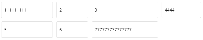
Grid columns sizes
By default every column takes the space based on their content.
You can define more space for all column with the all-col- option.
You can define more space for any column with the col- option.
How sizing works :
autokeyword means that the column takes the space based on their content- A
numbermeans that the column takes the number’s fraction of the available space
Changing all columns sizes (all-col- option)
- You can change how all columns sizes by specifying the
all-col-option all-col-automeans every column takes the space based on their content (default behavior)same-widthandall-col-1means every column takes 1 fraction of the available spaceall-col-2means every column takes 2 fractions of the available space
Changing individual columns sizes (col- option)
- You can change how individual columns sizes by specifying the
col-option col-1-automeans the first column takes the space based on their contentcol-1-1means the first column takes 1 fraction of the available spacecol-1-3means the first column takes 3 fractions of the available spacecol-6-3means the sixth column takes 3 fractions of the available space
All columns size can be changed based on mobile or tablet with :
all-mobile-col-optionall-tablet-col-optionmobile-col-optiontablet-col-option
For example :
col-1-2 means the first column will takes 2 fractions of the space, other columns will take 1 fraction of the space due to all-col-1.
> [!grid-4 card all-col-1 col-1-2]
> - 1
> - 2
> - 3
> - 4

> [!all-col-auto]
> [!all-col-1]
> [!all-col-2]
...
> [!all-col-7]
> [!all-col-8]

> [!col-1-auto]
> [!col-1-1]
> [!col-1-2]
...
> [!col-8-7]
> [!col-8-8]
> [!grid-2 card col-1-3 col-2-1]

> [!grid-3 card col-1-3 col-2-auto col-3-1]

> [!grid-4 card   same-width                col-2-2]

... is the same as ...

> [!grid-4 card   all-col-1                 col-2-2]

... is the same as ...

> [!grid-4 card   col-1-1 col-3-1 col-4-1   col-2-2]

> [!grid-4 card                  col-2-1]

... is the same as ...

> [!grid-4 card   all-col-auto   col-2-1]

> [!grid-3 card all-col-2 col-3-1]

> [!grid-3 card all-col-1 col-3-2 grid-tablet-2 tablet-col-2-1 grid-mobile-1]
On PC : 
On Tablet :
On Mobile :

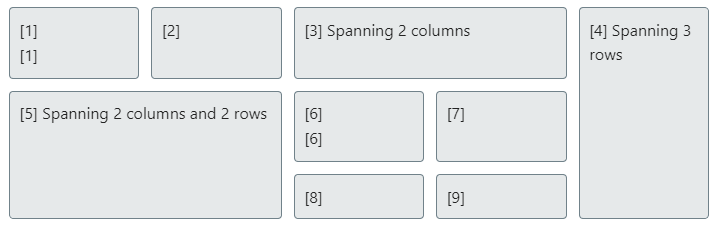
Grid items span
A grid item can span up to 8 columns and 8 rows with col-span- and row-span-
> [!grid-5 card same-width same-height]
> - [1]
> 	- [1]
>
> - [2]
>
> > [!grid-item col-span-2]
> > [3] Spanning 2 columns
>
> > [!grid-item row-span-3]
> > [4] Spanning 3 rows
>
> > [!grid-item col-span-2 row-span-2]
> > [5] Spanning 2 columns and 2 rows
>
> - [6]
> 	- [6]
> - [7]
> - [8]
> - [9]
> > [!grid-item col-span-2]
> > [!grid-item col-span-3]
> > [!grid-item col-span-4]
> > [!grid-item col-span-5]
> > [!grid-item col-span-6]
> > [!grid-item col-span-7]
> > [!grid-item col-span-8]
> > [!grid-item row-span-2]
> > [!grid-item row-span-3]
> > [!grid-item row-span-4]
> > [!grid-item row-span-5]
> > [!grid-item row-span-6]
> > [!grid-item row-span-7]
> > [!grid-item row-span-8]

Borders
> [!grid-4]

> [!grid-4 border]

Gap
> [!grid-4 border]

> [!grid-4 border gap]

Padding
> [!grid-4 border gap]

> [!grid-4 border gap padding]

Background
> [!grid-4 border gap padding bg]
Alignment
> [!grid-4 border gap]

> [!grid-4 border gap center]

> [!grid-4 border gap right]

> [!grid-4 card same-height top]

> [!grid-4 card same-height middle]
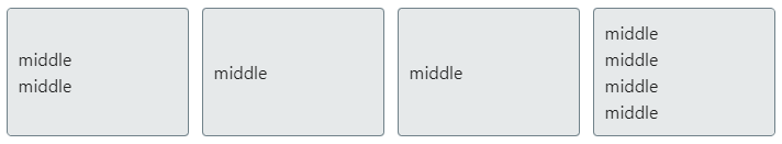
> [!grid-4 card same-height bottom]

> [!grid-4 card same-height center middle]

Only show on mobile / tablet / pc
> [!grid-2 card pc-only]
> [!grid-2 card tablet-only]
> [!grid-2 card mobile-only]
Hide on mobile / tablet / pc
> [!grid-2 card hide-on-pc]
> [!grid-2 card hide-on-tablet]
> [!grid-2 card hide-on-mobile]
Changelog
Changelog
- 1.0 : Initial version
- 1.1 : Thanks to Fred_V (CSS snippet to display markdown in grids without HTML - #2 by Fred_V)
- Added : “bg” option to add background color, added by default to the “card” option
- Added : “top”, “middle” and “bottom” options for vertical alignment
- Fixed : Multiple grids in a row were sticked, added some gap between them
- Fixed : Added a greater gap in the bottom of the grid
- Fixed : Remove default margin added by ul, ol, p inside grids
- 1.2 :
- Added : “grid-card-3” and “grid-card-2” for 2 new templates
- Added : “li” to create grids with simple lists instead of callouts
- 1.3 :
- Fixed : Remove bullets in “li” callout items in preview mode
- 1.4 :
- Fixed : margin fix was not applyed on “grid-item” with other options
- Refactored : simplify code using CSS nesting selectors
- 2.0 :
- Removed : “li” as callout option
- Added : Now supports both lists AND callouts as grid items
- Added : Now supports any callout as grid item, other callout’s style is not overridden
- 2.1 :
- Added : “col-1-1” to “col-8-8” for column sizes
- Added : “col-1-auto” to “col-8-auto” for auto column sizes
- Added : “mobile-col-” and “tablet-col-” for responsive column sizes
- Added : “all-col-auto” and “all-col-1” to “all-col-8” for all columns sizes
- Added : “all-mobile-col-” and “all-tablet-col-” for responsive column sizes
- Added : “col-span-1” to “col-span-8” for individual column span
- Added : “row-span-1” to “row-span-8” for individual column span
CSS file
callout-grid-2.1.css (40.6 KB)
Github link : GitHub - lvnacy-obsidian/basic-css-grid
Older versions
- callout-grid-1.2.css (15.0 KB)
- callout-grid-1.3.css (15.4 KB)
- callout-grid-1.4.css (13.2 KB)
- callout-grid-2.0.css (12.8 KB)
Testing markdown file
Markdown file I used for testing this :
Grid test 2.1.md (21.6 KB)
Older versions
- Grid test 1.3.md (15.1 KB)
- Grid test 1.4.md (15.8 KB)
- Grid test 2.0.md (16.0 KB)

 …
…