I want all tables in my notes to have a width that is equal to the width (text width) of the notes itself. If the width changes, depending of the device I’m using it should always fit.
If there is not much content, it should stretch it horizontally.
If the content of the table is wider than the note, it should be cut off (or hidden), and you should be able to scroll the table horizontally.
Here is an example of what I’m trying to do, but the scrollbars should not be visible: Responsive table
Well I can’t get the table to be max width, the best I could get was a centered table which displays scrolls bars if the area is less than the table width.
.markdown-preview-view table {
  display: block; /* This is needed for scrollbar */
  width: 100%;
  max-width: -moz-max-content;
  max-width: max-content;
  margin: 0 auto; /* this centers the table */
  overflow-x: auto; /* This is needed for scrollbar */
  white-space: nowrap; /* Keeps each cell on one line */
}

th { /* Not needed just colors the header bar */
  background-color: var(--text-normal);
  color: var(--background-primary);
}

tr:nth-child(even) { /* Not needed just colors even rows (aka zebra stripes) */
  background-color: var(--text-faint);
  color: var(--text-normal);
}
I’m not great with CSS but here is why i think what you are asking can’t be done 100%. Maybe someone who is better at CSSS can either confirm my theory or provide a correct explanation.
The link you give shows the DIV having the “overflow-x:auto;” to be able to use that in that way in obsidian there would need to be a named div for the table but there isn’t there is just a plain div.
in other words we would need for obsidian to name the div right before the table as something we could pick out uniquely such as
div.TableDiv { overflow-x:auto; }
But Obsidian doesn’t do that. If we try to add the overflow-x:auto; to the plain div tag
div {overflow-x:auto;}
that effects every div showing and adds scroll bars in lots of places where you probably wouldn’t want them.
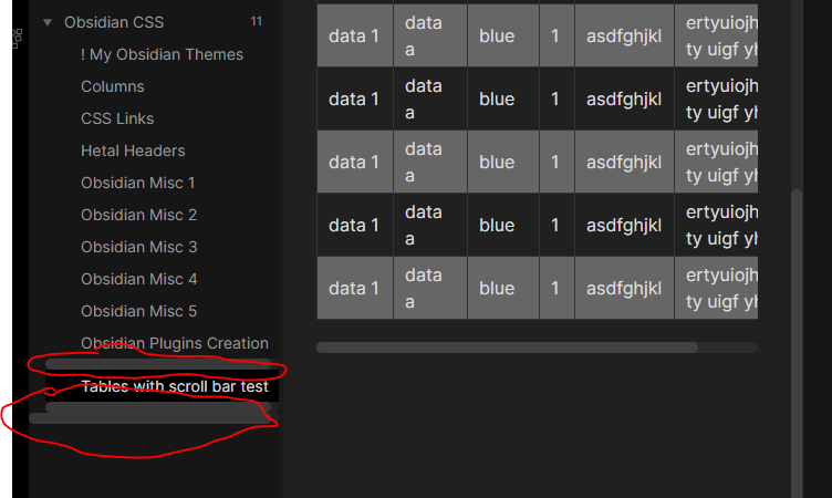
So I don’t think it is possible at this time. The way mine works is I moved the overflow from the div to the table and also added block as overflow only works on block items.
The problem is when adding that block it makes the columns collapse to just the content size no matter if the width is set to 100% or something else.
If you want to see where I got most of this info it was on this stackoverflow post under the sub heading “The solution for those who cannot or do not want to wrap the table in a div (e.g. if the HTML is generated from Markdown) but still want to have scrollbars:”
Now all the table are stretched to fit the width of the page, and on mobile the tables are cut off, but now they can be scrolled horizontally. This is exactly what I was looking for, I tried a lot of things, so I don’t dare to touch any of it again, otherwise it will break
So you may want to look closer and make sure nothing is getting messed up somewhere you don’t want it to. Also when the div is styled like that I have difficulty selecting the table in edit mode.
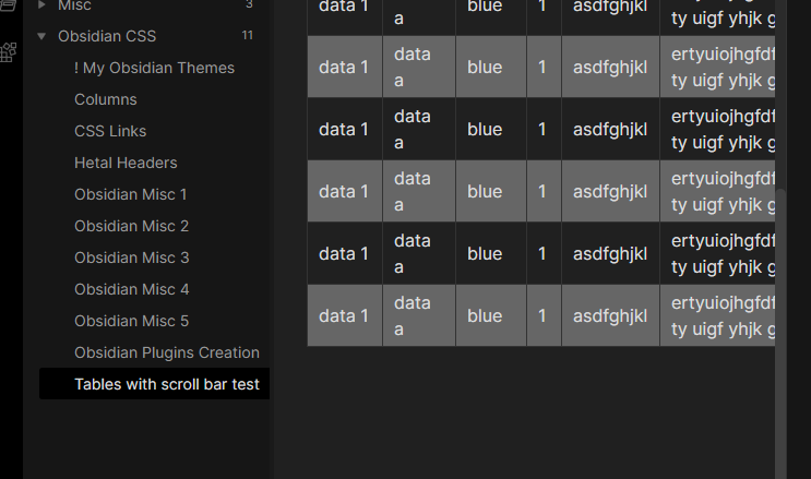
You are right about that, but I’m using the Hider plugin and that is hiding all the scrollbars. That is why I haven’t seen the scrollbars before. If I turn it off I see all the scrollbars indeed.
I think it is still a good solution, but then with the scrollbars hidden.