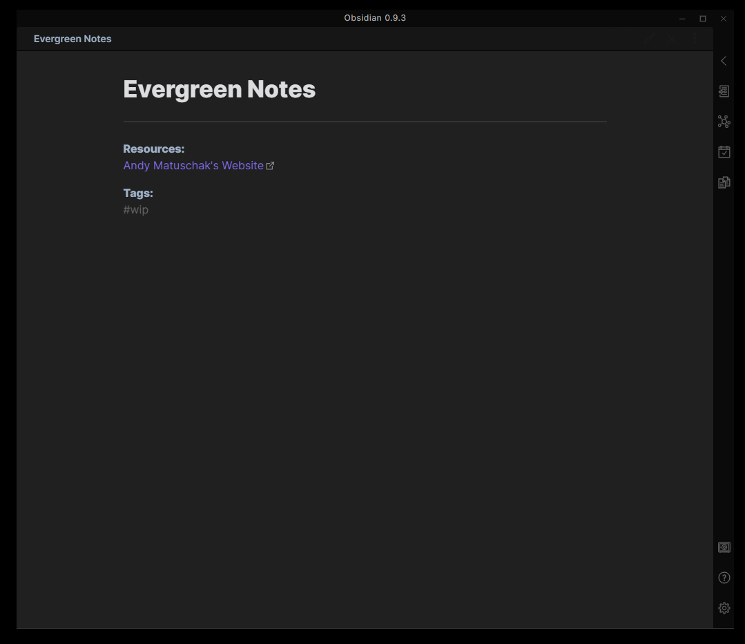
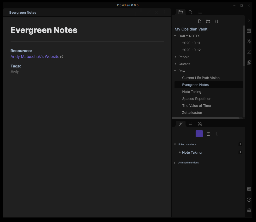
Hey guys 
I downloaded Obsidian 2 days ago and I pretty much immediately disliked the 2 Sidebars UI.
I don’t need that much information when im writing my Text and a lot of the time I’m hiding both of them anyways.
So I worked on the CSS a little and merged both Sidebars together into a single one on the right side. I think it helps to reduce the clutter and make the UI feel cleaner.
Have a look:
And this is the CSS Code on how to make it work:
/* ***************************************************
********** MERGE BOTH SIDEBARS INTO ONE ************
*************************************************** */
.backlink-pane .search-result-container {
	margin-left: 25px;
}

.workspace-ribbon.mod-left {
	top: 75px;
	left: unset;
	right: -1px;
	bottom: 0;
	background-color: rgb(255 255 255 / 0);
	height: calc(100% - 40px);
}

.workspace-ribbon.mod-left .workspace-ribbon-collapse-btn {
	display: none;
}

.workspace-split.mod-left-split {
	display: none;
}

.workspace-ribbon.mod-right {
	z-index: 1;
}

.tooltip.mod-right {
	left: unset !important;
	right: 38px !important;
}

.tooltip.mod-right .tooltip-arrow {
	left: unset;
	right: -10px;
	transform: rotate(180deg);
}