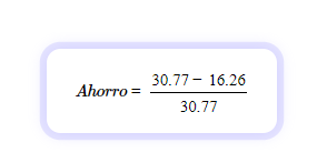
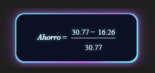
Today I was taking notes on knowledge formulas as well as mathematical formulas, similar to what I used to do in my notebooks. However, when I entered a formula with MathJax, the preview was not what I wanted.

Before, I used to put a frame around the box and add a shadow. So I started researching using the Obsidian selector and, based on that, I was able to modify it using CSS.
CSS can:
- Modify the text font
- Adopt changes according to light/dark mode
- Add a glow-type outline
/* :sun_with_face: Modo claro */
.theme-light mjx-container[jax="CHTML"][display="true"] mjx-math {
  font-family: "STIXTwoMath", serif;
  padding: 18px 24px;
  border-radius: 12px;
  background: #ffffff;
  box-shadow: 0 0 0 6px rgba(185,182,255,0.35),
              0 0 14px rgba(185,182,255,0.55);
  color: #000000;
}


/* :crescent_moon: Modo oscuro */
.theme-dark mjx-container[jax="CHTML"][display="true"] mjx-math {
  font-family: "STIXTwoMath", serif;
  position: relative;
  display: inline-block;
  box-sizing: border-box;
  margin-top: -0.2em;
  margin-bottom: -0.2em;
  width: fit-content;
  max-width: 100%;

  padding: 20px 38px;
  line-height: 0.8;

  border-radius: 16px;
  overflow: visible;

  background: #0b1022;
  color: #e8faff;

  text-align: center;
  text-shadow: 0 0 6px rgba(125,249,255,0.6);

  z-index: 1px;
}

.theme-dark mjx-container[jax="CHTML"][display="true"] mjx-math::before {
  content: "";
  position: absolute;
  inset: -2px;

  border-radius: inherit;

  background: linear-gradient(
    120deg,
   #6fe7ff 10%,
    #9aa6ff 35%,
    #c86bff 65%,
    #6fe7ff 90%
  );
  filter: blur(0.5px);

  box-shadow:
    0 0 6px rgba(111,231,255,0.4),
    0 0 12px rgba(200,107,255,0.4),
    0 0 36px rgba(200,107,255,0.35);

  z-index: -2;
  pointer-events: none;
}

.theme-dark mjx-container[jax="CHTML"][display="true"] mjx-math::after {
  content: "";
  position: absolute;
  inset: 0;

  border-radius: inherit;

  background: #0b1022;

  z-index: -1;
  pointer-events: none;
}
```
This is my first post, so feel free to add anything to the CSS or share it. Thanks to Obsidian for creating a great app.