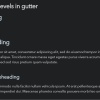
I would like to have heading levels (H1, H2, etc.) showing in the editor’s gutter (pls. see image)
I’d like to use a snippet so that the heading levels are always visible disregarding ot theme.
I know there are themes that do this, but I use Obsidian on both mobile tablet, smartphone and desktop, and it is not optimal to use same theme on different devices, while I’d like to see heading levels on all devices.
I am also aware of the Lapels plugin, but it does not work on any of my devices.
I used the theme URSA on desktop to demonstrate my point, but unfortunately Ursa makes text impossibly tiny on mobile and the tags’ coloring and format on mobile is practically illegible.
In general, it is dissapointing that most of the best stuff for Obsidian is aimed for desktop.
On mobile and accross several devices Obsidian is invaluable tool for me, because I have short term memory difficulties.
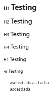
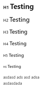
OK, so here’s a CSS snippet I came up with that works in all 3 viewing modes (and hides when editing the header), although I haven’t tested it on mobile but should work just fine (preview images below):
Result with --hh-gutter-margin: -20px (that is, the heading markers are slightly offset to the left of the main content):
Result with --hh-gutter-margin: 0 (that is, no offset so heading markers are inline with the main content):
NOTE: you can also adjust the size of the marker with --hh-marker-size, which is a percentage as you may have noticed and as @holroy realized was a better way of achieving this than using random divisions as I initially did.
@woofy31 , I was thinking along the same lines, but I don’t remember the selectors for headers in live preview.
One question though; why don’t you set the size of the prefix to be say 80% of the accompanying header size? Why do you divide by that seemingly random numbers?
Because it was about 4am and it was the last thing I did before falling asleep after a long day Now I am both ashamed of myself AND amazed by what the brain does when sleep-deprived
I have updated the code, but 80% was still a bit too big as opposed to the preview that OP showed, so I felt 65% was around the size in OP’s preview image.
And I also added a variable for OP to change that percentage if needed.
 Now I am both ashamed of myself AND amazed by what the brain does when sleep-deprived