Hi there!
I’ve been messing around with gradient headers for a while. I’ve seen other snippets creating them but found their execution unsatisfactory, so I opted to recreate it myself.
The specific issues I found were repeated code, full screen width based coloring, and the formatting symbols being ignored. Technically the last issue is caused when fixing the page width issue, but that’s something to talk about later.
In this post I use the term h# and # to refer to headers from h1 to h6 and general 1 to 6 for use in CSS variables and classes. With that hopefully cleared up, let’s move on to the actual code!
The Snippet
For anyone just interested in using it, here’s the snippet:
/*----------------------*\
*!   Gradient Headers   !*
\*----------------------*/

/** Colors **/
:root .theme-light {
    --h1-color: #e53935;
    --h1-gradient: var(--h1-color), #f44336, #f06292;
    --h2-color: #fb8c00;
    --h2-gradient: var(--h2-color), #ff9800, #ffb300;
    --h3-color: #fbc02d;
    --h3-gradient: var(--h3-color), #ffc107, #ffca28;
    --h4-color: #7cb342;
    --h4-gradient: var(--h4-color), #9ccc65, #c0ca33;
    --h5-color: #1e88e5;
    --h5-gradient: var(--h5-color), #03a9f4, #26c6da;
    --h6-color: #8e24aa;
    --h6-gradient: var(--h6-color), #9c27b0, #9575cd;
}

:root .theme-dark {
    --h1-color: #ef5350;
    --h1-gradient: var(--h1-color), #e57373, #f06292;
    --h2-color: #ffa726;
    --h2-gradient: var(--h2-color), #ffb74d, #ffcc80;
    --h3-color: #ffd54f;
    --h3-gradient: var(--h3-color), #ffd54f, #ffe082;
    --h4-color: #a5d6a7;
    --h4-gradient: var(--h4-color), #aed581, #e6ee9c;
    --h5-color: #90caf9;
    --h5-gradient: var(--h5-color), #80deea, #80cbc4;
    --h6-color: #ce93d8;
    --h6-gradient: var(--h6-color), #b39ddb, #f8bbd0;
}

/** Gradient Headers **/

/* Fix formatting symbol colors */
.cm-formatting-header {
    color: inherit;
}

/* Add text-clipped background gradients */
.cm-header:not(.cm-formatting),
:is(h1, h2, h3, h4, h5, h6) {
    background: linear-gradient(to right, var(--gradient-header));
    -webkit-background-clip: text;
    -webkit-text-fill-color: transparent;
    width: fit-content;
}

/* Apply the gradient variables */
.cm-header-1,
h1 {
    --gradient-header: var(--h1-gradient);
}

.cm-header-2,
h2 {
    --gradient-header: var(--h2-gradient);
}

.cm-header-3,
h3 {
    --gradient-header: var(--h3-gradient);
}

.cm-header-4,
h4 {
    --gradient-header: var(--h4-gradient);
}

.cm-header-5,
h5 {
    --gradient-header: var(--h5-gradient);
}

.cm-header-6,
h6 {
    --gradient-header: var(--h6-gradient);
}
A file for mobile users:
header gradients.css (1.9 KB)
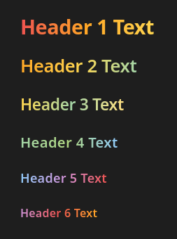
And examples on the default theme:


NOTE: In these screenshots I’m using snippets to make the reading and editing modes look similar to make the comparison easier.
A bit long, but it essentially just sets two color schemes for dark and light modes and then modifies the formatting symbol and headers themselves. I’ve added a little title comment at the top in case anyone is copying this into a long file with other snippets.
This should work on most popular themes, though some may break the formatting symbol colors.
The snippet uses a color order based on the Everforest color scheme, more specifically from the Obsidian Everforest theme. That theme specifically isn’t actively developed and broken in light mode, so I would self promote recommend the theme Everforest Enchanted to use over it. It’s the same look with very slight color differences and updates for the latest version of Obsidian.
If you just wanted the snippet and don’t care about the details, feel free to leave here. Otherwise, it’s time to tell the overly technical reasoning behind all the code!
The Details
As mentioned in the first section, other gradient header snippets weren’t to my standards.
For my own snippet, I wanted to reduce repeated code, change the full screen width based to text width base, and account for the formatting symbols. As a side objective, I wanted to make it easier to modify and support both light and dark modes in preparation for sharing.
Here’s the details on how I achieved these goals.
CSS Variables
Let’s first look at the big block of variables labeled “Colors”.
/** Colors **/
:root .theme-light {
    --h1-color: #e53935;
    --h1-gradient: var(--h1-color), #f44336, #f06292;
    --h2-color: #fb8c00;
    --h2-gradient: var(--h2-color), #ff9800, #ffb300;
    --h3-color: #fbc02d;
    --h3-gradient: var(--h3-color), #ffc107, #ffca28;
    --h4-color: #7cb342;
    --h4-gradient: var(--h4-color), #9ccc65, #c0ca33;
    --h5-color: #1e88e5;
    --h5-gradient: var(--h5-color), #03a9f4, #26c6da;
    --h6-color: #8e24aa;
    --h6-gradient: var(--h6-color), #9c27b0, #9575cd;
}

:root .theme-dark {
    --h1-color: #ef5350;
    --h1-gradient: var(--h1-color), #e57373, #f06292;
    --h2-color: #ffa726;
    --h2-gradient: var(--h2-color), #ffb74d, #ffcc80;
    --h3-color: #ffd54f;
    --h3-gradient: var(--h3-color), #ffd54f, #ffe082;
    --h4-color: #a5d6a7;
    --h4-gradient: var(--h4-color), #aed581, #e6ee9c;
    --h5-color: #90caf9;
    --h5-gradient: var(--h5-color), #80deea, #80cbc4;
    --h6-color: #ce93d8;
    --h6-gradient: var(--h6-color), #b39ddb, #f8bbd0;
}
This section is two selectors for light and dark modes respectively. Under each is the color palette. Splitting these allows for individual color customization based on the mode to get better contrast with the background. There is a :root selector here just to add specificity. The :root pseudo-class selects the highest parent element, e.g. the html in most cases to explicitly increase specificity without duplicating class selectors.
Note that this may possibly lead to issues if the light/dark mode classes somehow disappear. There is no default set as to be cleaner and since this case should never happen.
The snippet uses the default CSS classes of --h#-color to define each of the different levels of headers. This is used so that the formatting # symbols are affected by only the first color.
For the actual gradients, a custom variable is set called --h#-gradient which pulls the corresponding header color and custom colors as a comma separated list for use later in the gradient function.
As a side note, I use Visual Studio Code’s Better Comments which is why my bigger headers have double asterisk * characters.
Fixing Header Colors
First on our list to make headers look cool, we need to set up the formatting symbols to actually use the header colors. We tackle this with the following rule:
/* Fix formatting symbol colors */
.cm-formatting-header {
    color: inherit;
}
This rule seems simple, but takes a bit of background knowledge to understand.
The rule selects the formatting header and sets its color to inherit. In Obsidian terms, it makes the pound/hashtag symbols in front of all headers use the --h#-color.
The reason why inherit is works here is that the color is also set on the element’s parents. We note that --h#-color is set on any element with the classes of HyperMD-header-# or cm-header-#. The structure is something like this:
div class="HyperMD-header HyperMD-header-1 cm-line"
    ...
    div class="cm-formatting cm-formatting-header cm-formatting-header-1 ... cm-header-1"
    div class="cm-header cm-header-1"
From this, we see that the header text will be double colored—once from the HyperMD-header-# parent and again from cm-header-# on the formatting symbol itself.
The way the default app.css makes the formatting header have the --text-faint color is via a simple cm-formatting-header selector. To make the text use its corresponding --h#-color without rewriting the header color for each cm-formatting-header-# class, we can just use the fact from before that it’s applied on the parent and inherit to overwrite the default CSS setting the color.
Basically, just inherit and it works out.
Adding Header Gradients
Now to the actually fun part—adding the header gradients. This last part covers both the actual header stuff and doing some basic variable application.
/* Add text-clipped background gradients */
.cm-header:not(.cm-formatting),
:is(h1, h2, h3, h4, h5, h6) {
    background: linear-gradient(to right, var(--gradient-header));
    -webkit-background-clip: text;
    -webkit-text-fill-color: transparent;
    width: fit-content;
}

/* Apply the gradient variables */
.cm-header-1,
h1 {
    --gradient-header: var(--h1-gradient);
}

.cm-header-2,
h2 {
    --gradient-header: var(--h2-gradient);
}

.cm-header-3,
h3 {
    --gradient-header: var(--h3-gradient);
}

.cm-header-4,
h4 {
    --gradient-header: var(--h4-gradient);
}

.cm-header-5,
h5 {
    --gradient-header: var(--h5-gradient);
}

.cm-header-6,
h6 {
    --gradient-header: var(--h6-gradient);
}
To start unwrapping this, let’s skip over the first part and talk about applying the variables since it’s a bit boilerplate.
Since we don’t want to be writing the same declarations over and over for each of the header levels, we’ll simply make new declarations of the same variable for each header! Since we set --gradient-header as the same name for each header level, we can use that singular variable name to refer to each header color scheme at the same time when using it later.
The rest of the work is just placing it on each header level for both reading and editing mode. If you remember the structure of editing mode headers from before, you can note that we are using the cm-header-# class here to directly set our variables on the header, though this could technically be done at any level that differentiates the headers like HyperMD-header-#.
Enough hair splitting, it’s time to tackle the big block. Here’s a copy by itself for your viewing convenience:
/* Add text-clipped background gradients */
.cm-header:not(.cm-formatting),
:is(h1, h2, h3, h4, h5, h6) {
    background: linear-gradient(to right, var(--gradient-header));
    -webkit-background-clip: text;
    -webkit-text-fill-color: transparent;
    width: fit-content;
}
We start with our selectors. In this case, we are selecting the cm-header class and explicitly ignores the cm-formatting class. This is for editing mode. The second selector concerns reading mode and is just all the h# variants inside of an :is() pseudo-class. This just groups them up and keeps the CSS formatting software happy without lowering specificity like a :where() does.
background: linear-gradient(to right, var(--gradient-header));
Our first declaration is to change the background to a linear-gradient. This is technically a background-image but we won’t be setting a background color so it’s cleaner to just use the shorthand. Normally this would just be a new background, but we’re going to fix that with some webkit tricks in a bit.
The linear-gradient function can be changed and will affect all headers, a helpful feature of using variables for everything. Further customization can be done here like setting the gradient to go to top.
As a quick side tangent, you may have seen others using a fallback color. AFAIK, this is set so that browsers who don’t yet support linear-gradient can have a backup option. This would only really concern some case where you need to support outdated browsers. Considering Obsidian is only used through its app which is a consistent browser via electron, this shouldn’t be an issue. Technically you could use it with transparent colors on the list of colors for the gradient to remove a variable call for the first item, but that feels a bit less explicit and also confusing to write.
-webkit-background-clip: text;
The second declaration uses the background clip present in webkit to clip the background to where the text is. This removes our ability to use backgrounds normally with our header gradients, but this can technically be fixed by applying the header to some parent element if someone were to really want backgrounds.
-webkit-text-fill-color: transparent;
The third declaration changes the text fill to be transparent. For this specific use case you can’t just set the color to transparent for some reason, so this is a must-use with the background clip declaration.
width: fit-content;
The fourth and final declaration is to set the width to fit the content. Either fit-content or max-content can be used here to make the gradient span the length of just the text. If 100% is used, the background will fill the whole page and not be based on the text length, so you must use those two specific values.
Header 1 without fit-content:

Header 1 with fit-content:

Conclusion
And that’s about it! Customization can be done through editing the “Colors” section. The defaults were taken from the material UI palette, specifically various colors from the 400-200 range for dark mode and 600-400 for light mode.
As said above, I used the color palette from Everforest as a base, but you can easily shuffle their order or change them entirely based with the material UI or other palettes to your liking. I tried to keep the gradients subtle, but you could totally go crazy with it if you wanted.
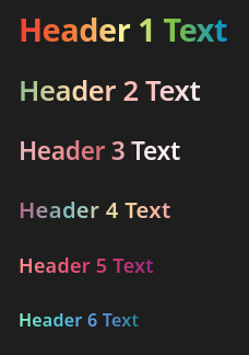
Here’s some loud examples showcased in dark mode:
Setting each gradient to the two next headers:
:root .theme-dark {
    --h1-color: #ef5350;
    --h1-gradient: var(--h1-color), #ffa726, #ffd54f;
    --h2-color: #ffa726;
    --h2-gradient: var(--h2-color), #ffd54f, #a5d6a7;
    --h3-color: #ffd54f;
    --h3-gradient: var(--h3-color), #a5d6a7, #ffe082;
    --h4-color: #a5d6a7;
    --h4-gradient: var(--h4-color), #aed581, #90caf9;
    --h5-color: #90caf9;
    --h5-gradient: var(--h5-color), #ce93d8, #ef5350;
    --h6-color: #ce93d8;
    --h6-gradient: var(--h6-color), #ef5350, #ffa726;
}
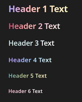
Random color palettes from color-hex and Color Hunt
:root .theme-dark {
    --h1-color: #ee4035;
    --h1-gradient: var(--h1-color), #f37736, #fdf498, #7bc043, #0392cf;
    --h2-color: #96C291;
    --h2-gradient: var(--h2-color), #FFDBAA, #FFB7B7, #F4EEEE;
    --h3-color: #ecb7bc;
    --h3-gradient: var(--h3-color), #e9969a, #d56971, #f8e6e6, #fff8f8;
    --h4-color: #BC658D;
    --h4-gradient: var(--h4-color), #82C4C3, #F9D89C, #F5A7A7;
    --h5-color: #FE9191;
    --h5-gradient: var(--h5-color), #E4406F, #9C297F;
    --h6-color: #89FAD0;
    --h6-gradient: var(--h6-color), #4EC9E1, #6796E5, #228291;
}
More palettes from Color Hunt but softer colors and sort of themed:
:root .theme-dark {
    --h1-color: #B2A4FF;
    --h1-gradient: var(--h1-color), #FFB4B4, #FFDEB4, #FDF7C3;
    --h2-color: #D14D72;
    --h2-gradient: var(--h2-color), #FFABAB, #FCC8D1, #FEF2F4;
    --h3-color: #C4DFDF;
    --h3-gradient: var(--h3-color), #D2E9E9, #E3F4F4, #F8F6F4;
    --h4-color: #B799FF;
    --h4-gradient: var(--h4-color), #ACBCFF, #AEE2FF, #E6FFFD;
    --h5-color: #73A9AD;
    --h5-gradient: var(--h5-color), #B3C890, #DBDFAA, #F5F0BB;
    --h6-color: #F2BED1;
    --h6-gradient: var(--h6-color), #FDCEDF, #F8E8EE, #F9F5F6;
}
I hope this helps!