Hi
What I’m trying to do
I’m trying to use a line chart to plot bacterial growth (represented by numbers measured) function of time (in minutes). And I would like the X axis (time in minutes) to be scaled to the actual timepoints displayed (ie. there should be twice as much space between time 0 and time 20 than there is between time 20 and 30), as Excel would do by default.
For now I am using Obsidian Chart and this very simple piece of code:
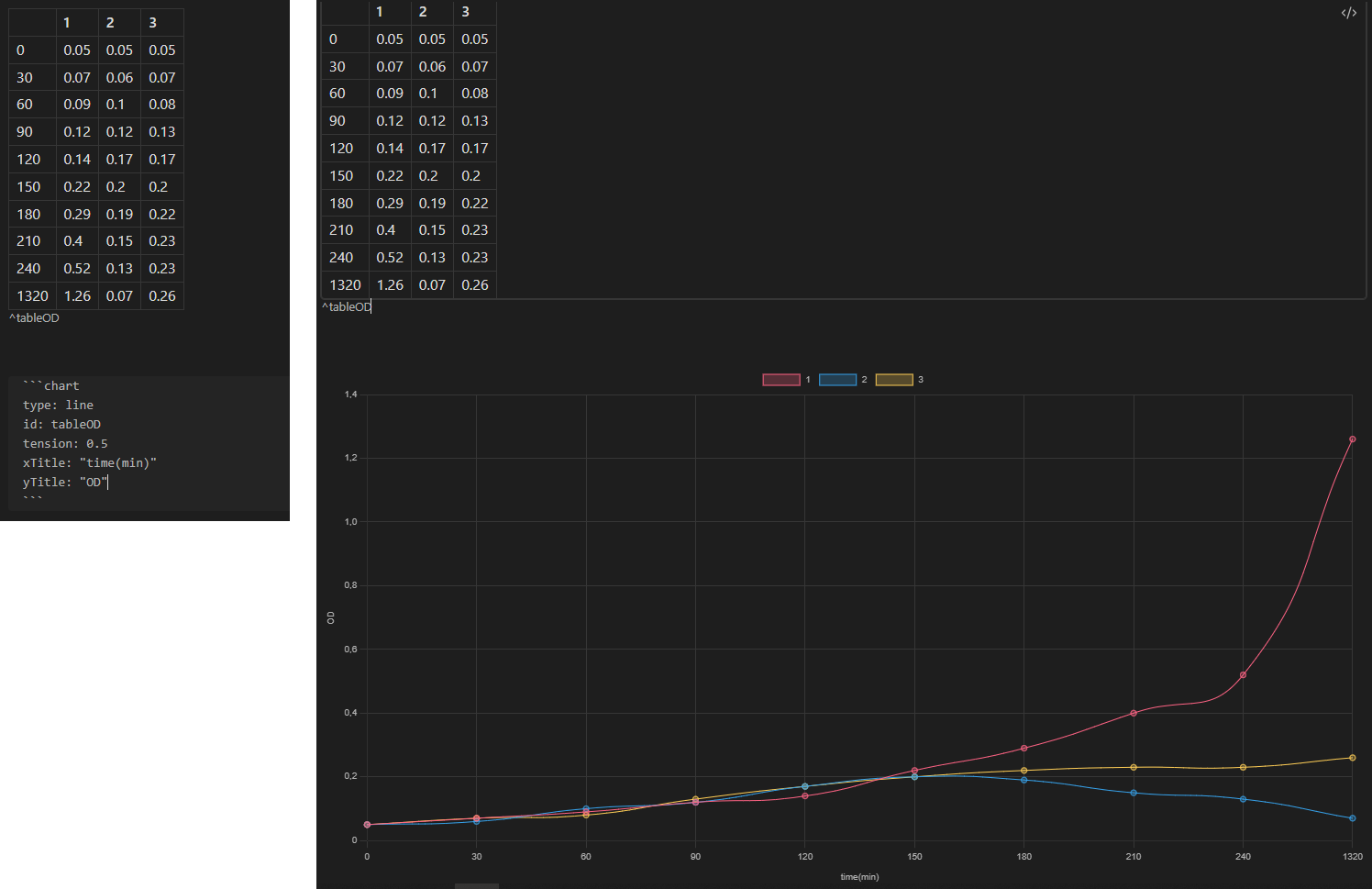
But as you can see this does not yield a scaled X axis, else the last point (1320min) would be much further away from the others.
Things I have tried
I looked online and on the forum if there was already a given solution but couldn’t find anyone that cared about scaling that X axis.
Bear with me if this is a simple fix, my coding level is the one just before beginner.
Thanks for any input!