Spent a good day trying to recreate the Cornell Method setup but we all know how finnicky tables are in Obsidian. After ruminating on it a bit, I came to the conclusion that in digitial spaces, the Cornell Method layout isn’t nearly as important as the overarching structure: clearly delineated sections + spaced repetition that requires active recall.
Here is the workflow I’m using currently:
<%* let newChapterName = await tp.system.prompt(“What would you like to name the Cornell Note Chapter?”); -%>
<% newChapterName %>
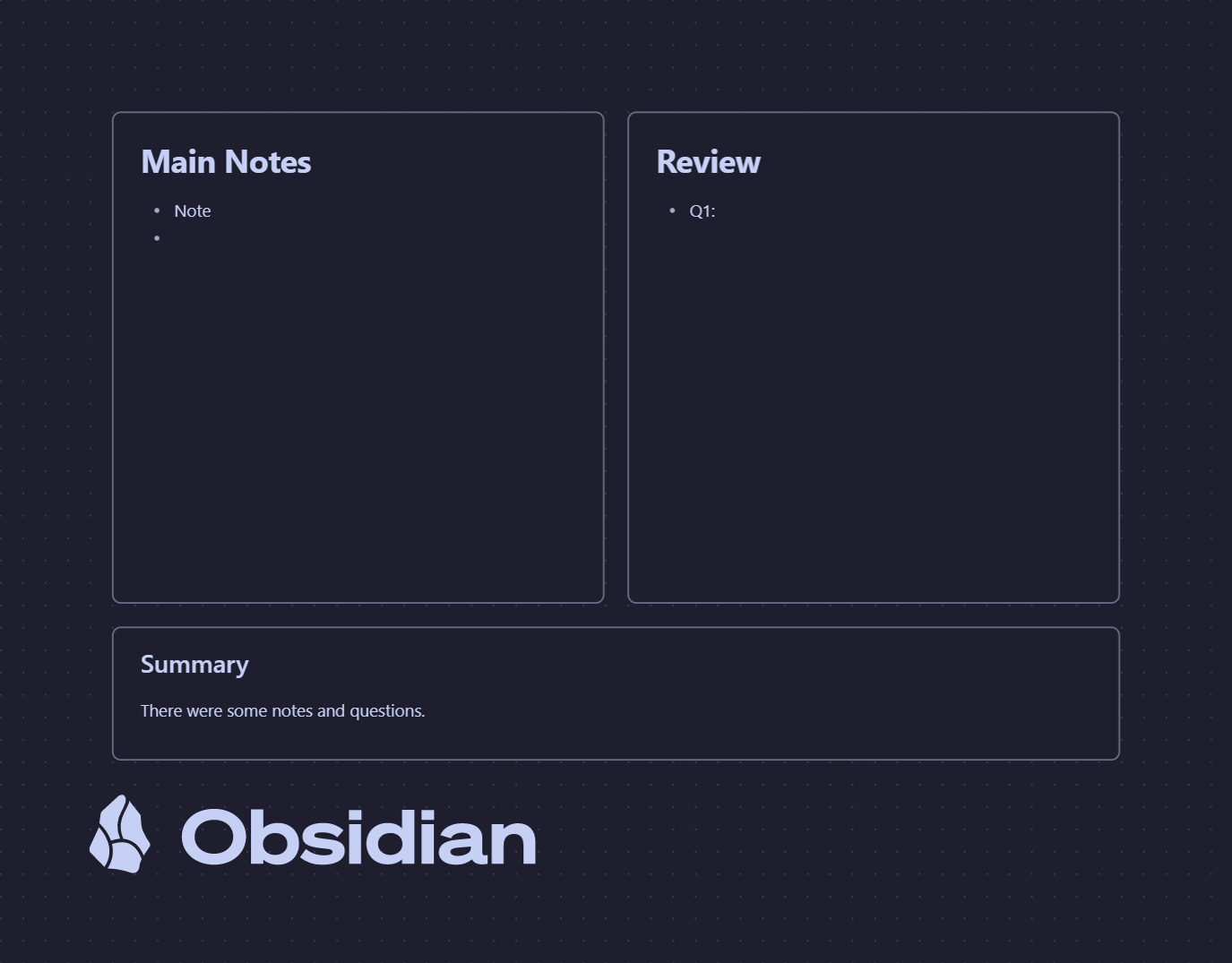
Record/Review/Reflect
Main Notes
<% tp.file.cursor(1) %>
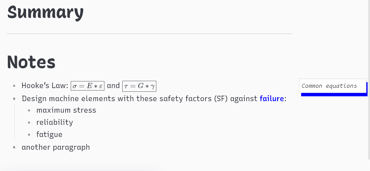
Summary
[[Incomplete Review]]
Here’s a breakdown of the reasoning behind. Each # corresponds to a line of text in the above code:
This is templater code so that a pop up prompts you for the chapter name once the template is triggered.
This header is auto-populated w/ whatever I typed in the prompt.
This the header for the Review/Important section. In the traditional Cornell Method layout, this would be the margin on the far left. The header size is smaller to mirror the smaller width in the OG format. I keep this ‘collapsed’ 95% of the time so that it doesn’t take up space. The only time I utilize it is when I’m entering an important note or later on when I’m reviewing the document
This is where I jot down key facts or ask myself questions Each thing I jot down gets a new checkbox. Then, when I revisit the doc for review, I can check the box for each successful review (or in my case each important fact I turn into a flashcard in Anki) and mark it as complete. What makes this special is that I can then do a global search in Obsidian to find any skipped reviews. This can be accomplished by searching for “” because marking something as ‘complete’ in markdown turns the text from “” to “”.
This is where I jot down all of my detailed notes. General facts and also more in-depth explanations that answers questions & prompts in the ‘Record/Review/Reflect’ section
Since you will almost always start note-taking w/ generally facts, the templater code places the cursor here as soon as a new chapter is created. The only time I collapse this section is when I’m doing my review.
Header for the Summary section. This would be the bottom of the page in the traditional Cornell Notes layout
I caught myself skipping out on the summary, so now, every created Cornell Notes chapter O create links to a note called “Incomplete Review”. After turning on the backlink/toggling it in the options, the ‘Incomplete Review’ page turns into a source document for every Cornell Note that is missing a summary Once I complete a summary of the chapter, I delete the link to the page.
Feel free to share any feedback/suggestions or tips you have for your Cornell Method workflow/workaround.
Regarding the [[Incomplete Review]] tag, one thing I like to do when I have files linked to a specific note for some reason is use dataview to gather all the linked files and embed them into a note. If you might like to set up a dashboard or other means of identifying what notes in your vault need action, you might try it.
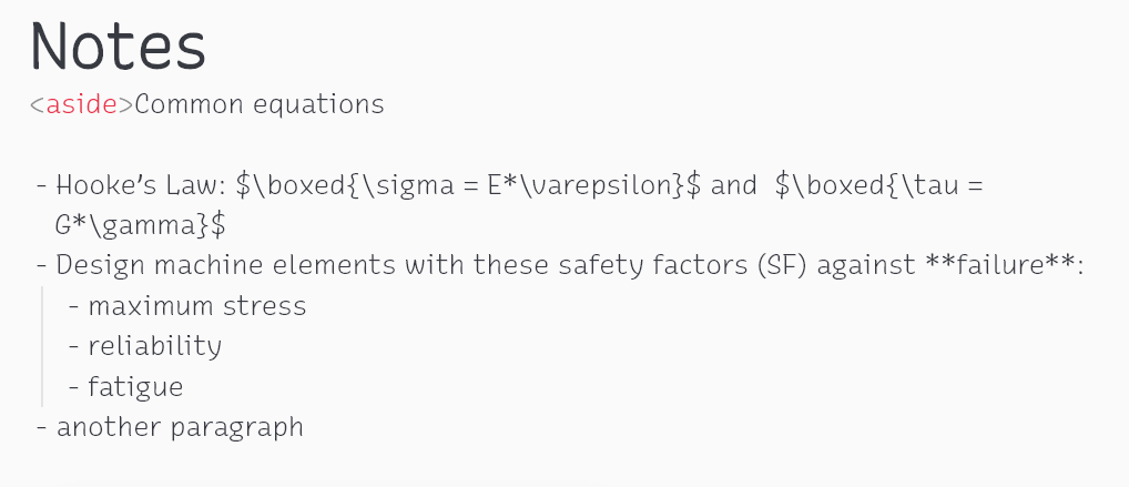
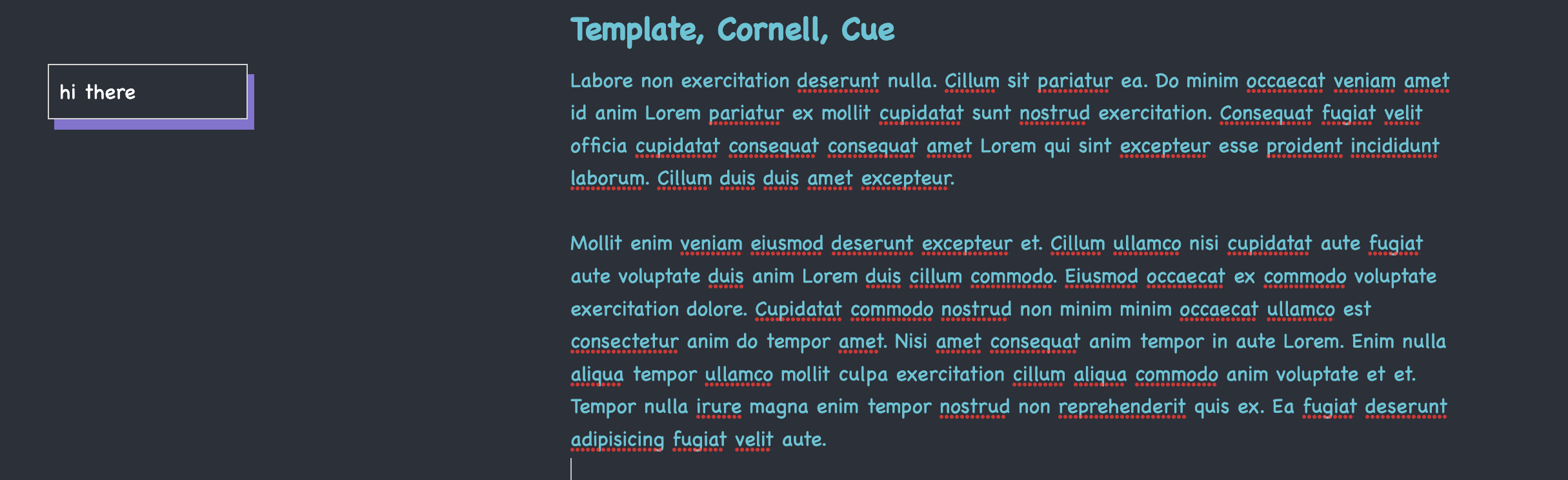
Hey, I also use Cornell Notes when I study. I just figured out a way to note down questions/key points/… on the side just like on paper using Obsidian. It requires one CSS snippet to work, and one more to adjust the readable line length so it’s customizable. Here is how it looks:
/*
you can name the class "aside" to whatever you want
*/
aside {
    float: right;
    border: 1px solid lightgrey;
    padding: 8px;
    position: relative;
    left: 170px;
    width: 155px;
    box-shadow: 5px 8px #8272d0;
    color: black;
}
Create another .css file with below contents. This adjust the readable line length space by changing the percentage. Must enable Readable Line Length in Obsidian settings.
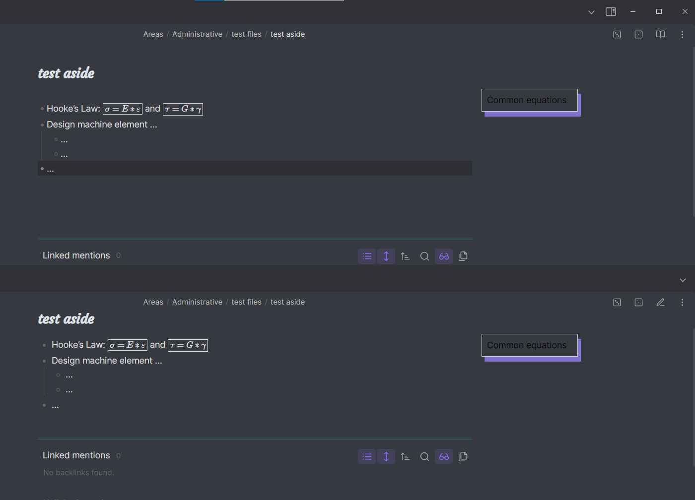
@jeremynotes@ninhbui i’ve amendment to make it float properly in live preview. hope this benefit both of you (and possibly others)
/* i only add this part to make it work in LP */
	.markdown-source-view.mod-cm6 .cm-html-embed:has(aside) {
		display: inline;
	}
    /* this is the original css, unchanged */
	aside {
	    float: right;
	    border: 1px solid lightgrey;
	    padding: 8px;
	    position: relative;
	    left: 170px;
	    width: 155px;
	    box-shadow: 5px 8px #8272d0;
	    color: black;
	}
I (ChatGPT) tweaked it a little bit so it stays on the left side and adjusted the color to white so it’s easier to read. Oh and I combined both CSS snippets into a single file. I hope that won’t break anything. It seems to work fine for me though.
In that case edit the left “Main Notes” section and collapse everything under the heading. Bam. Practice to your hearts content.
although, for this sort of self testing, I prefer to write my notes as indented bullets underneath the question. That way you can collapse and expand the answer as needed.
Actually, you could even use collapsed Callouts.
> [!Question]- Question
> Answer text.
Doing that will ensure that the answer is always collapsed under the question. If you use a plugin like text snippets then you can speed up the process.
 Once I complete a summary of the chapter, I delete the link to the page.