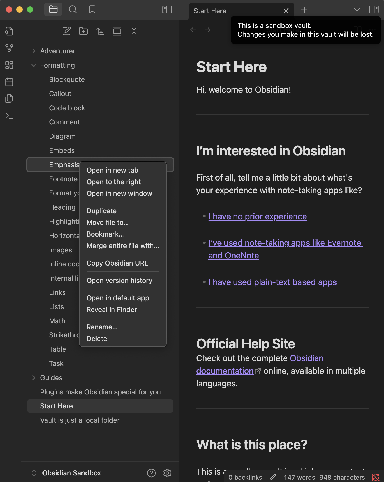
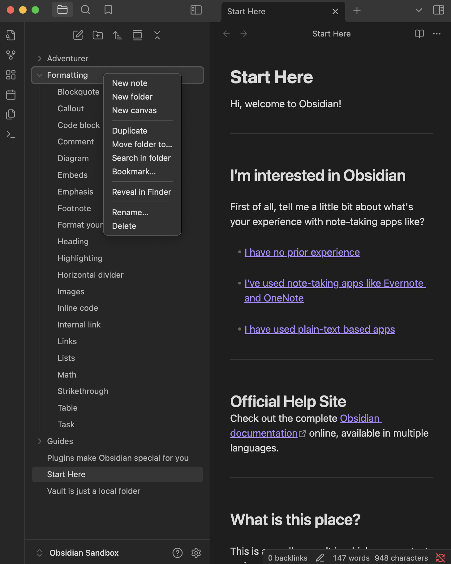
Contextual menus are essential but the commands in there grow longer. Not only with plugins but also for default commands. Sometimes I’m struggling to find the right command.
Proposed solution
One idea could be to make contextual menus editable, so users could decide by themselves what to show
Another idea, (and I prefer this one) would be to add a search field on top, which is active by default, so all you had to do, is:
Right click to open the contextual menu
Type at least 1 to 3 letters to filter menu entries
Press enter to confirm
Current workaround (optional)
None, scrolling through default and plugin entries in contextual menus is time consuming if you don’t memorize roughly where your most used commands are placed in the contextual menu.
In the editor itself all commands are available using ⌘P. If you have multiple editors visible (split right etc) then you need to focus the corresponding editor.
I didn’t specify which menu, because I meant any context menu:
Issue: often I can’t find menu entries immediately, this creates some friction.
Therefore my FR, to make context menus quicker.
Question: what if we add some filter mask to context menus ?
All context menus would look the same, only add a search mask on top [of the active context menu]
After typing some letters, the context menu would filter results, beginning/containing the letters of your search and shorten the list of contextual menu items. A quicker overview !
In the case of editing a file you can use command palette ⌘P. I don’t understand why would you want to use mouse then keyboard if you can use just keyboard in this particular use case. With Files things are different because ⌘P assumes focus from the current editor. In this case mouse and context menu have a real purpose although the available actions are quite limited unless you use many plugins.
Agreed, switching from mouse to keyboard sounds strange and is probably inconvenient.
All I want is to figure out how to filter and shorten the menu entries in contextual menus. Maybe by adding background colour to group similar menu entries?
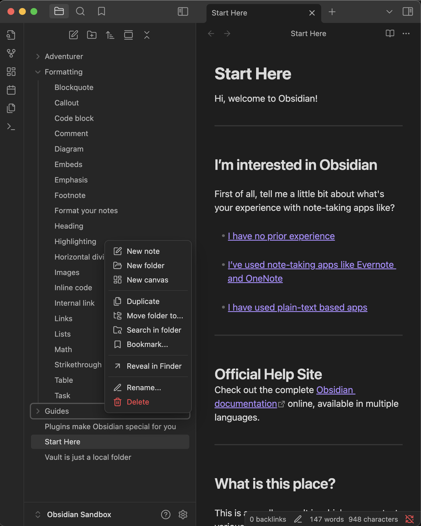
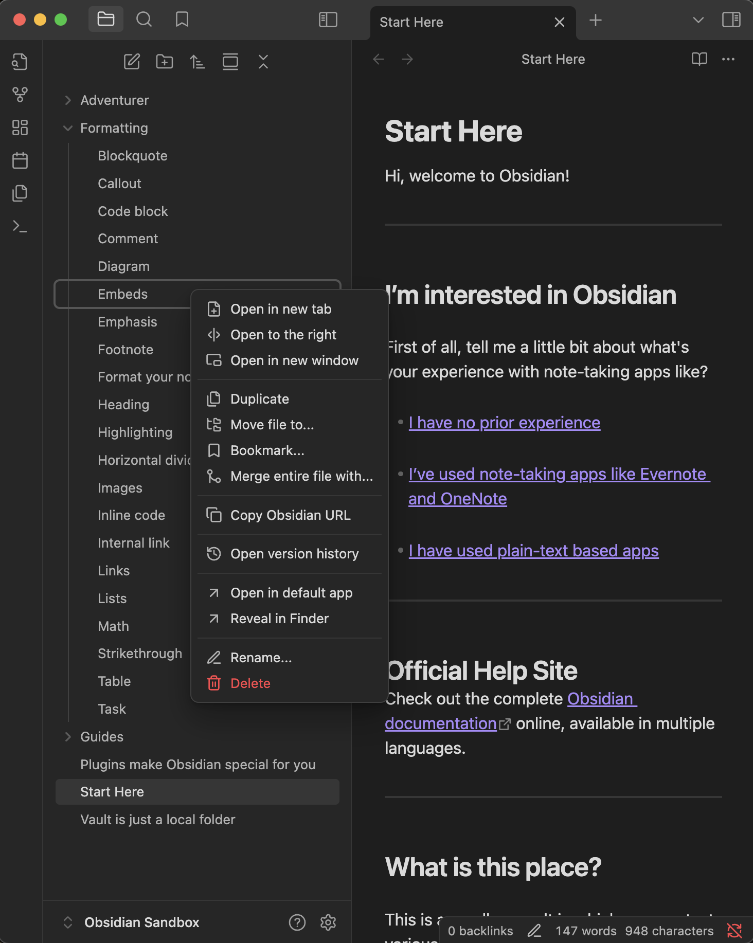
I’ve contextual menus reaching almost the bottom with Obsidian full screen and clicking the hamburger menu on top right.