Use case or problem
More consistent UX pattern for users who use the “Auto-reveal active file” feature for the File Explorer.
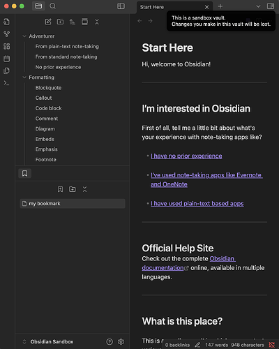
Currently the way this feature works appears to be that it scrolls up or down and then stops when it finds the current file. If the file is already visible within the File Explorer then no scrolling happens and it is simply highlighted.
This means that the vertical position that the user’s eye has to focus on in order to see the active file is always different. Sometimes it will be at the very top of the pane, sometimes at the very bottom, and sometimes at any possible position between those two extremes.
The problem is that there is no consistent location in the File Explorer that they can look to in order to see the active file, instead they have to scan through the entire pane. The larger the monitor / smaller the font-size, the more cognitive overhead involved in this scan.
Proposed solution
After file is highlighted in the File Explorer, have the view scroll towards it so that its final position is always consistent (preferably at the very top of the File Explorer unless otherwise not possible).
Current workaround (optional)
None
Related feature requests
None
