Use case or problem
The file viewer offers very limited space for displaying file names that are several folders into the vault. Instead of being compact like in some other productivity tools, Obsidian prioritises visuals, but this is obviously bad for productivity.
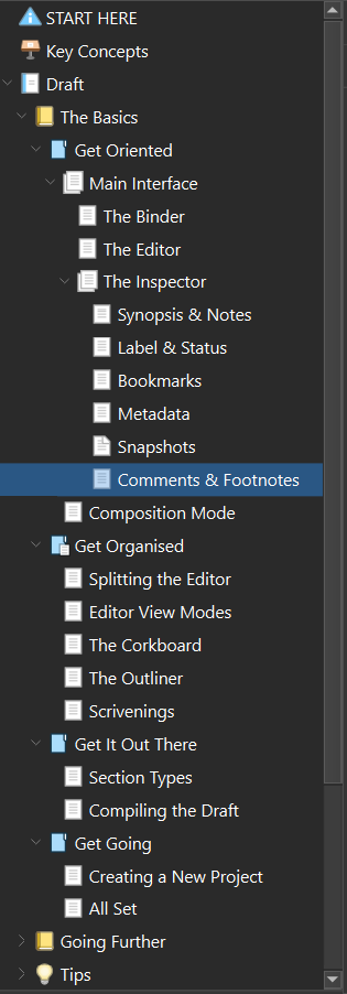
Scrivener’s file viewer:
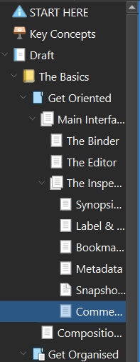
Obsidian’s file viewer:

Obsidian’s file viewer has large gaps in the appearance that could be used for displaying text. Once the scroll bar starts displaying in the file viewer, there is even less space for file names to be displayed.
Proposed solution
An alternative compact file viewer that prioritises displaying of information over appearance (i.e. by reducing the amount of gaps in the viewer’s UI). It should be toggleable in the core plugin “Files” to switch between the standard appearance and the compact appearance.
Current workaround (optional)
- Compress file names - in the example above you could shorten “Chapter” to “Ch.” or even remove it altogether and keep just the number, but often times compressing file names is not viable
- Drag the file viewer further across the screen to see more information - this takes up more screen space and can distract from editing documents, though
- Use a plugin to force an alternative compact file viewer, like GitHub - ozntel/file-tree-alternative: This Obsidian Plugin allows users to have a different file explorer experience. (which is quite popular) - but other plugins which add functionality to the file viewer will likely break. I use “Icon Folder”, “Prominent Starred Files”, and “Folder Focus Mode”; none of which work with this plugin.