In my opinion, the use of color coding can complicate the perception of information, make the interface less minimalistic. Also, the use of colors can cause problems for some people with visual impairments.
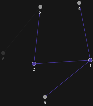
It seems to me that using a double line to display backlinks can help avoid color coding.
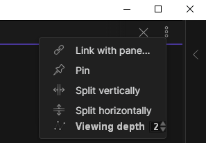
To display links of the second level and below, it may be useful make a setting item in viewing parameters of the graph