I’m having troubles locating the CSS selectors to change the size and appearance of tooltips. So given the code below, I would like for the tooltip to be larger and possibly formatted differently than it currently is under the Minimal theme.
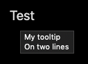
<span title="My tooltip
On two lines">Test</span>
Which currently displays as:
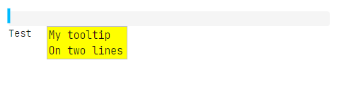
I really would like for this text to be larger.
Things I’ve tried
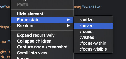
I’ve tried using Developers Tools in Elements pane, but I’m having a hard time getting it to show styles in action when a tooltip is activated. I’ve tried setting various Focus state’s, but there’s something I’m missing related to that, as it doesn’t have any effect that I can see.
So this doesn’t show the tooltip, and thusly not the CSS selectors to use.
I’ve also tried doing stuff related to .tooltip, and setting the --color-tooltip-bg just to see if that somehow targeted the tooltips. But no luck in either case.
So after writing this post I did a different google search, and came across this stackoverflow post:
It basically says, that you can’t change the tooltip from the title attribute, as it default to the display by the browser in use. Bummer. However, it continues to show some alternate stylings related to the title attribute, or other attributes, which also provides me with a solution for single line attributes.
I would however really love being able to have multiple lines, and potentially in a box related to the <span> element. I tried a few variations using position: absolute, but my attempts have failed so far.
They could possibly fail because in addition to the tooltip, I’m also having this CSS to relocate the <span> element to the right margin:
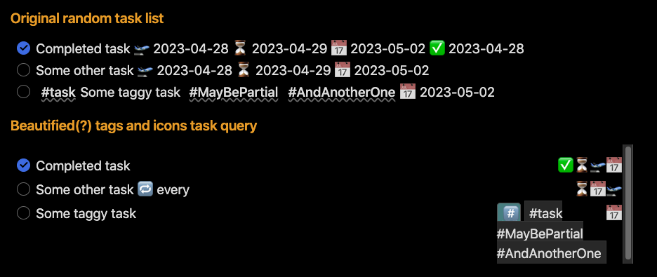
This will keep the inline expansion for the various dates, and use a multi-line tipbox for any tags present in a task. Everything will still keeping the link related to the task origin intact. This displays as the following image when hovering over the tags icon on the lower task:
I tried uncommenting the position: relative for the tipbox, but I got some issues related to containing box. So this a 90% solution for me, but I would love for the tipbox to hover related to hash emoji and above the text below.
Update: Fixed a minor thingy in the query, and would also like to point out that removing the two float: right lines would leave the icons at the end of the task, which is also a rather nice alternative visually speaking.
It’s code very similar to this I utilised in my 90% solution above, but this still gets clipped off, or displays the scrollbars if used in the task context for multiple tags, and it’s the last task in the list. (That is if you also include the position: relative option you didn’t include )
 )
)