Use case or problem
When creating new notes without tweaking the CSS, the formatting / header sizes don’t make sense to me.
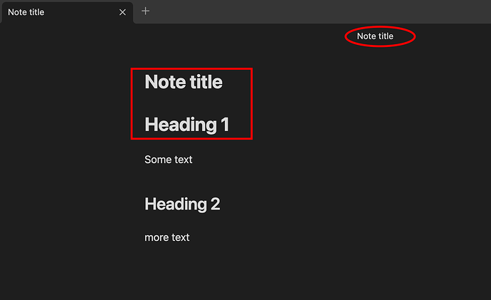
For example, why does heading 1 seem to be even slightly bigger than the title of the note? (red square box)
Why is the title of the note shown 3 times? On the tab it still makes sense, but why also on the top in small (circled in red)?
I know formatting preferences are very personal, but to make the title of the whole document smaller than the first heading feels generally wrong, the same for showing the same piece of information 3 times next to each other.
Some people asked how to change this, and apparently it’s possible via CSS, but shouldn’t the default not make people ask here how to change it?
Proposed solution
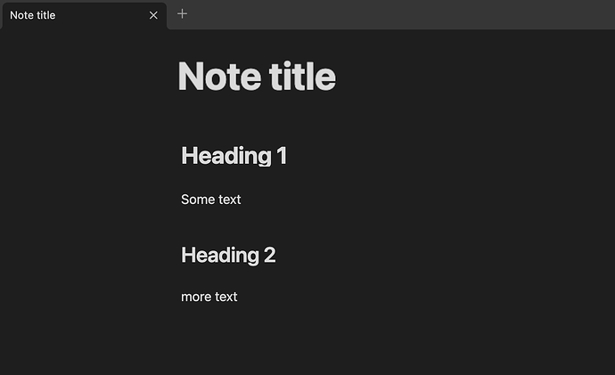
I think this would be a good default, and who doesn’t like it, can still use css to change it.
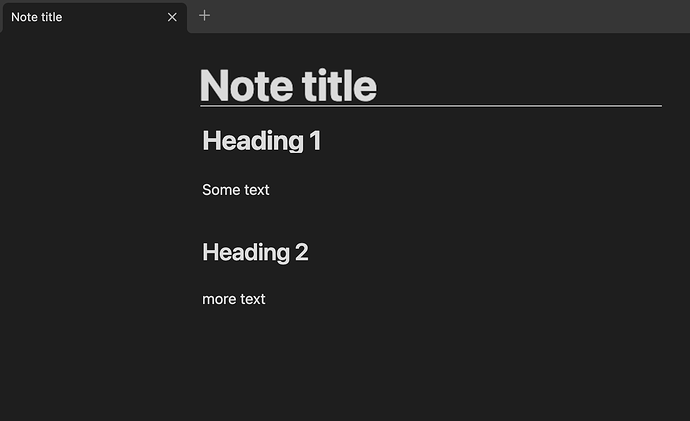
or this:
So basically the title a little bigger (or the headings all a little smaller), and a clear distinction between title and the rest of the document, either by space or by some other visual element like a line, and not repeating the title above the title…
Current workaround (optional)
Apparently setting font sizes for all headers via css, see linked requests.
Another workaround - disable “Display title in Note” in preferences.


