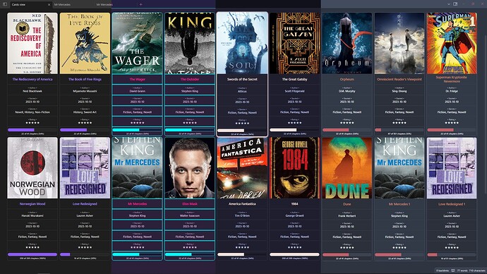
I have created my own css snippet for Cards View from Dataview tables. I was inspired by Minimal Cards but they were lacking some things I’d like to see or have. That’s why I’ve written my own snippet and also ability to change styles via Style Settings plugin.
This is how it looks by default in some themes
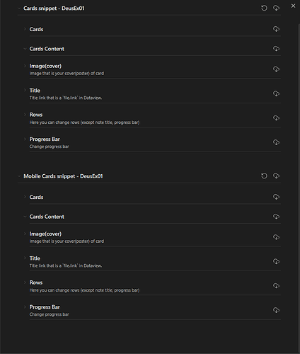
I tried to implement some basic settings in Style Settings plugin. It has settings for Desktop and mobile versions(mobile activates if width less than 400 points:
Here is a link to GitHub page where I you can download it. Star it if you liked the snippet <3
12 Likes
Also I’ve forgotten to attach a mobile style. On my phone it looks like this:
2 Likes
Looks great!
Like it more than the Minimal Cards look.
Ran into one problem for me though. I have one note where I use horizontal pictures and one note where I use vertical pictures. Would be great if there was some way to control the width via cssclasses in the metadata or something. So setting one single width which is applied to all cards like shown in your Github demo wouldn’t work.
Added this line for myself so I can apply card-height-120 to the cssclasses property to get the horizontal images to look better:
.cards.card-height-120 table.dataview tbody>tr>td:has(img){
	height: 120px;
}
How hard would it be to make the gap space consistent so it does not change regardless of screen size and amount of elements? And then either align the whole group to the center or start (left).
Otherwise it’s great  Thank you for making this!


