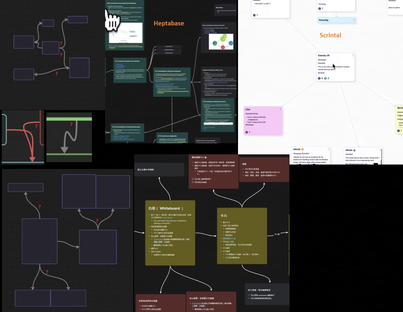
On canvases with many cards their arrow connections look chaotic mishmash between completely straight, rounded and very unusual angles.
Decrease the angle of the arrow when it’s leaving the card, but not the angle of entry into another card.
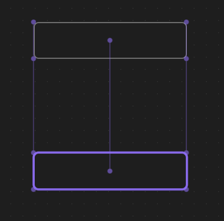
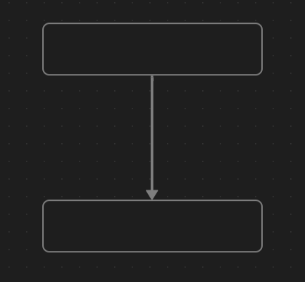
In that second image, if the two cards are aligned with their centers, the arrows will be straight.
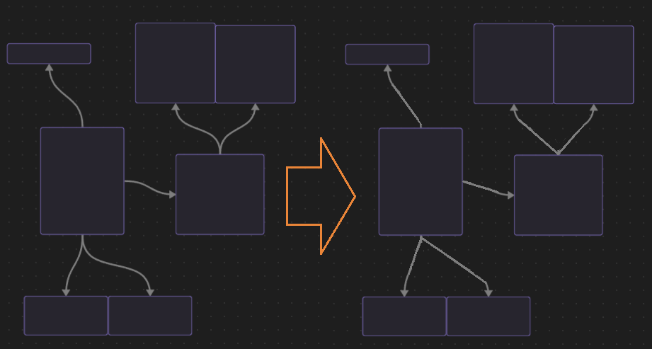
In the other cases, I actually like the aesthetic of the curved lines as they are now, but that definitely boils down to personal preference.
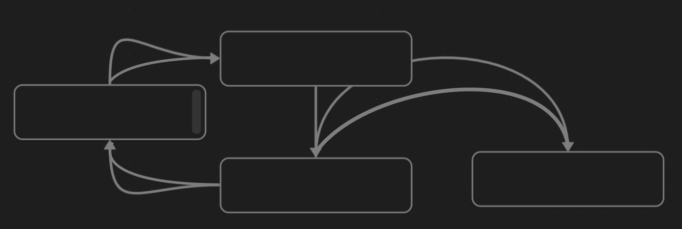
I agree with the above, currently making a family tree and using squared connector lines would help immensely. Even just two nodes to move around the position of the arrowline would be a big boon for legibility in some complex flowcharts.
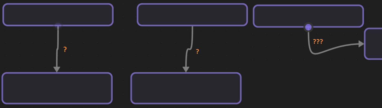
I need this feature, the wacky lines are distracting/confusing.