Steps to reproduce
- Embed a page with consecutive callouts
- Be in Live Preview
- Observe the spacing in between the callouts in the embed
Yes, this is due to the default CSS and I checked in the sandbox with no themes to be absolutely sure.
Expected result
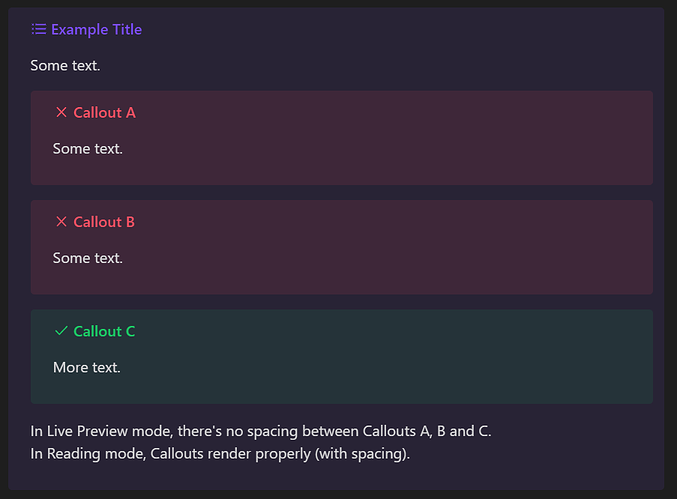
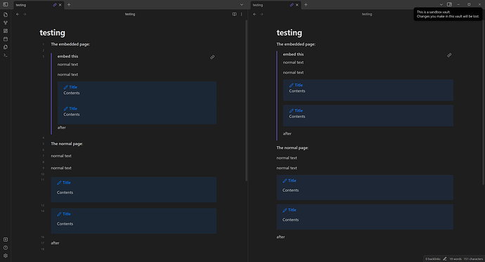
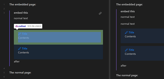
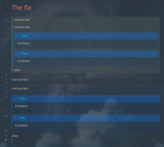
1em spacing in between as seen in reading mode:
(Screenshot done with edited CSS as shown below)
Actual result
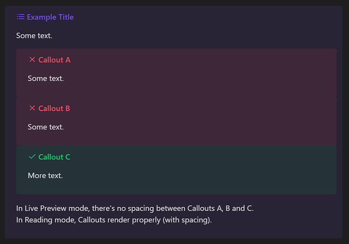
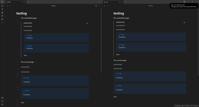
No spacing in between callouts or after:
Environment
SYSTEM INFO:
Obsidian version: v1.3.5
Installer version: v1.3.5
Operating system: #25-Ubuntu SMP PREEMPT_DYNAMIC Fri Jun 16 17:05:07 UTC 2023 6.2.0-25-generic
Login status: not logged in
Insider build toggle: off
Live preview: on
Legacy editor: off
Base theme: dark
Community theme: none
Snippets enabled: 0
Restricted mode: on
RECOMMENDATIONS:
none
Additional information
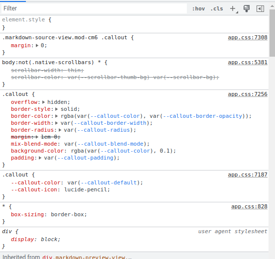
The reason this is happening seems to be the life preview margins of callouts rule leaking into markdown embeds that should be in reading mode. The selector in question is in app.css lines 7308-7310.
.markdown-source-view.mod-cm6 .callout {
  margin: 0;
}
The selector here overrides the default style set on .callout on line 7256 even in the embed that should be in reading mode:
And a screenshot of the callout lacking padding:
Notably, you can see another unrelated possible bug/strange behavior where all paragraph elements inside embeds do not have top margins due to the app.css line 7724-7726. I’m not sure if this is intended so I’m just leaving this here as a related observation of margins in embeds.

The CSS is as follows:
.inline-embed .markdown-embed-content p:first-child {
  margin-top: 0;
}
This might have been intended as:
.markdown-preview-section > div:first-child p {
  margin-top: 0;
}
Alright, tangent over. Going back to the other issue…
To fix the callout spacing issue, the selector could be made more specific so as to target live preview elements only. Here’s the example solution I came up with:
.markdown-source-view.mod-cm6 .cm-callout > div > .callout {
  margin: 0;
}

/* You technically don't need the first part anymore, leading to this: */

.cm-callout > div > .callout {
  margin: 0;
}
*Edit: To fix callouts within callouts, I have edited the code above to have direct descendant selection.
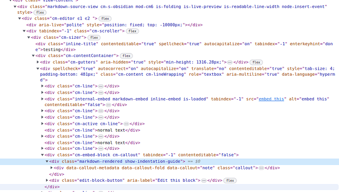
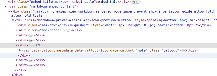
This would use the fact that callouts in life preview have the cm-callout class as a parent while those in embeds do not.
Normal callout:
Callout inside an embed:
Changing the current selector to one of the two versions above fixes the issue:
In case any non-developers come across this and want a fix through adding a CSS snippet, you can fix this with the following:
:root div:not(.cm-callout) > div > .callout {
    margin: 1em 0;
}
*Edit: To fix callouts within callouts but with a snippet, I’ve edited the above code.
The :root is just there to add a bit of specificity.
If your theme changes how reading mode spacing works, this may not fit exactly, but this is about the simplest fix possible.
Here’s a screenshot of using it in my vault:
