Platform
[ ] iOS
[x] Android
Obsidian Mobile version: v1.4.3 (95)
Theme: Minimal & Default
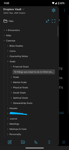
It is really difficult to open files on the mobile version of obsidian when they are close to folders. I don’t know if this is a theme issue, but the spacing in the file panel can make it hard to open the correct file / I often hit the folder making it collapse. Today I was trying to open a file that was the only file in a folder. I collapsed the folder and reopened it many times before I finally fit the file I was trying to open. I feel like there needs to be just a little more space between files and folders to make them easier to hit.

