Normal H1 headings look bold and bold H1 headings look normal. Doesn’t seem to happen on other headings. It makes theming with font weights messy.
Here’s source, live preview and reading view side by side.
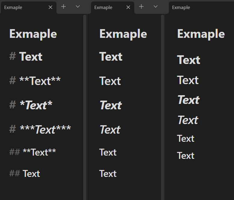
I’m on v0.16.2.
Here’s the markdown:
# Text

# **Text**

# *Text*

# ***Text***

## **Text**

## Text