Use case or problem
Currently, the Search/Graph filters look like this:
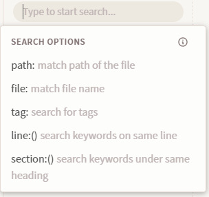
And it outputs text in the search bar that goes like path:"" or tag:# or file: ""
And if you want to exclude files, you gotta add a - there somewhere.
Until now, I still have a hard time remembering if I should put it before the property itself ( -path , -file, etc.) or right before the value (e.g. -filename or -pathA/pathB/pathC), and if I should put it inside or outside quotation marks, if any (file: “-file name” or file: -“file name”) Wait, are those quotation marks even necessary, or can I go without them?
Oh yeah, we don’t even need to indicate the property right? We could type right away -"filename" to exclude a specific file.
Another question: Do I need commas between two different filters?
Anyways, my point is that the current filters can quickly become confusing once you start filtering a lot of stuff. I already have to remember a lot of other text syntax in this app (Markdown, Dataview, etc.) And now I also have to worry about filters. I have ADHD, and this can quickly become too stressful for me.
Proposed solution
Make filtering more intuitive. I’m no expert, so I’m not gonna dictate how it should be done. But here’s how other apps are doing it so you can get an idea:
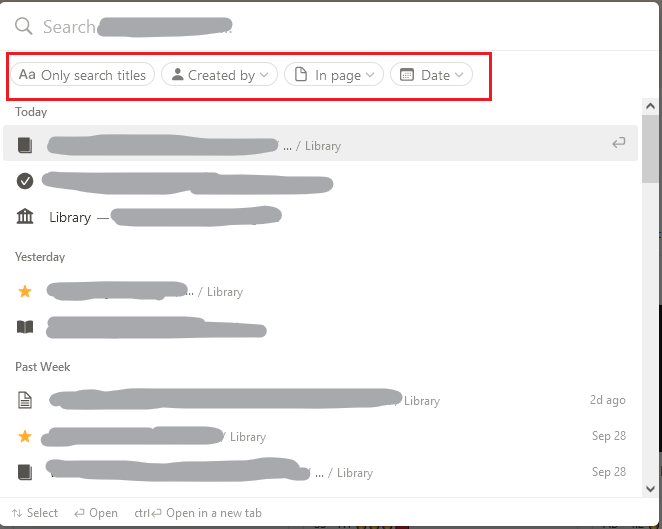
Notion search filters:
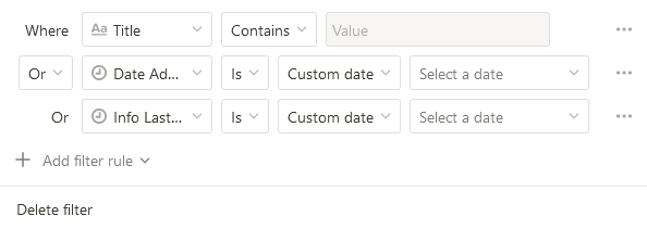
Notion database advance filters:
Google’s Advanced Search
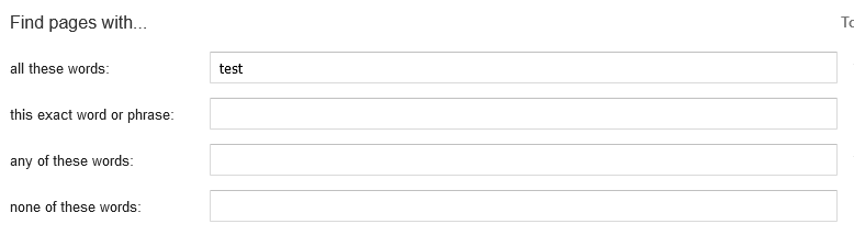
Evernote Filters

(image from Evernote website)
Current workaround (optional)
None