Steps to reproduce
- Open Obsidian on Android (tested on 1.12.7) with default theme and minimal
- Open a Base (
.basefile) that has at least one saved view with a name - Look at the Bases toolbar at the top — the view name dropdown button shows the current view’s name
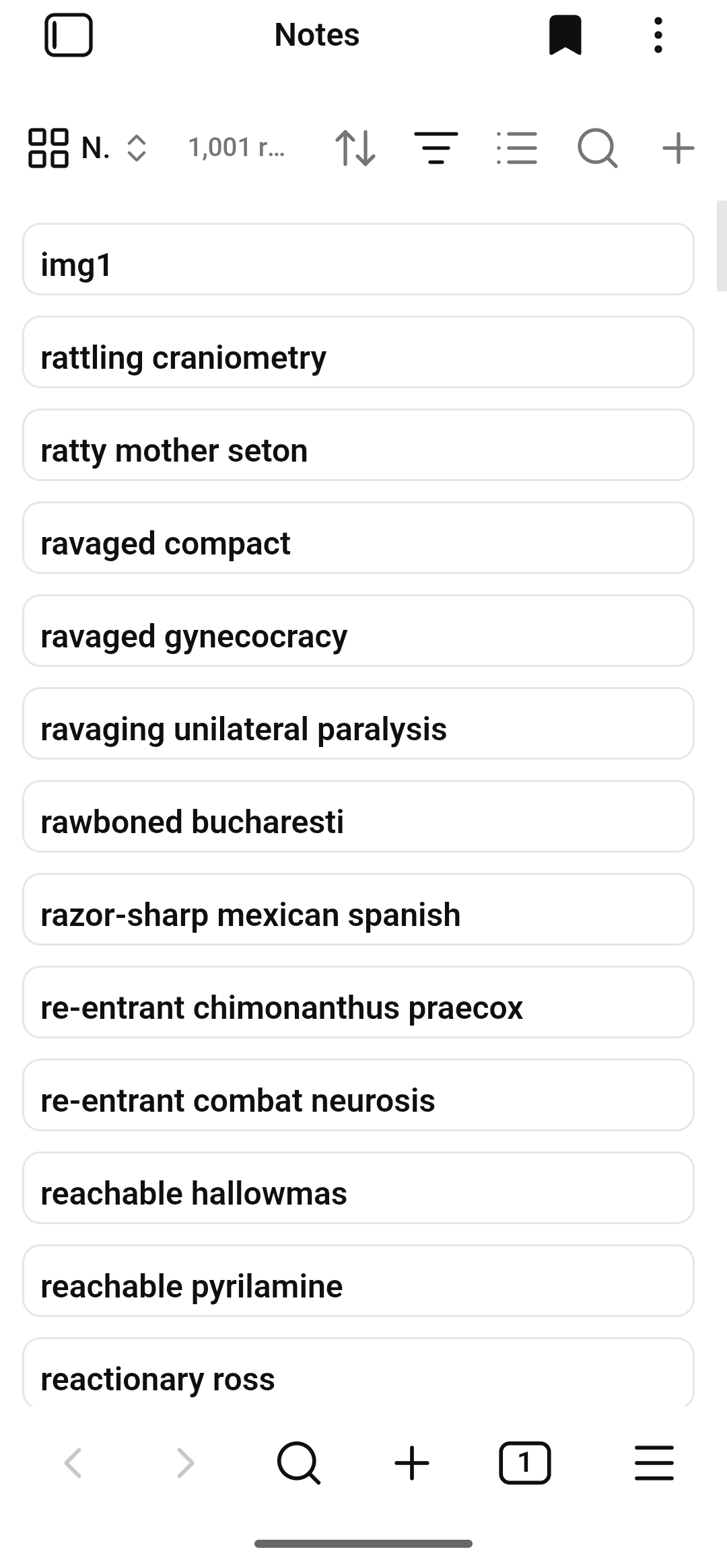
- If the view name is short (e.g. “Notes”), the text still gets cut off / ellipsized to “…” on a phone-width screen
- If the view name is longer (e.g. “Long title”), even more is cut off
Did you follow the troubleshooting guide? Y
Expected result
The view name should be fully visible (or at minimum, not cut to “…” for short names like “Notes”). The toolbar should either:
- Give the view name button enough space to show its full text, or allow the user to scroll the toolbar horizontally to reach the right-side icons (sort, filter, properties, new-item) that get pushed off-screen
Actual result
The view name is truncated to “…” even for short names like “Notes”. The right-side toolbar icons (sort, filter, properties, new-item) are squeezed off-screen and unreachable on narrow phone screens.
Screenshots:
shows the view name being cut off on mobile:
shows the same issue with a longer view name (even more truncated):

Environment
SYSTEM INFO:
Obsidian version: 1.12.7
Installer version: 1.12.7
Operating system: Android 13

REGISTERED COMPONENTS:
- Bases (core plugin, built-in)

COMMUNITY PLUGINS:
- Minimal Theme Settings (for Minimal theme by @kepano)
Additional information
Root cause (found in decompiled APK)
I decompiled the Obsidian Android APK (Obsidian-1.12.7.apk) and traced the issue in assets/public/app.css and assets/public/app.js.
The Bases view name button has this DOM structure:
.bases-toolbar
  └── .bases-toolbar-item.bases-toolbar-views-menu   ← overflow: hidden  (CLIPS)
        └── .text-icon-button                        ← overflow: hidden  (CLIPS)
              ├── .text-button-icon                  (view type icon)
              ├── .text-button-label                 ← overflow: hidden + text-overflow: ellipsis  (ELLIPSIZES)
              └── .mod-aux                           (chevron icon)
Three nested elements all have overflow: hidden, and the label has text-overflow: ellipsis. On mobile, the toolbar (width: 100%, display: flex) has limited space. The right-side icon buttons (sort, filter, properties, new-item) and the result-count (“12 results”) compete for space. The views-menu gets squeezed, and the label gets ellipsized to “…” even for short names like “Notes”.
The relevant CSS rules in app.css:
.text-icon-button {
  overflow: hidden;  /* CLIPS */
}
.text-icon-button .text-button-label {
  overflow: hidden;
  text-overflow: ellipsis;  /* ELLIPSIZES */
}
.bases-toolbar .bases-toolbar-item.bases-toolbar-views-menu {
  overflow: hidden;  /* CLIPS */
  display: flex;
}
On a ~360px-wide phone screen, the toolbar layout is approximately:
[view-name-button] [result-count] [sort] [filter] [properties] [new-item]
     ← squeezed →     ← shrinks →    ← icons, fixed width →
The view-name button gets squeezed to almost nothing, and the label becomes “…”.
CSS workaround
Tested on Android with both the default Obsidian theme and the Minimal theme. Makes the toolbar horizontally scrollable and shows the full view name.
/* --- 1. The toolbar: horizontally scrollable, no wrap, hidden scrollbar --- */
.is-mobile .bases-toolbar {
  overflow-x: auto !important;
  overflow-y: hidden !important;
  flex-wrap: nowrap !important;
  -webkit-overflow-scrolling: touch !important;
  scrollbar-width: none !important;           /* Firefox */
  -ms-overflow-style: none !important;        /* IE/Edge */
  scroll-behavior: smooth !important;
}

.is-mobile .bases-toolbar::-webkit-scrollbar {
  display: none !important;
}

/* --- 2. All toolbar items: keep natural width, don't shrink --- */
.is-mobile .bases-toolbar .bases-toolbar-item {
  flex-shrink: 0 !important;
  overflow: visible !important;
  min-width: 0 !important;
}

/* --- 3. The views-menu container: stop clipping --- */
.is-mobile .bases-toolbar .bases-toolbar-item.bases-toolbar-views-menu {
  overflow: visible !important;
}

/* --- 4. The button inside: stop clipping --- */
.is-mobile .bases-toolbar .bases-toolbar-item.bases-toolbar-views-menu .text-icon-button {
  overflow: visible !important;
  max-width: none !important;
}

/* --- 5. The label text: show full name, no ellipsis --- */
.is-mobile .bases-toolbar .bases-toolbar-item.bases-toolbar-views-menu .text-button-label {
  overflow: visible !important;
  text-overflow: clip !important;
  white-space: nowrap !important;
  max-width: none !important;
  font-size: var(--font-ui-smaller) !important;
  letter-spacing: -0.01em !important;
}

/* --- 6. Result-count: remove auto margin so items flow consecutively --- */
.is-mobile .bases-toolbar .bases-toolbar-item.bases-toolbar-result-count {
  margin-inline-end: 0 !important;
  flex-shrink: 0 !important;
  overflow: hidden !important;
  text-overflow: ellipsis !important;
  white-space: nowrap !important;
  max-width: 30vw !important;
}

/* --- 7. Phone-specific: tighter spacing --- */
.is-phone .bases-toolbar .bases-toolbar-item.bases-toolbar-views-menu .text-button-label {
  font-size: var(--font-ui-smallest) !important;
  letter-spacing: -0.02em !important;
  padding-inline-end: var(--size-2-1) !important;
}

.is-phone .bases-toolbar .bases-toolbar-item.bases-toolbar-views-menu .text-icon-button {
  padding: var(--size-2-1) !important;
  gap: var(--size-2-1) !important;
}

/* --- 8. Subtle edge fade to indicate scrollability --- */
.is-mobile .bases-toolbar {
  -webkit-mask-image: linear-gradient(to right, transparent 0, black 8px, black calc(100% - 8px), transparent 100%) !important;
  mask-image: linear-gradient(to right, transparent 0, black 8px, black calc(100% - 8px), transparent 100%) !important;
}

/* --- 9. Optional: hide result-count on very narrow phone screens --- */

/*
.is-phone .bases-toolbar .bases-toolbar-item.bases-toolbar-result-count {
  display: none !important;
}
*/
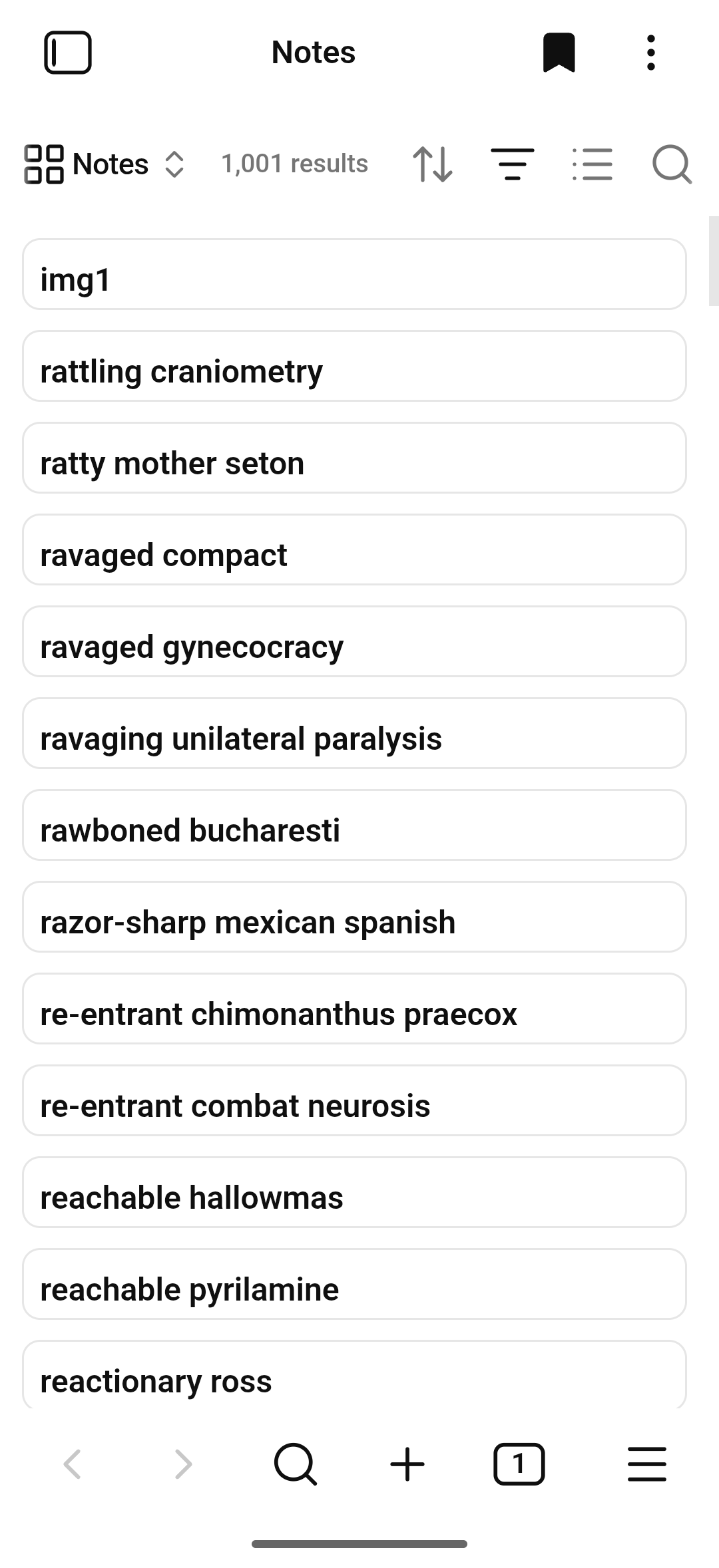
Screenshots of the fix:
shows the view name fully visible after applying the CSS:
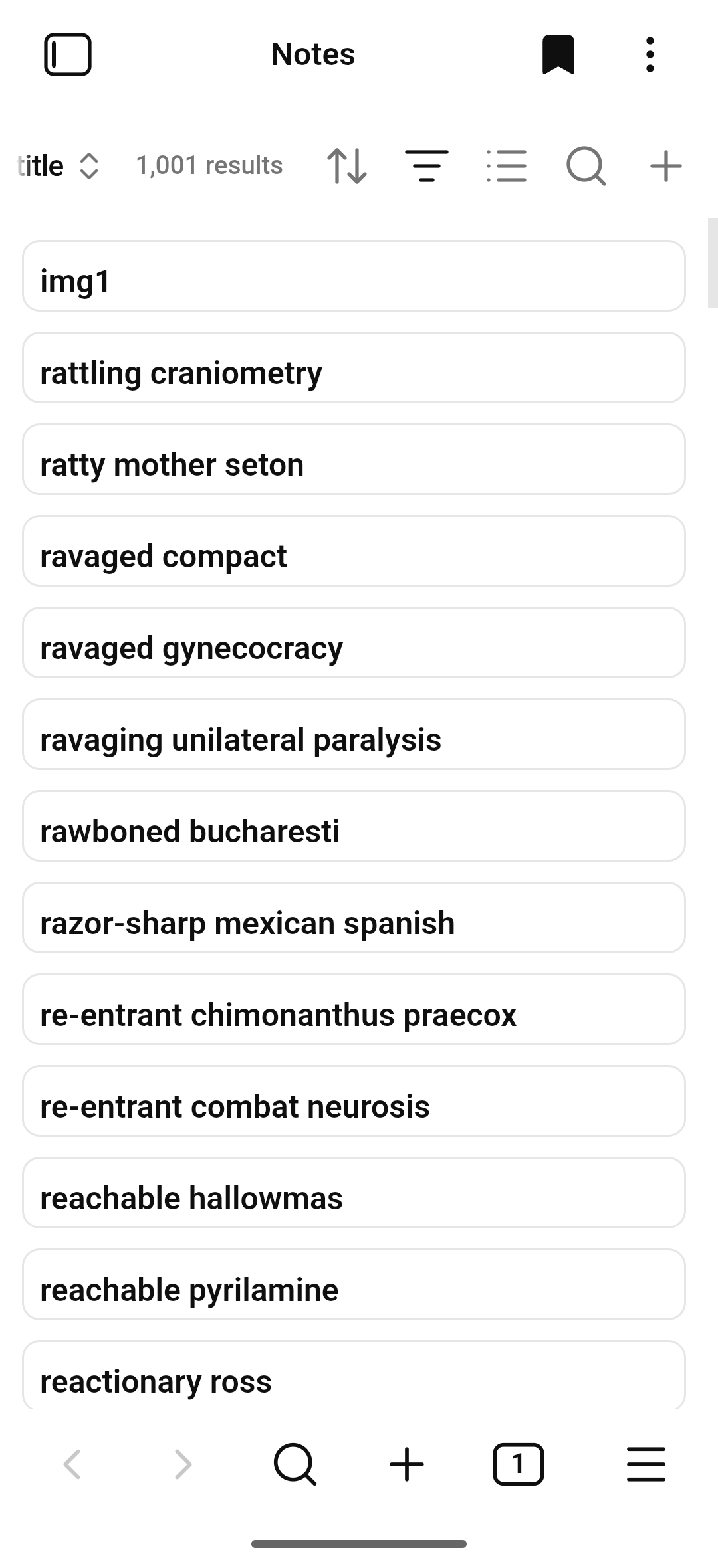
shows the same fix with a longer view name:

shows the scrollbar behavior (swiping left reveals the right-side icons):
The fix was tested on Android only, with both the default Obsidian theme and the Minimal theme. Desktop is unaffected (the .is-mobile / .is-phone selectors don’t apply).