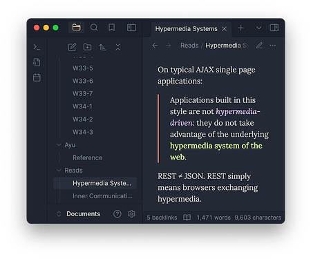
Ayu Light & Mirage: my favourite colours on the best editor

Obsidian surprised me after years.

It has grown significantly since my last visit. It looks sleek, and even the logo is triple-A. Daily Notes works perfectly and fully supported as one of the core plugins. And the Preview mode :face_holding_back_tears: is a game-changer.

I am so ready to move to Obsidian.

Still, I was missing one thing: the colours. The default theme mauves fine. The community themes are juicy. But what I want is the colours, the only, true colours. I was missing Ayu.

Well, in the middle, I recalled that there is Ayu and Ayu Mirage themes. I remember I tried it years ago. It’s legacy now and was calling for a renewal. It was time for Ayu Light & Mirage

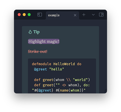
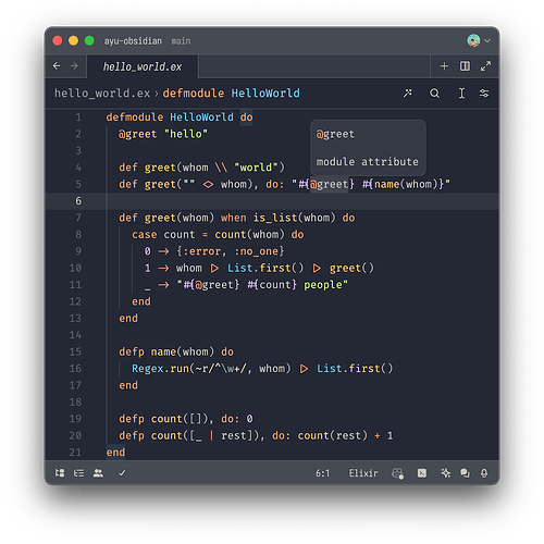
This is what Ayu Mirage usually looks like on code editors. I’ve been using it across all code editors I stumbled upon.

Compared to the monochrome document editors, code editors are much more vibrant to add semantics to dense code.

How do I apply all these colours in Obsidian?

I took inspirations from some other popular themes.
Screenshot 2024-08-03 at 16.31.29

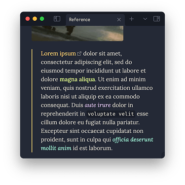
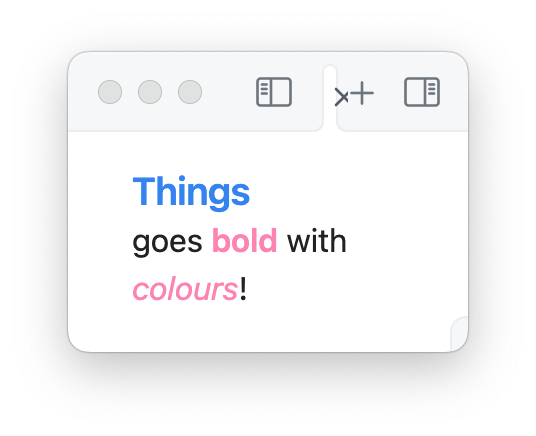
Things theme was my go-to back then, not just because I was using Thing 3, but for its sensible application of vibrant colours. They are more than making things chromatic. They are semantic and practical. They just make sense.

Styles

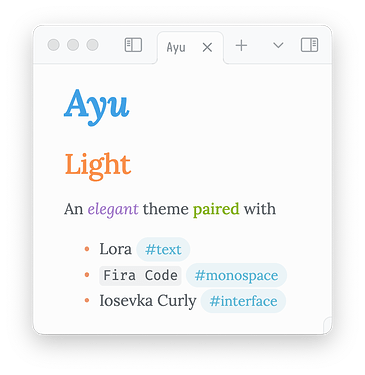
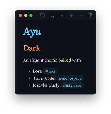
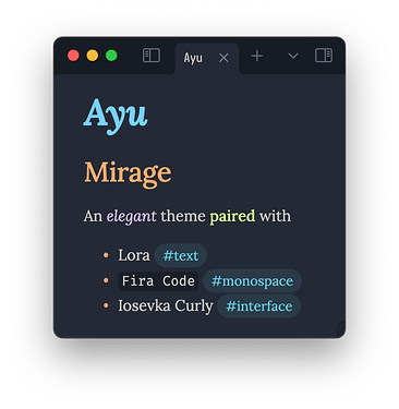
Title is special because there’s only one per page. I made it stand out by size and colour, different from headings. The royal blue also matches the original semantics of entity perfectly because a title represents a file, an object in the system.

Oh, do you like serifs? I picked up Lora typeface from Substack. It’s beautiful already, but its italic is just top-notch.

Heading 1 is by far the most frequent in Markdown. Sometimes it replaces the title because “title” is not a part of content. In code, keywords takes the same place in which are orange.

For body emphasis, I applied the colours for hard-coded data such as numbers, strings, and its variants like regex.

I didn’t intend this initially. But naturally, colours have developed a guideline itself.

  • indicators: warm colours
  • content: cool colours

The bullets in salmon clarify what I mean. The colour is for operators in code. It fits the size and position of small bullets as indicators.

Headings

Then, headings became a headache. There are 6 of them, and they don’t have a clearly defined semantics! There had to be a general yet clear styles for them. I was running out of warm colours and I didn’t want to make my users hit # six times just to make them smaller.
Screenshot 2024-08-03 at 17.40.58

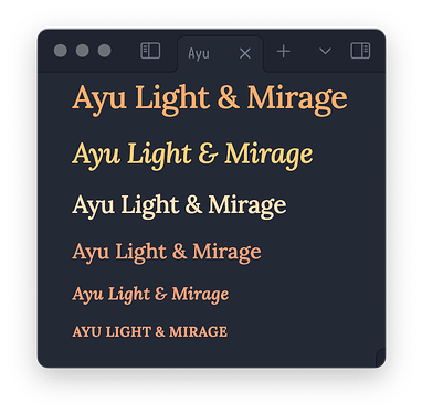
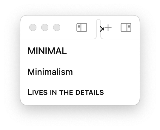
Clue was in the Minimal Theme. It has fairly small headings and when they are about to hit below 1em. It utilises small caps. Contrast in size could distinguish the headings.

Unfortunately, small caps in Lora don’t do justice. Instead, I uppercased them all with 0.8em and matched the colours to the bullets.

And the rest was a breeze :relieved: thanks to the CSS variables Obsidian has offered. Of course, you have all of the triplet in theme.css

Thanks for reading! Enjoy and let me know if you want any change. Visit the GitHub page for further information.
5 Likes

I just want to say this is such a fun showcase post. Great work with the images! I like this a lot more than the Ayu Mirage theme that’s been up for 4 years :yellow_heart:

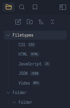
My one suggestion would be to tweak the contrast of labels in the file explorer and similar tabs. The skinny, compact letters in Iosevka Curly need a bit more support to pop out against the background without any eye strain when you’re scanning up & down for a file.

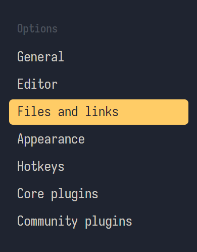
It looks great in the settings menu, where you’ve used white text, plus a colored background with inverted letters to signify selections.

Settings

Even just letter-spacing: 0.5px makes a nice difference with this font, but you should trust your own taste on that o/

1 Like

Thanks!

Iosevka was bugging me too. I’ve replaced it with Inter.

Colour has got a bit brighter as well. I hope you find it more legible!

1 Like

That really brings it home, yeah! I’m using this theme in one of my vaults now. It’s like a warmer Catppuccin with more interesting typefaces.

Thanks for taking the time to create this :3

1 Like

The colors look really great and I like the italic headings in “Lora”.

How about making it into this? AnuPpuccin/snippets/extended-colorschemes.css at main · AnubisNekhet/AnuPpuccin · GitHub So not as another theme but as a color-scheme for AnuPpucin?

Thanks for the suggestion!
I was thinking the opposite: adopting what AnuPpuccin and other themes as I go.
What do you like the most about AnuPpuccin? What would you miss without it?

I think there is really a lot of work to implement a full theme like AnuPpuccin or Minimal. And you have to deliver updates, compatibility/support with a few plugins and so on.

And I :innocent: would be happy with the colors only.

What I use from AnuPpuccin: rainbow folders, callouts and the general layout.

1 Like

This is my favorite theme at the moment, and I have tried them all. I do miss Iosevka as default, but I added it manually. I really like Victor Mono font for the text, it has an amazing design in Italics. Thank you for creating it!

1 Like

Thanks for the kind words!

I’m happy to share the work I started for myself.

Iosevka and Victor Mono are my favourite types too. You have a good taste. :wink: Font choice can be 100% flexible on Obsidian and that’s the beauty of it.

After @Heimdum’s suggestion, I’m thinking what to add next. If there’s any feature you want, let me know.

1 Like

love this theme the colors always amaze me mo matter how many times i saw them.
the one thing i was really missing, i recently added with the plugin file color: colored folder names (in the left sidebar).
and before that i really loved Anuppucin too but now i find myself using this theme most of the time.
thank you a lot creator :pray:

1 Like

Regarding your question about Anuppucin, I believe its standout feature is the high degree of customizability. This flexibility allowed for various modifications, such as implementing a card layout or setting a background image. Although the background image feature was removed at some point, it could still be enabled through a CSS snippet and the Style Settings Plugin.

One of the aspects I particularly appreciated was the rainbow folder colors in combination with the card layout. Additionally, the ability to choose the size of the headings and the spacing between headings and subsequent paragraphs was highly valuable. These customization options significantly enhanced the user experience and allowed for a personalized interface.

1 Like