Hi everyone,
I’m looking to achieve a card-style workspace layout , similar to what’s shown in the AnuPpuccin theme screenshots.
At the moment, I’m using:
I’d prefer to stick with the Minimal theme rather than switching to AnuPpuccin.
Does anyone know which CSS snippet I can use to recreate this layout?
Thanks in advance!
It might need a bit of tweaking, but you could try the snippet here:
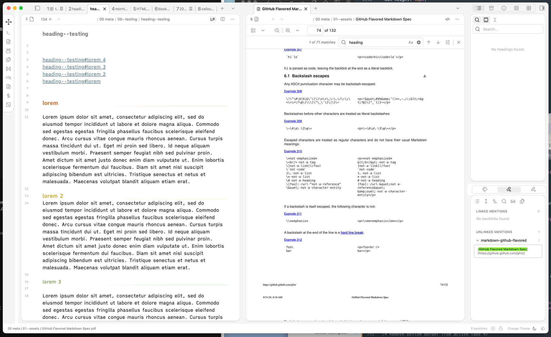
I like AnuPpuccin’s card layout, but I’m using minimal theme, so I use AI to extract it, however, I am not satisfied with the tab style:
Now:
[image]
Need to be(neglect text color):
[image]
How can I modify below code?
/*===============================================================
Card Layout Snippet
----------
Based on AnuPpuccin theme for Obsidian
This snippet is extracted from AnuPpuccin theme and allows you to
use the …
It looks more-or-less alright in Minimal:
Claude Code helped me test the Minimal Theme Table Classes in AnuPpuccin the other day, I also prefer the Minimal Theme but like some of the styles in AnuPpuccin. Worth harnessing the power of AI to create some CSS snippets
Thank you very much for the reference.
I created a minimal, cleaned-up version. Everything looks fine, except for the line on the active tab, it’s the same issue described in the original post. I also tried resolving it with AI, but without success.
If you have any suggestions on how to fix this, I’d really appreciate your input.
`css
body {
    --card-background-color: var(--background-secondary);
    --card-foreground-color: var(--background-primary);
    --file-header-border: var(--border-width) dashed var(--background-modifier-border);
}

body .mod-left-split .workspace-tabs .workspace-leaf,
body .mod-right-split .workspace-tabs .workspace-leaf,
body .mod-left-split,
body .mod-vertical .workspace-tab-container,
body .workspace-split.mod-vertical,
body .mod-root .workspace-tabs .workspace-leaf {
    background-color: var(--tab-container-background);
}

body .mod-vertical .workspace-tabs .workspace-tab-header-container {
    padding-left: 20px;
}

body .mod-left-split .workspace-tab-container,
body .mod-right-split .workspace-tab-container {
    padding-left: 10px;
    padding-right: 10px;
    background-color: var(--tab-container-background);
}

body .workspace-split .workspace-leaf-content:not([data-type=file-explorer]) {
    background-color: var(--card-foreground-color);
    border: 1px solid var(--tab-outline-color);
}

body .mod-vertical .workspace-tabs {
    padding-left: 10px;
    padding-right: 10px;
}

body .workspace-split .workspace-leaf-content:not([data-type=file-explorer]),
body .workspace-leaf-content[data-type=file-explorer] {
    border-radius: 16px;
    margin-bottom: 10px;
    /*border-top: none !important;*/
}

body .workspace-tabs.mod-top .workspace-tab-header.is-active {
    border: 1px solid var(--tab-outline-color, var(--background-modifier-border));
    border-bottom-color: transparent;
    margin-bottom: -1px;
    position: relative;
    z-index: 2;
}

body .workspace-tabs.mod-top .workspace-tab-header .workspace-tab-header-inner::after {
    display: none !important;
    content: none !important;
}

body .workspace-tab-header.is-active {
    font-weight: 600 !important;
}
1 Like