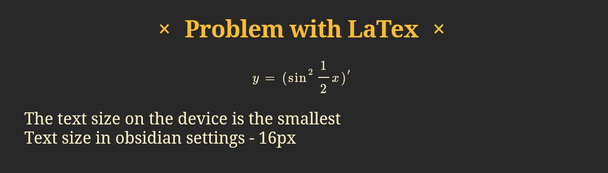
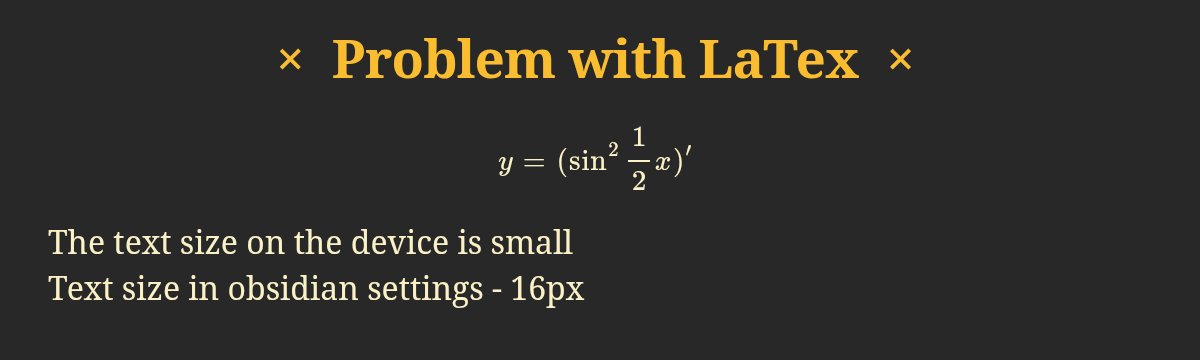
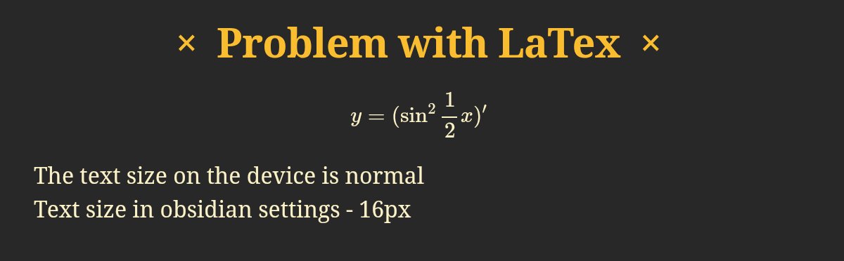
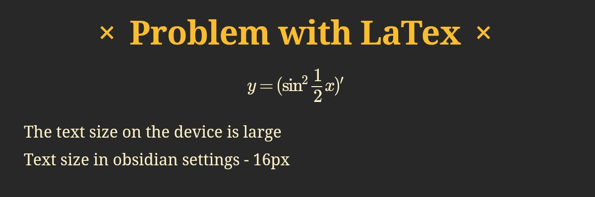
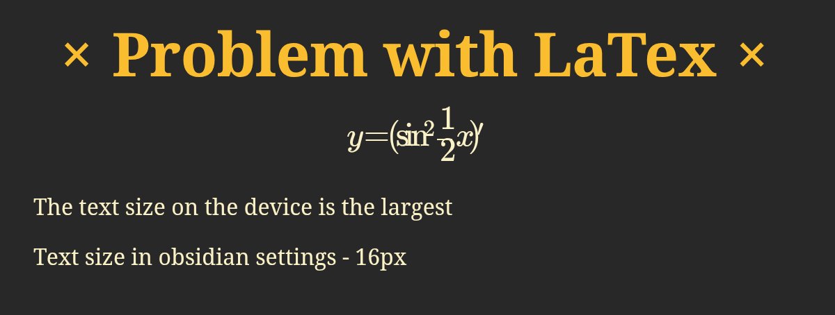
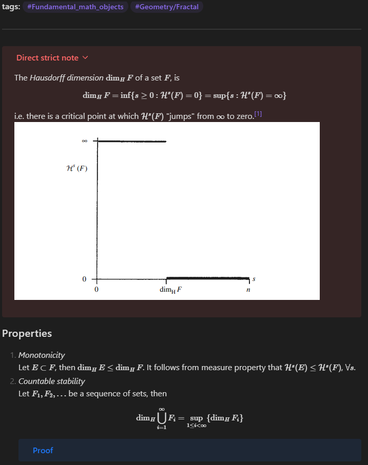
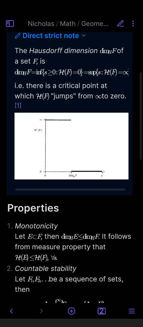
Tested on 5 different Android devices, the error is repeated everywhere (in safe mode without themes and snippets too)
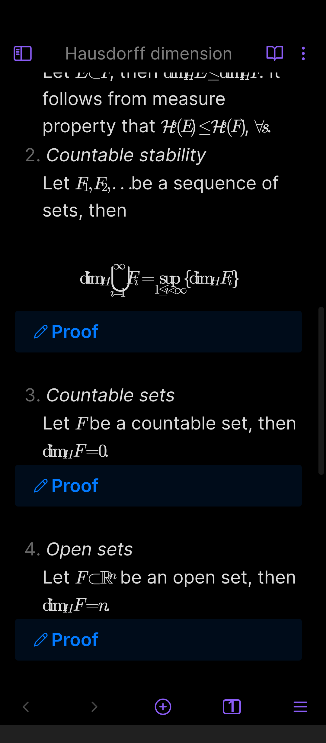
When changing the system font size, formulas look broken/corrupted
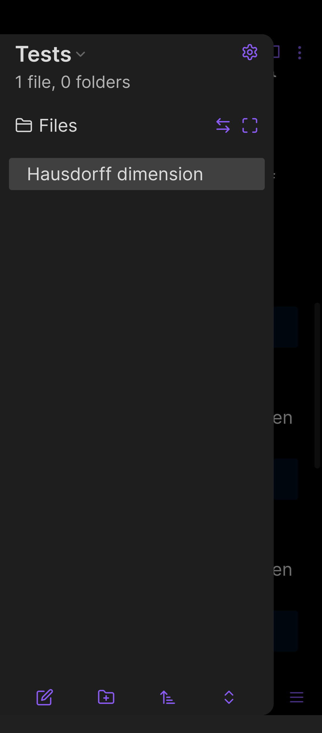
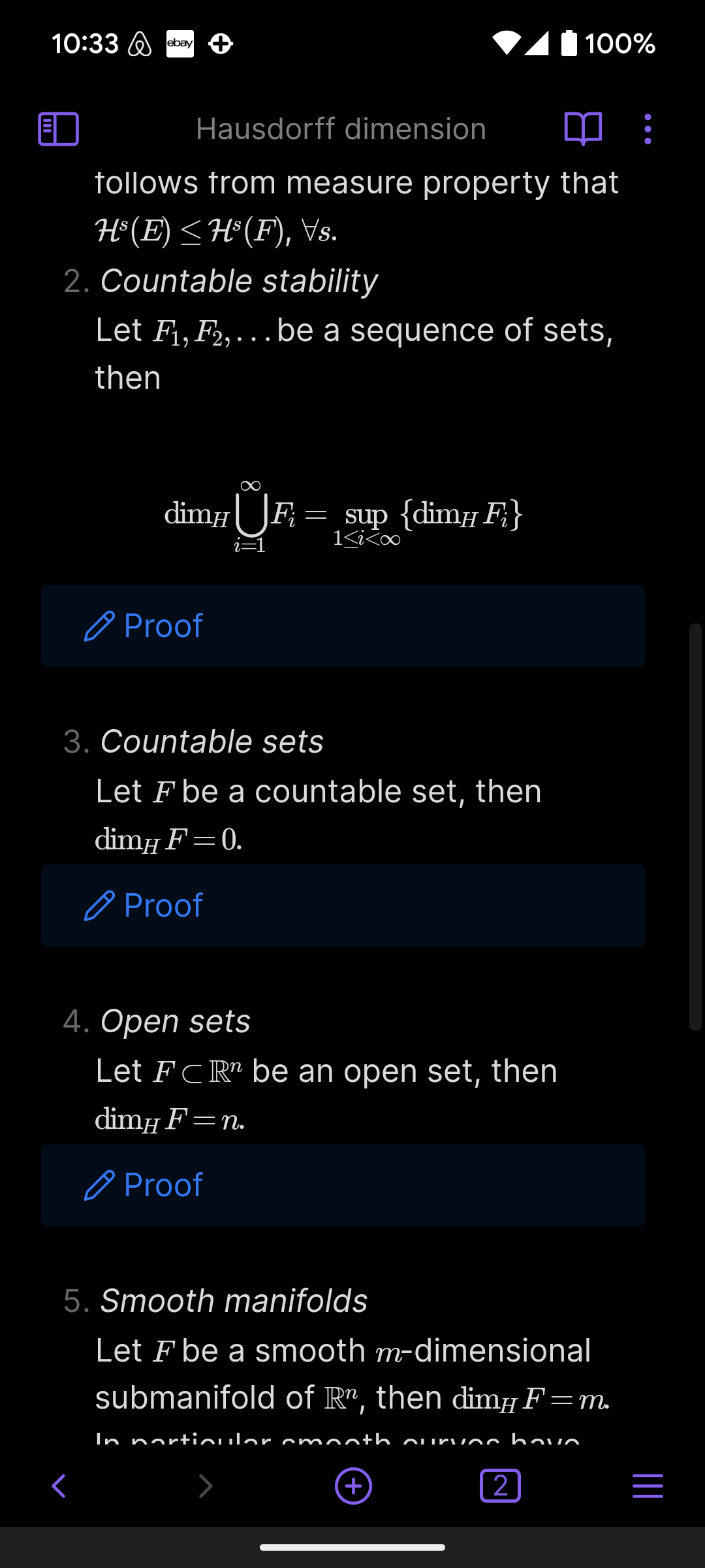
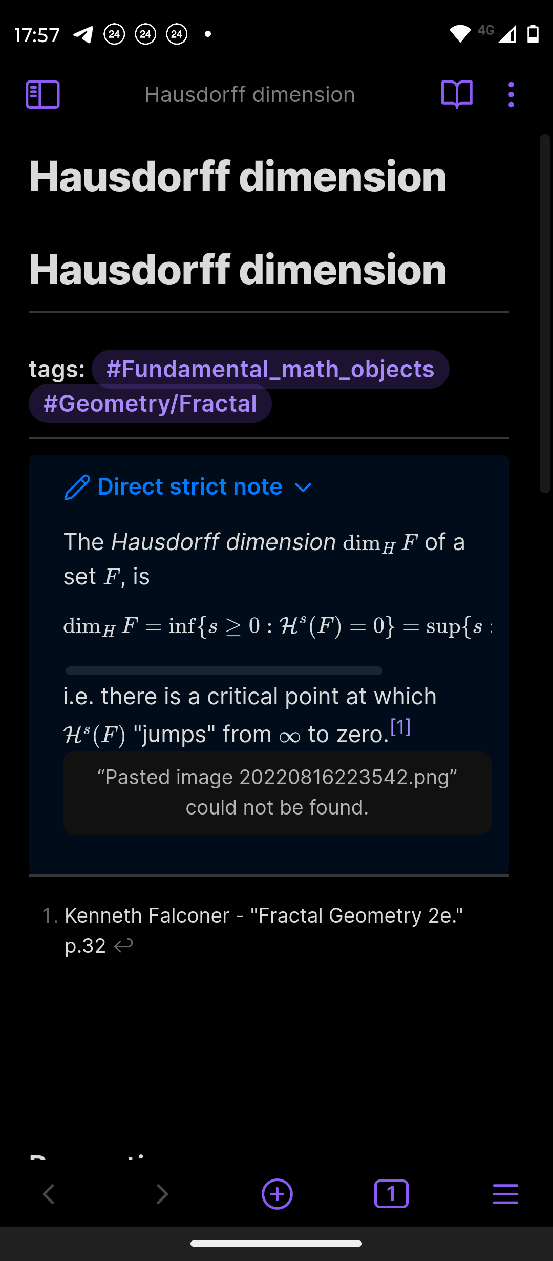
Below are the pictures of the problem:
I ran into this while debugging the same thing on a Honor tablet (HEY4-W09, Android 16, WebView 151.0.7922.199), and I can confirm your finding and the mechanism behind it.
Cause
The Android system font size is handed to WebView as textZoom. That scales the rendered glyph size but does not scale CSS em lengths. MathJax’s CHTML output lays the whole formula out in em — character advance, sub/superscript offsets, fraction gaps — so every glyph gets drawn ~1.45× larger than the box MathJax reserved for it, and glyphs end up colliding with their neighbours and with sub/superscripts.
Measurements taken from the device with system font scale = 1.45:
| measurement | value |
|---|---|
element with font-size: 20px → computed font size |
29px (= 20 × 1.45) |
that same element’s 10em width |
200px (so 1em is still 20px) |
| width MathJax reserved for one glyph | 12.99px |
| width that glyph actually needs | 19.99px |
Obsidian body — --font-text-size vs computed |
18px vs 26.1px |
The last two rows are the whole bug: layout advance says one thing, glyph drawing says another.
What does not work
-webkit-text-size-adjust: none / 100% / auto, including on :root — measured, no effect whatsoever. textZoom is a WebView-level setting and CSS cannot reach it.letter-spacing workarounds — this is not a spacing problem; glyph advance and layout advance disagree, so no fixed letter-spacing can repair it.tex-chtml-full.js, so users have no way to select SVG.Workaround
Set the system font size back to the default (font scale 1.0). That shrinks text system-wide, so if you want to keep the large size inside Obsidian only, add this CSS snippet:
/* mobile only — desktop has no .is-tablet */
html:has(body.is-tablet) {
  font-size: 26px !important;
}
body.is-tablet {
  --font-text-size: 26px !important;
}
Obsidian adds .is-tablet / .is-phone to body, so desktop stays untouched. 26px is the equivalent of the old 18px × 1.45. Both rules are needed, because Obsidian writes the root font-size and the --font-text-size variable as inline styles — !important is what lets the snippet win.
Verified on the device: formulas render correctly afterwards and the text size on screen stays the same.
Same root cause, reported before
Your five-device test fits this picture: the devices that look fine are simply at font scale 1.0.
Ultimately this is an Obsidian bug — the app could set textZoom to 100 for its WebView, or compensate for it, which is the only real fix. Every workaround above costs the user their system-wide font-size preference.
Type any math formula with upper or lower indices, or fractions etc.
Something like this
I can’t reproduce. Your whole UI looks weird and zoomed.
Attach a copy of the file that you are using.
Hausdorff dimension.md (1.4 KB)
I can’t reproduce this on my phone.
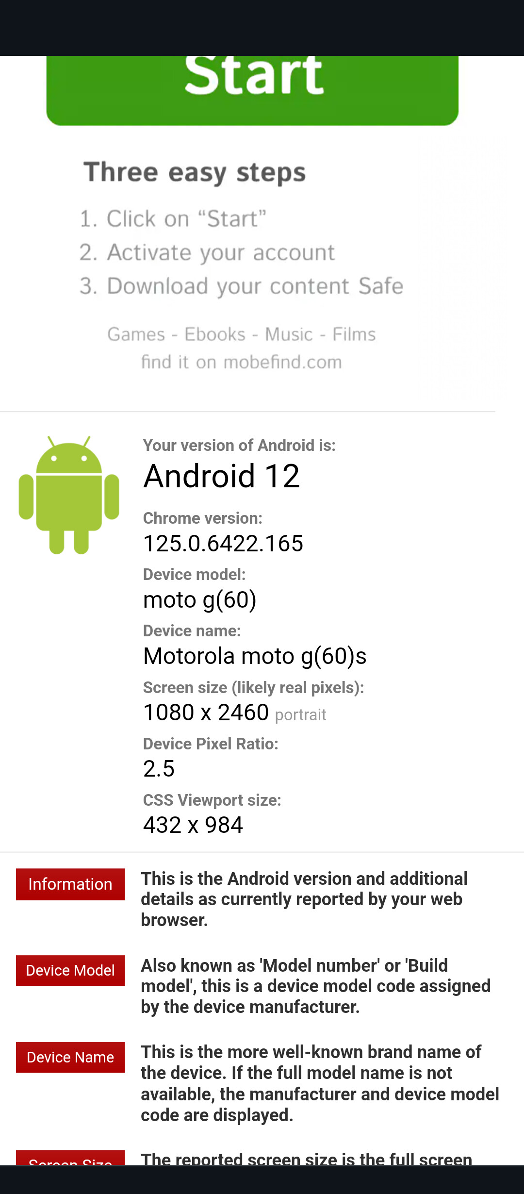
what is your android/chrome webkit version?
did you try a new vault with just the note you sent me?
Do you have some zoom on your UI?
For me, it’s seems that all symbols have negative space after them.
Also, the ui size do not affect the render, only the font size screws everything up
Please, let me know if you still have this problem with 1.14.2+. I can’t reproduce it anymore.