From your CSS, .markdown-preview-view is for targeting reading mode (yeah, it’s confusing). For general targeting of Source + Live-Preview you want to be using .markdown-source-view or .markdown-source-view.mod-cm6 (see linked examples).
I’ve played around with using different shapes before in nested lists (think they look neat), but end up turning off the snippet after a while because I hit an edge case and things start looking strange. I don’t know exactly what is going on, but the bullets (or shapes) seem to be drawn on the fly. I do know that different themes, spaces instead of tabs, scrolling too fast, etc, will distort them. Default bullets for me.
As holroy said, it’s quite convoluted. In addition to their thread (above), I’ve looked at these two quite a few times:
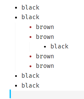
This sort of works (with just a little distortion ![]() ):
):
ul>li> .list-bullet::after, .cm-list-1 .list-bullet::after {
  background-color: black;
}
ul>li> ul>li> .list-bullet::after, .cm-list-2 .list-bullet::after {
  background-color: brown;
}
ul>li> ul>li> ul>li> .list-bullet::after, .cm-list-3 .list-bullet::after {
  background-color: black;
}

EDIT: the odd shape, in this case, is caused by the font. I tried on a different machine with a different font, and the bullet circles are all the same shape.