I make heavy use of callouts. Sometimes I just want to display some info that stands out a little more than simply bold/highlight, so I use a callout with a title only, example:
> [!info] Something Important!
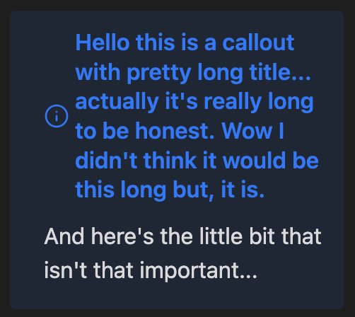
But sometimes the text is rather long, and it displays the icon aligned vertically in the middle:
I was just wondering if anyone knows of a way to adjust this using CSS so the icon is positioned at the top?
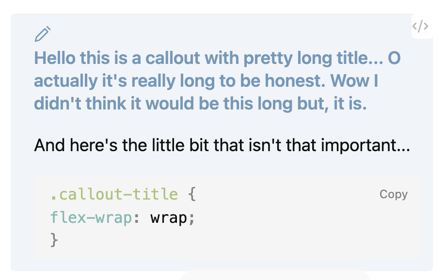
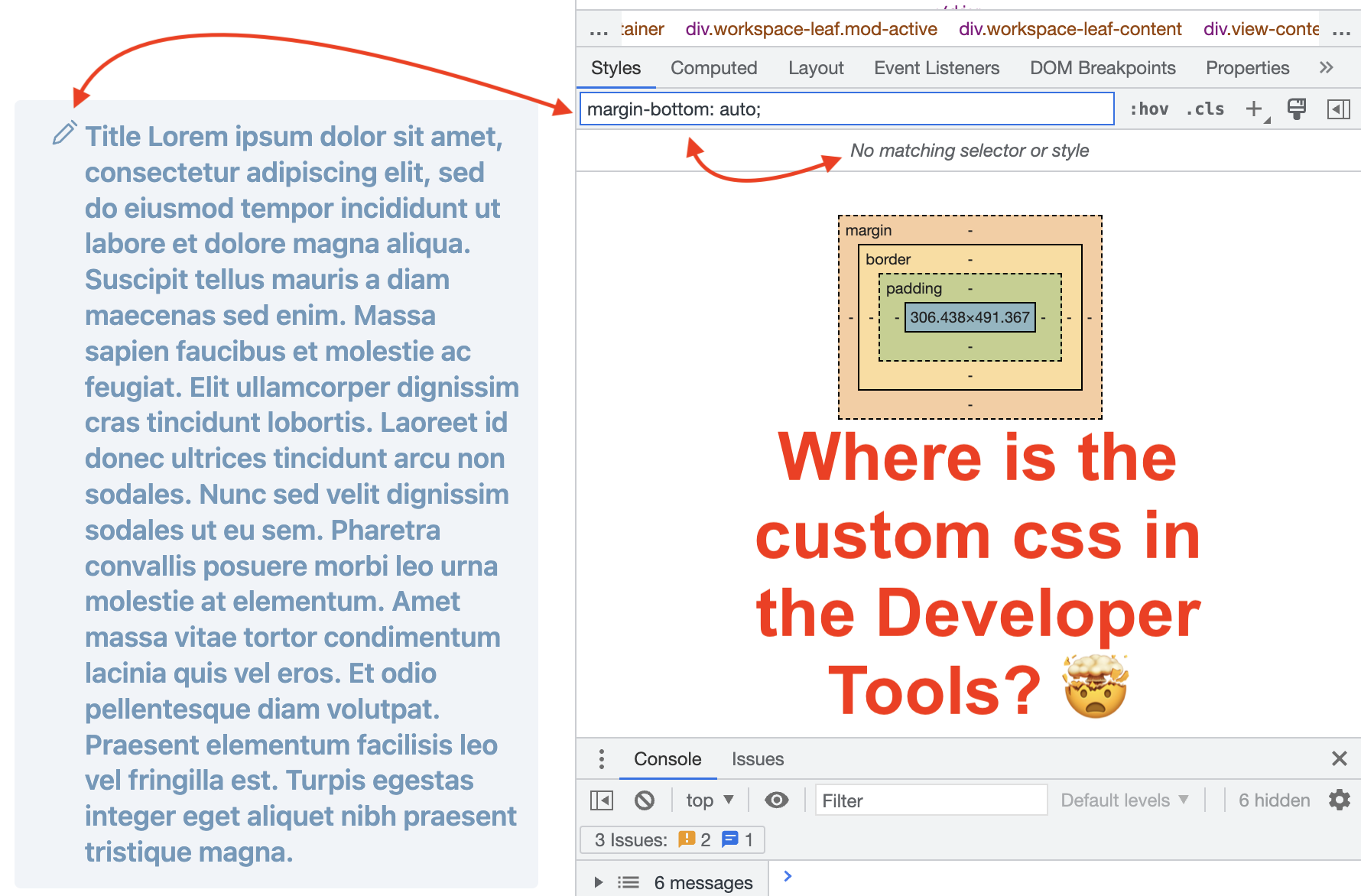
It works if I add it as custom css. But if I open the Developer Tools and search for margin-bottom: auto; or select the callout icon to give it focus, it can’t even find that text / rule to be able to see the wizardry in action. Scratches head until
You most likely selected the svg not .callout-icon. If you select the svg you can see the parent selector right above it and click on it.
Then you can see the styles for that selector:
Thanks. I thought the selector tool picked up the whole element and loaded all the related style info in the styles pane. I can get to it following the advice given and clicking in the doctype pane indicated by the red arrow in your screenshot. I live and learn … but too darn slowly.
Don’t we all
I’ve never been in contact with a developer console or css before starting to use Obsidian a few months ago. As soon as the css gets too complex I’m completely lost and I’m not sure I should invest the time to learn the intricacies, I’m already fiddling way too much with the looks of Obsidian instead of actually writing notes Then again, it’s so much fun…