hmm, you’re right… on the dark theme, the footnote accent is a bit too subtle (it’s ok on the light theme though).
To avoid issues when switching between light and dark modes, I think it’s better to introduce a new variable for the text color of search results, so I’ve just pushed a small update on Github for that (v202008071640) : https://github.com/cannibalox/Obsdn-dark-rmx/releases/tag/v202008071640
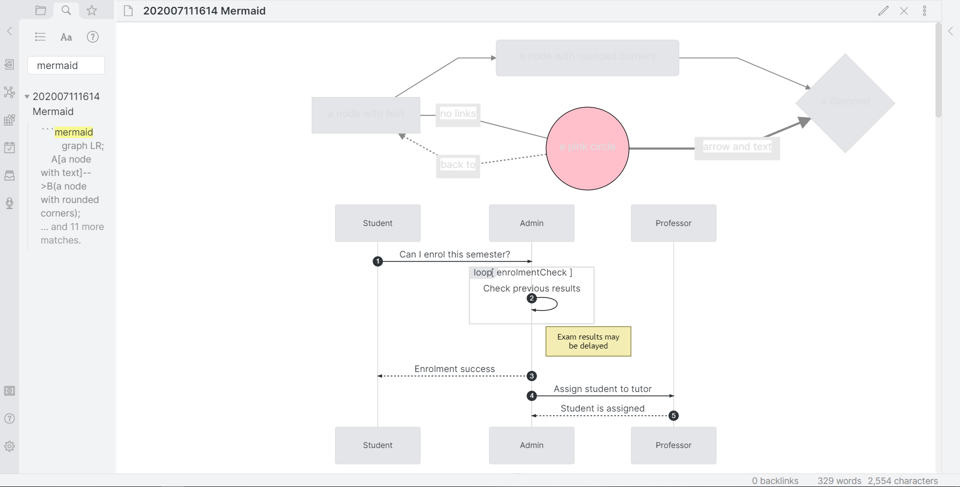
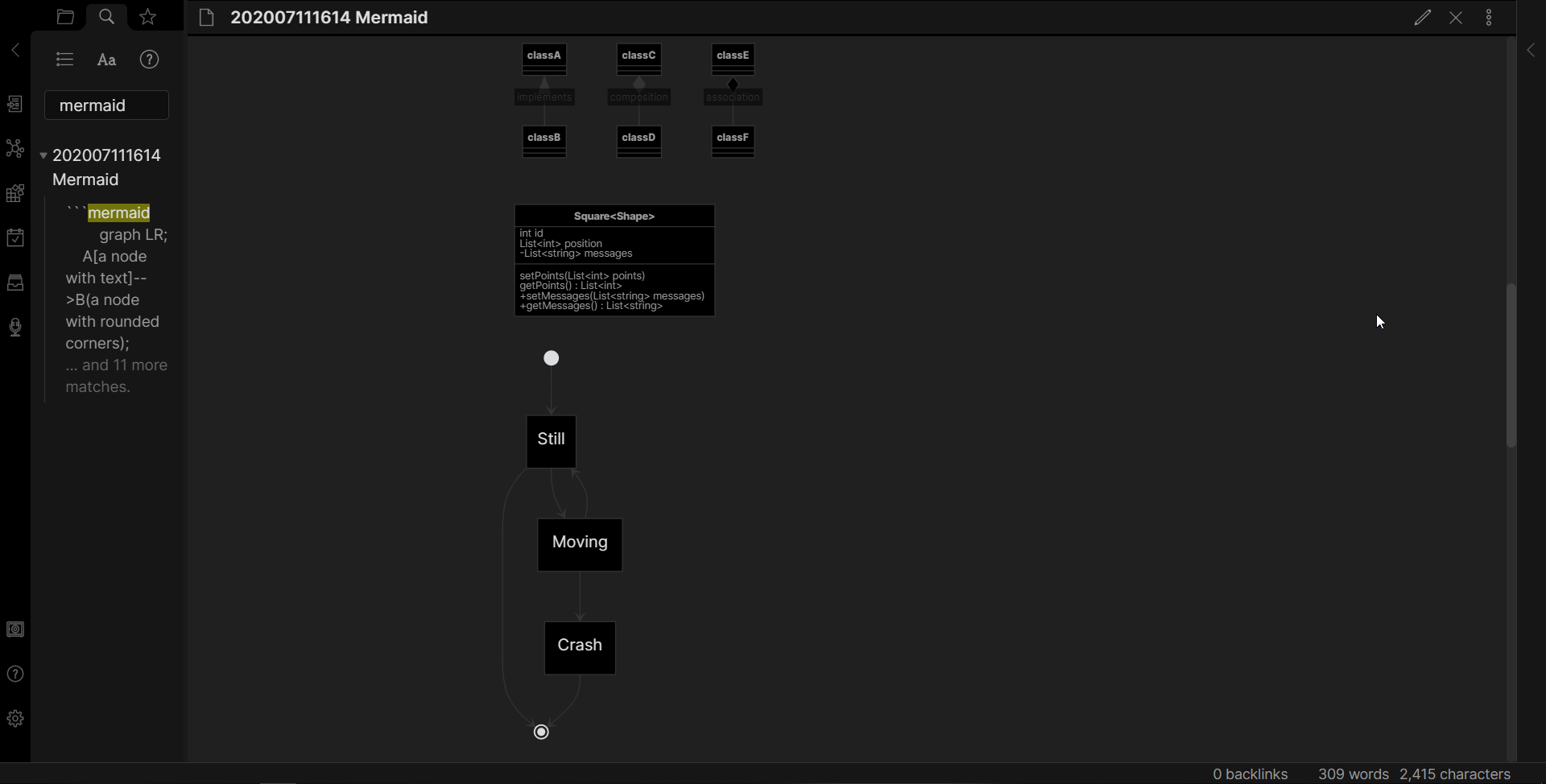
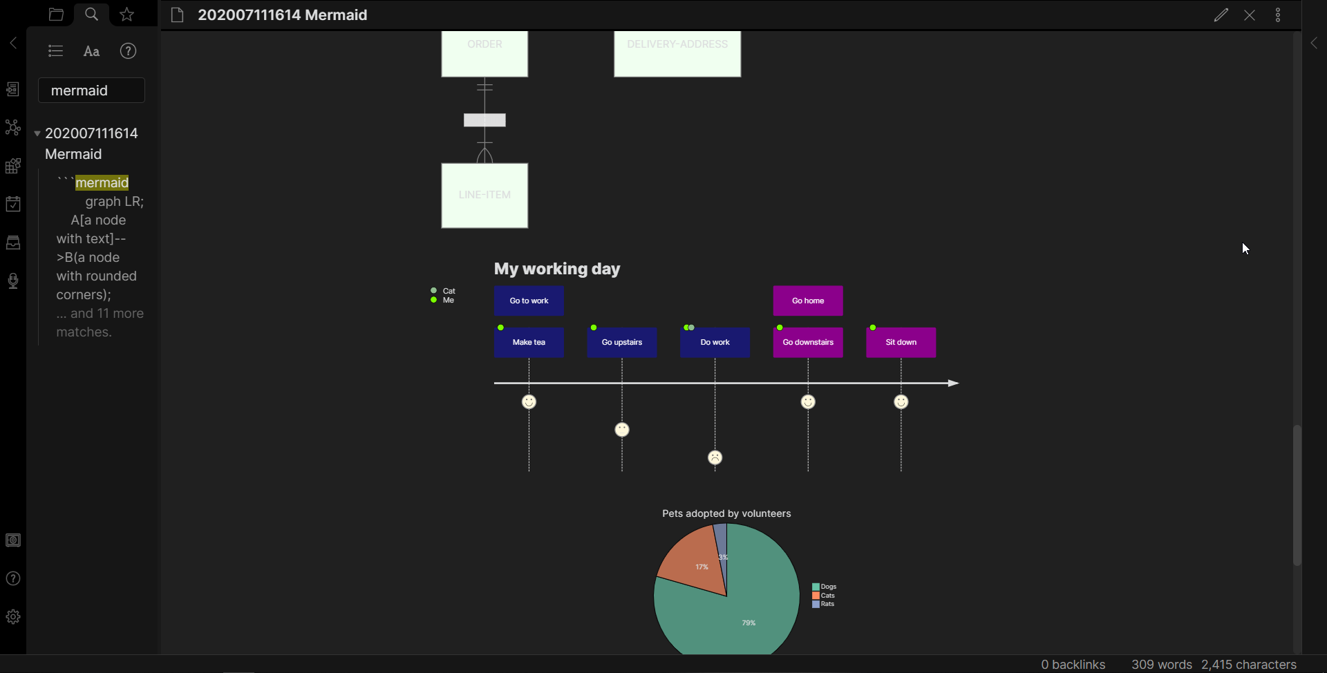
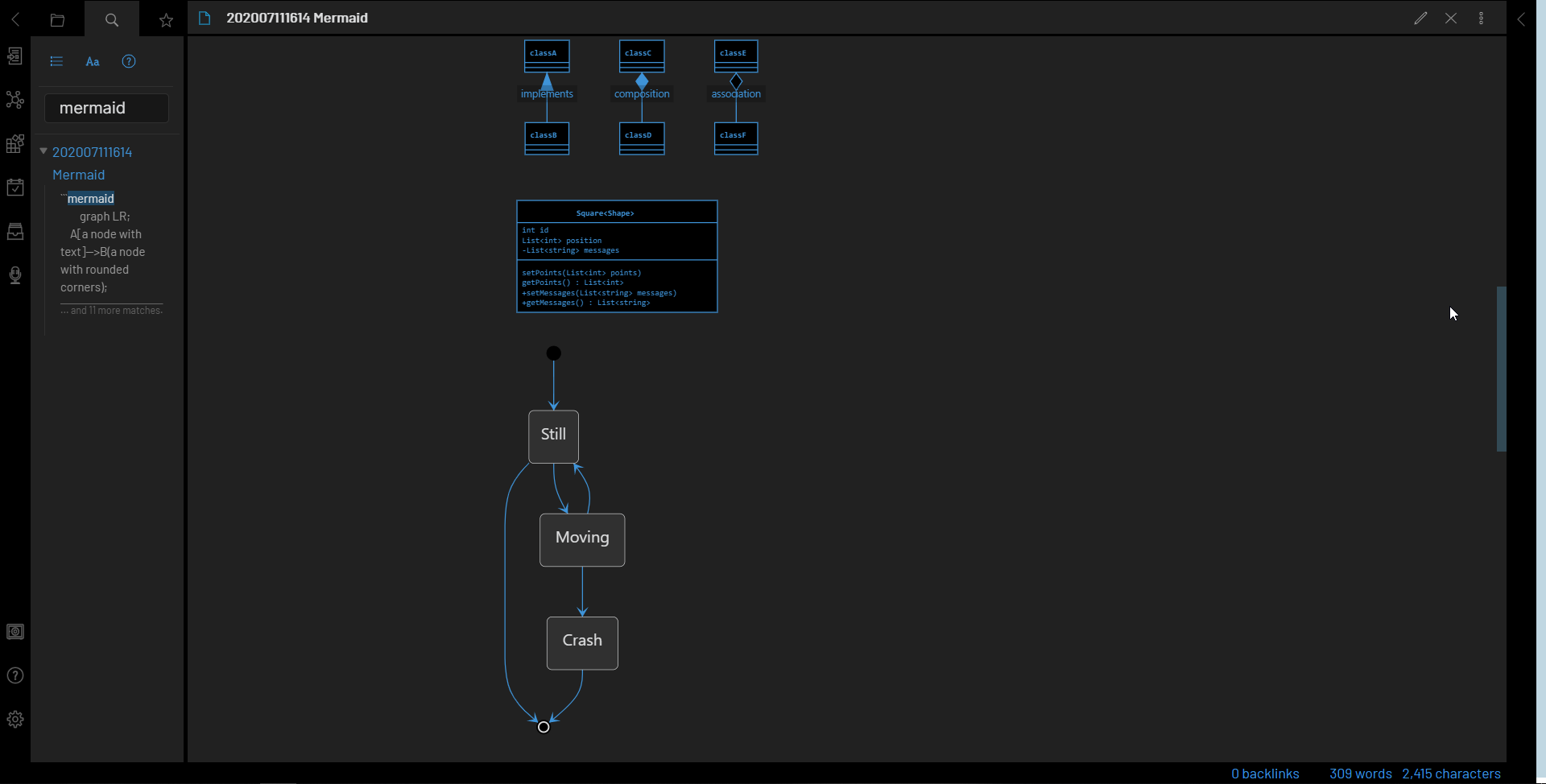
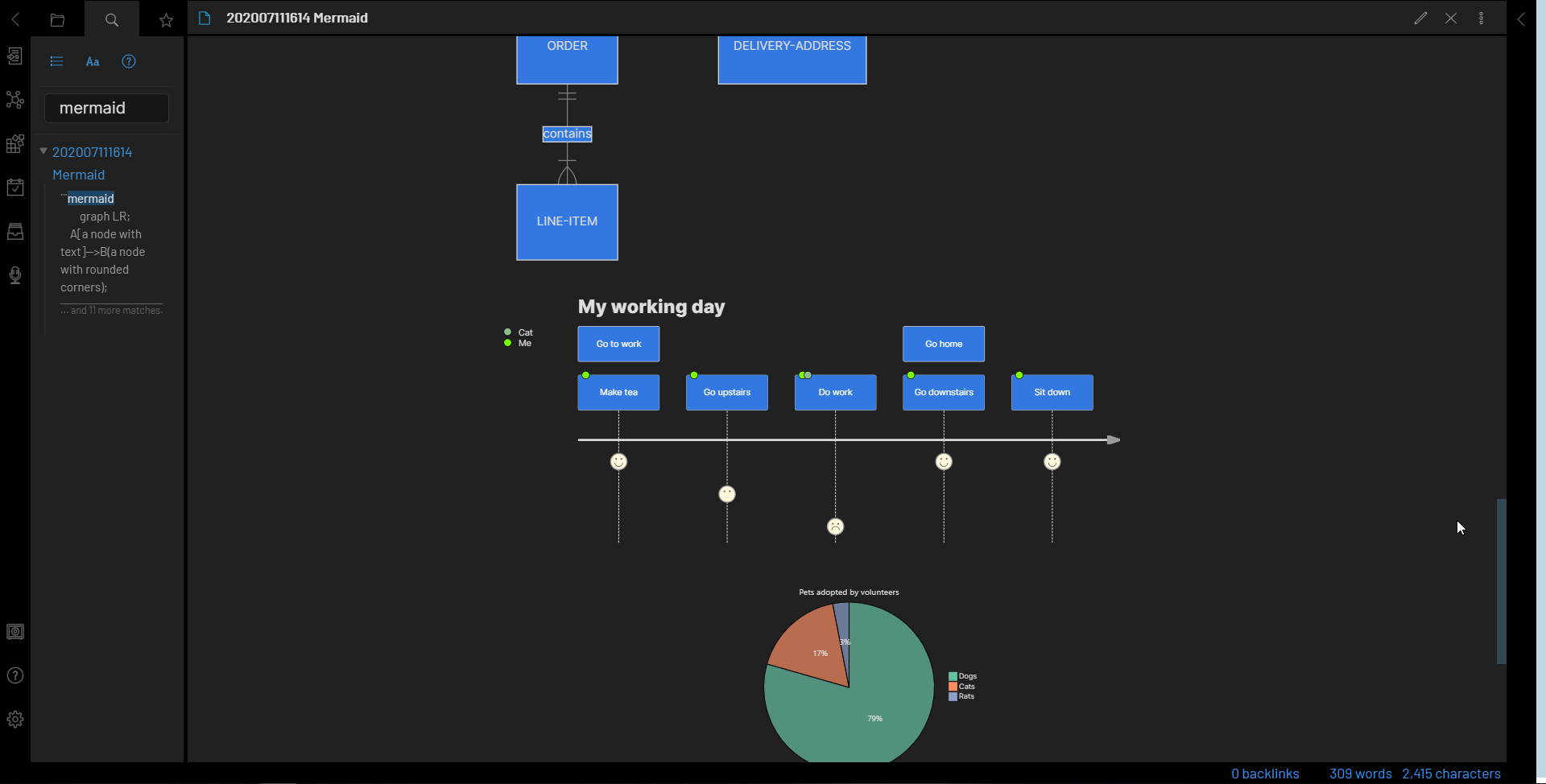
I forgot that there is now a section for Mermaid graphs at the end of the css…It’s mostly WIP. It looks ok-ish for both light & dark mode (I had issues with mermaid & dark mode previously) BUT it will probably override any inline style (I’ve put !important tags everywhere as a quick hack). I plan to improve that later on, with specific colors for mermaid (currently, it’s using the theme colors)
so if you don’t style your mermaid inline, you’re fine, otherwise, you may consider to delete everything under the mermaid section of the css ( it has a big mermaid ascii art to mark its beginning).
Thanks for trying the theme and for the snippets !
I might add the quotation mod in the next release… usually I 'd rather not embed extra snippets thought
I think it’s easy enough to manually add them (see Getting comfortable with Obsidian CSS or Mixing and Matching CSS Snippets with SASS) and it’s less time consuming for me (I don’t have to check for snippets updates myself and in case they are updated, I don’t have to release a new version of the theme… )
This is the best theme I have found here. Thank you!
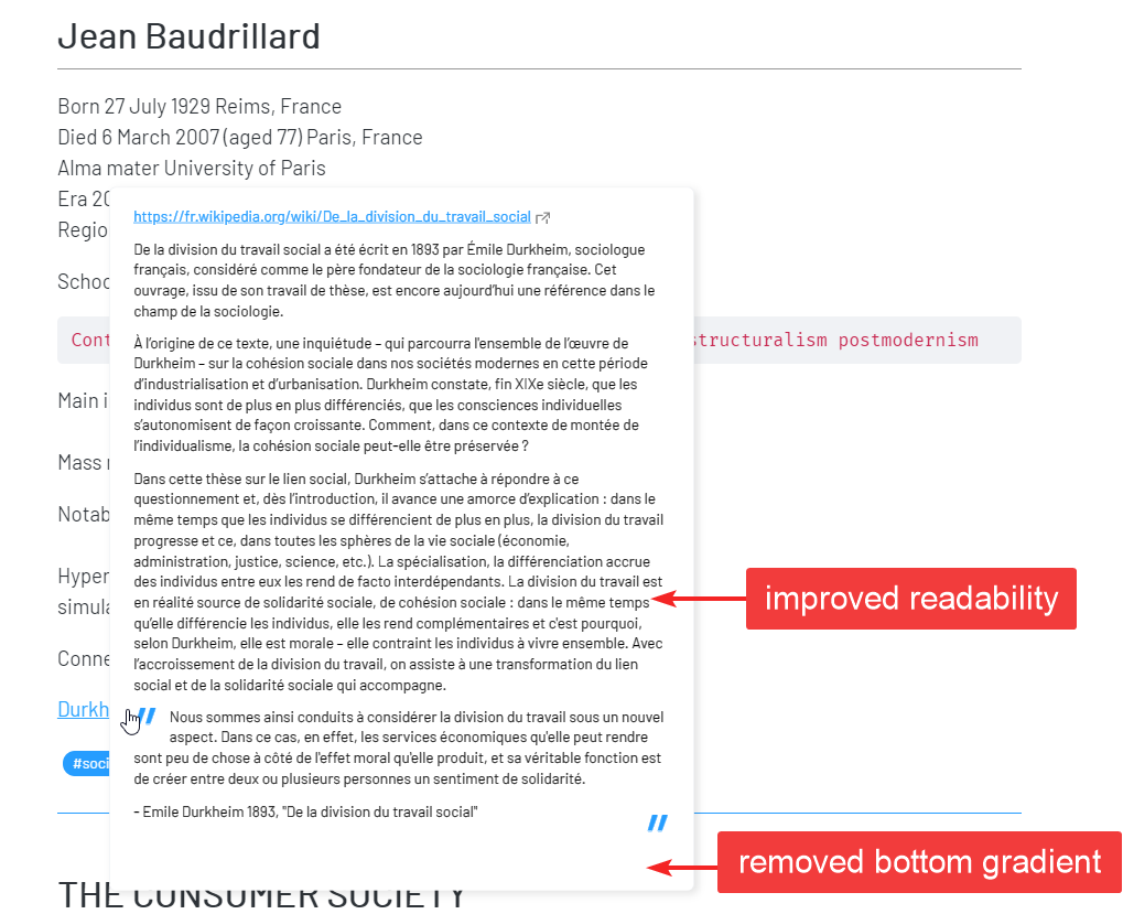
I especially like the bigger popup preview. One small issue I have with it is that the text in the popup note is not very sharp and missing some contrast (especially in light mode).
Am I the only one having this issue?
I am not that familiar with CSS but maybe I could tweak that myself somehow?
Hi Kevzen, thanks for reporting the issue. It’s right on time as I was updating the theme
I’ve tried to add small tweaks to the popover in hope to make the text more readable, but it will never be as crisp as the normal fonts, since it’s a scaled down zoom effect. the easiest way to fix, is to make the zoom a bit bigger and to add a thiny outline/stroke on the text.
new update v20200826(compatible with Obsidian 0.8.8)
changelog
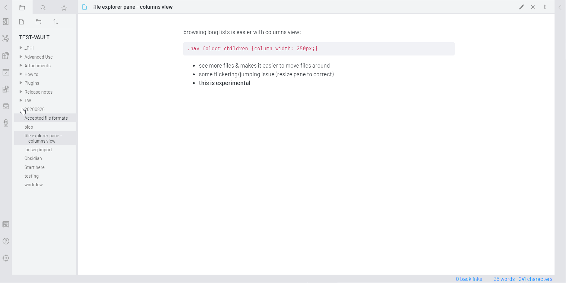
new feature: file explorer column view (disable it by removing lines [870-874])
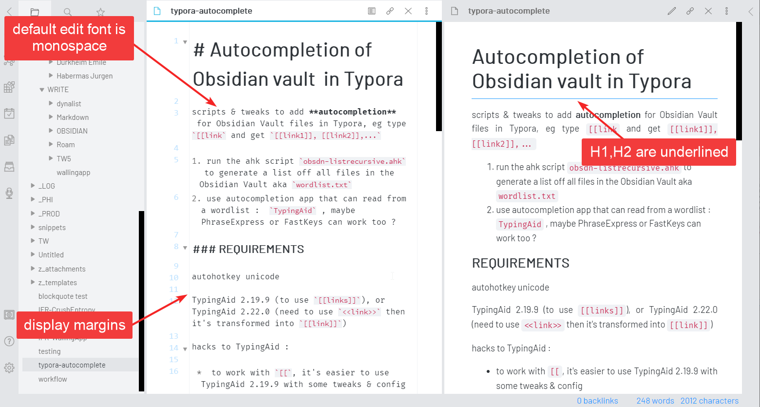
new feature: added faint margin lines to delimit the writing space in the Edit view
fix : adjusted the footnotes to get consistent line heights
new: the default Editing font is now monospaced (install Fira Code to match the demo) - you can comment out lines [9-12] to revert the modification
popover preview : changed zoom x0.8 > x0.85 and added a thin stroke on the text to improve readability
popover preview : removed the bottom gradient
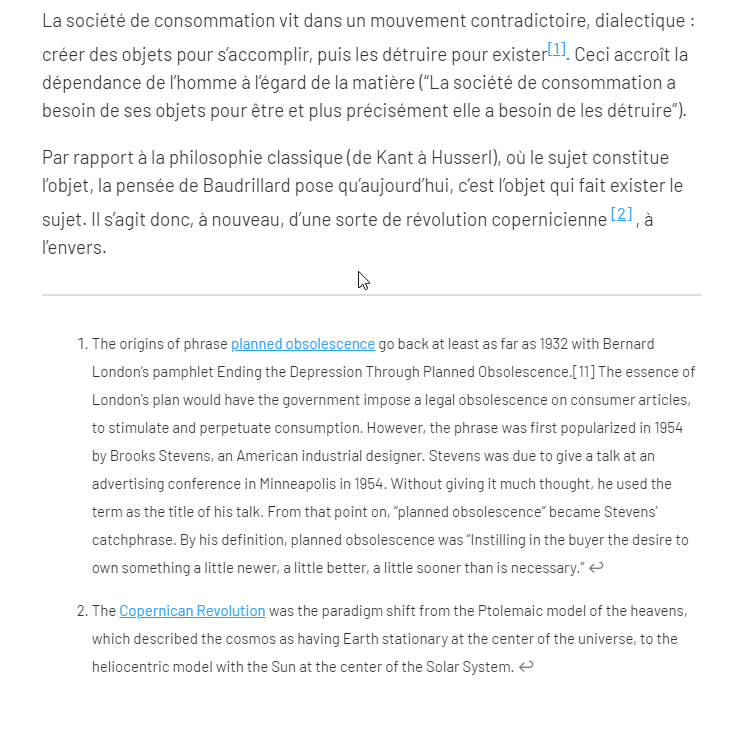
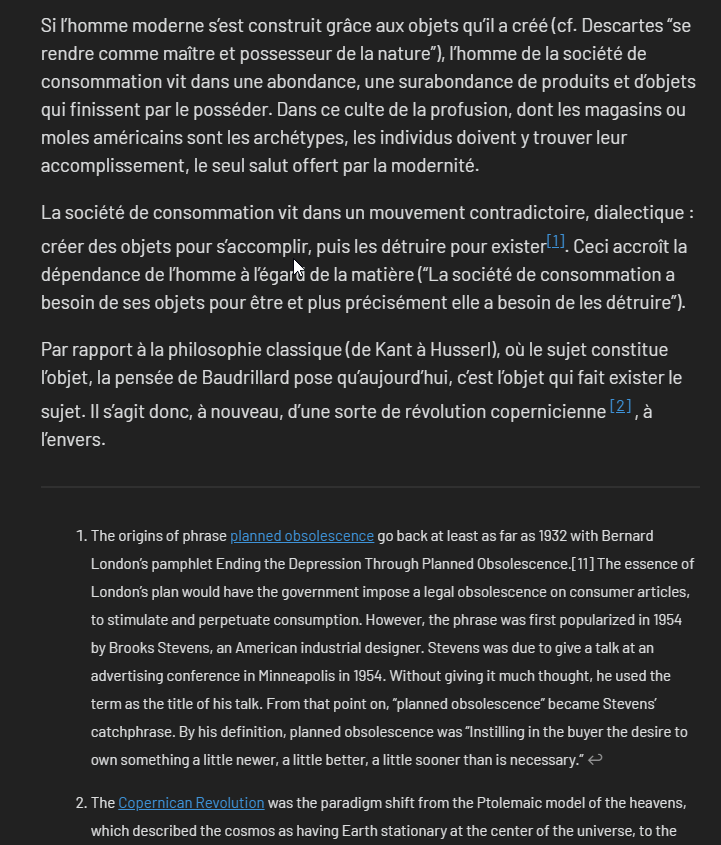
preview mode : text is now justified except in code blocks
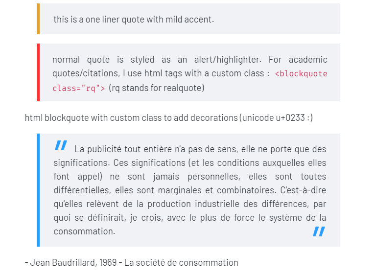
styled the quote blocks as alert boxes, academic block quotes should be inserted using <blockquote style="rq">...</blockquote>
added class “rq” for academic quote blocks with quotes
reduce the max-width of embedded media (search for /* reduce size of embedded files */ to remove it), all images will be smaller
modified the bullets (disc then circles for all sub lists, no squares)
modified some borders and alignements for v0.8.8
cleaned up some errors in the mermaid section
demos :
file explorer pane column mode (experimental and somewhat buggy but I find it useful)
the file list may jump/flicker when scrolling, resize the pane to fix the issue. you can disable the modification by removing/commenting out lines 870-874
This is awesome, by far my favorite theme. Will it automatically update if iv’e added it through the Obsidian interface, or do I need to go to GitHub to get the latest?
You’ll need to add it through community themes again (click on “Use”). Should be easier than manually doing it via GitHub. There’s a search bar in community theme interface.
Love the theme! For those using SASS to update the theme with other snippets, there is an extra */ on line 596 that needs to be removed prior to running the update command:
thanks for the feedbacks ! I’m glad it’s of use for someone besides of me.
@aja2488 nice catch ! thank you, I’ve updated the repo.
@y.h yup, I can reproduce it, it seems there is an offset of the popover preview depending on the x position of the document… unfortunately, it seems to be coming from the Andy mod (same behavior with other themes I’ve tried). Maybe you could drop a note to @death.au ?
I’m new here on the forum, a noob with Obsidian and have never tinkered with CSS…yet. Now that that’s out of the way, I installed this theme through community themes. When I hover over a link, there is no preview that pops up. Am I missing something?

 )
)