Nice theme. I like the blue “house” colour; the unobtrusive link to parent of transcluded notes; the unobtrusive, thin line in the left margin to demarcate a transcluded notes; longer notes can be transcluded in their entirety (no extra scroll bar); the blue tag pillboxes; the connection lines of (indented) bullet points. The latter is nice to have, not essential because with indentation the bullet shape changes so it’s easy to see which bullet points are on the same level.
You obviously put a fair amount of thought into transclusions, which I find very good because I use them a lot for, among other things, my “story rivers”.
Points for improvement:
- External links (= links to a website URL) show a little square with an arrow next to them. That square with arrow is the standard designation of an external website.
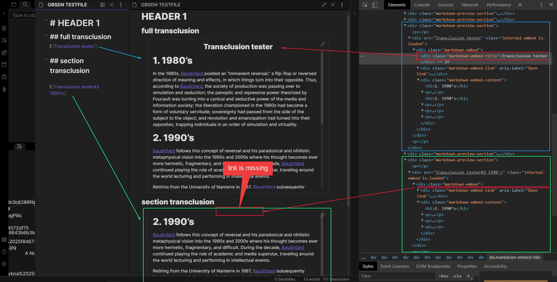
However, in your theme internal links (= links between notes) also show that little square with an arrow next to them. That is confusing. Internal links should not have anything next to them. - It might be useful to add
.suggestion-item.is-selected {
    background-color: var(--text-accent);
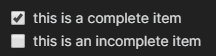
- Text is not correctly aligned vertically with a checkbox.


 ), but you are very welcome to strip the theme apart and improve or rebuilt it.