aah, now I understand better, thanks for the screenshots !
I has the same issue as you, hence the css tweaks included in my theme to make the title to look more like a reference link rather than a heading.
It’s also possible to hide the title completely :
.markdown-embed-title {
    display : none
    }
but it might break the alignement of the elements depending on your custom theme.
Since obsidian will reflect the modification internally, it shouldn’t be a problem though ? I did a bunch of renaming from xx_yyyyMMddhhssMsec to actual titles and never had issues with lost links so far.
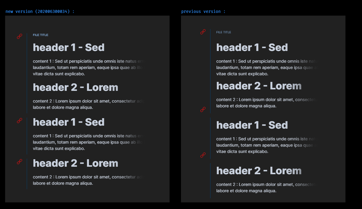
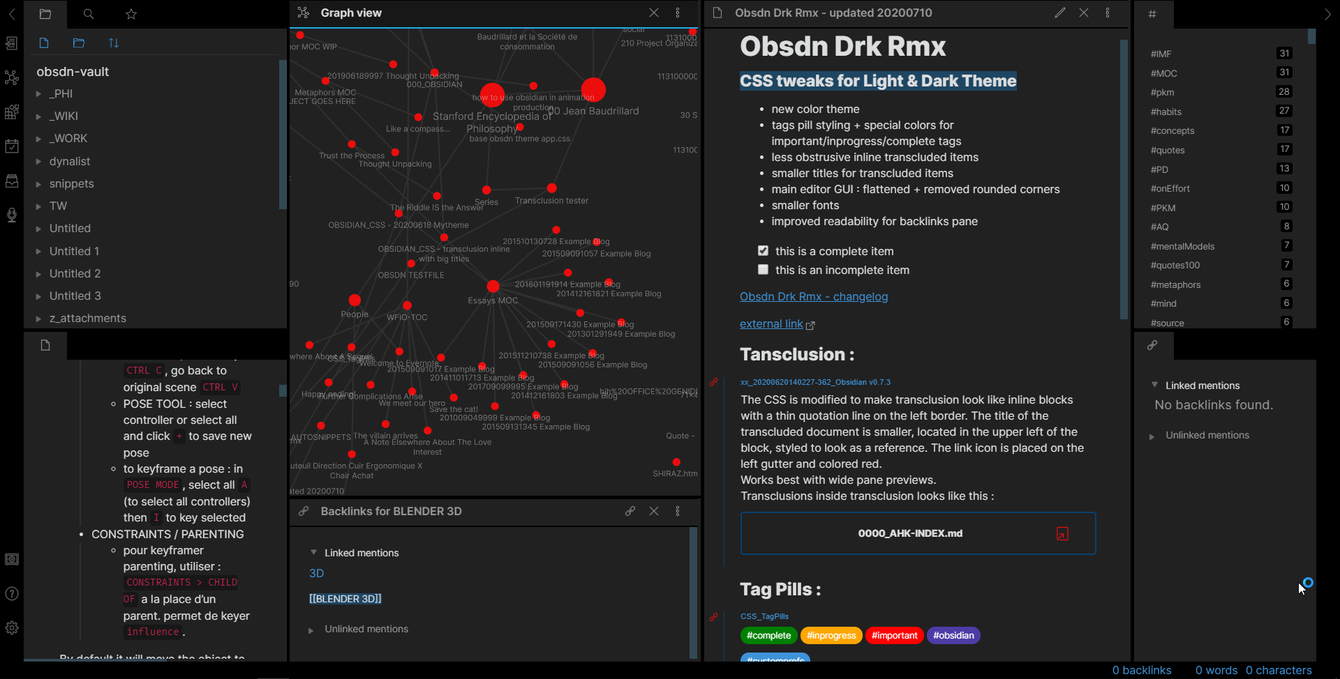
in the previous version, when using ![[file#section]], the red link icon ended up being too high and there were small inconsistencies in element spacing. This should be fixed with the latest version : now the red icon is aligned with the text block.
the spacing between blocks has been reduced to enforce consistency.
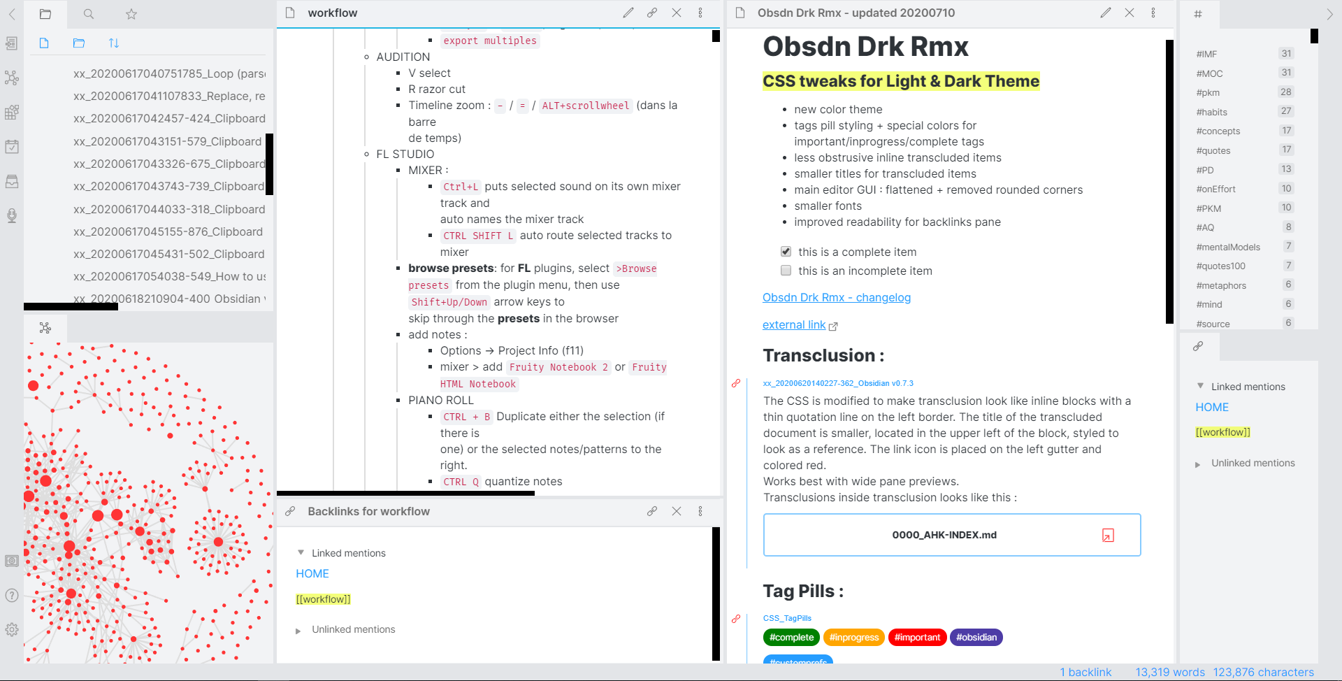
The transcluded file title (the small blue link) should look sharper.
It should work well if you are using inline transclusions a lot.
I came over here from another thread, trying to find out how to modify my CSS to show the blue border on the embedded documents/sections.
I have a mixture of quite a few things in my CSS from different themes/snippets. I did copy all the tweaks under ==Transclusion Tweaks=== from GitHub, and played around with them (mostly to fix positions of things) but couldn’t find what selector adds the blue border on the left. Any hints?
Thanks!
Edit: I ended up finding the collisions, but just in case someone comes here after me the selector in question is (very obviously, duh me) .markdown-embed, specifically border-left , e.g. for me it ended up as border-left: 3px solid rgb(150,200,255);
@randulfr : sorry for the late reply. see my post in the other topic
@argentum : glad you found what you were looking for. I’ve made minor revisions in the latest version of my theme to get a better preview layout (on the margins and paddings), maybe you’ll want to apply some of the tweaks too.
replace var(--accent-strong); with var(--text-accent); for the blue tone (or with var(--text-muted); for the neutral gray)
thanks, I’ve corrected it and hanged the pictures
actually @Silver added it to the community themes a couple of days ago… I should have waited for this update to get a nicer screenshot though, but I wasn’t really planning to do the light version.
I made an account just to say how much I like this. I’m a TW nerd from way back, and transclusion is one thing I was missing here. I like the fill on the pills, too. I killed most of your styling in favor of the stock dark-theme, but that’s just a personal preference.
FWIW, I’m only leaving TW because I tend to tweak it more than use it. I need something I can use OOTB without worrying over plugins and styling. The TW markdown flavor will take time to unlearn.
Great work. I look forward the the future of Obsidian (hint - mobile app )
I left TW too, not because of the endless tweaking on my side, though it was obvious from the forum comments that many users were essentially just doing that. No, I left because of the HTML/JavaScript/CSS expertise needed to implement even simple things.
What I find with Obs is that there is now choice of quite a few custom themes, and each new one I want to try. That’s the only temptation I feel. Each time I run back to this theme (Obsdn-Dark-Rmx) because I like it and I have been able to tweak it to my liking. And when @_ph makes an update I copy the tweaks to the new version.
@Klaas - I saw this somewhere else, but I also confirmed myself: currently that line (a border, in this case) is controlled through the ‘var(–text-selection)’ variable. Changing the variable is one option, but may alter unwanted things as well.
You can control it explicitly by adding the line ‘.markdown-preview-view .markdown-embed {border-left: 1px solid red;}’ - Change the color at will, or change the size to 0px to remove.
haha, it’s funny you mention TW as I’m currently experiencing exactly that: I’m spendiing more time tweaking it than actually using it. But I like the feature set and TW is currently my daily driver (alongside Dynalist). I have high hopes for Obsidian and AthensResearch though.
Erisred got it right. I think you can just put the border-left to 0px instead of using white, that way you can still switch between light & dark mode.
I’m not sure how I can update the screenshot ? I didn’t link the thread image from the Gihub, but just used a drag-n-drop upload to the discourse.
Should I hotlink from https://raw.github.com/cannibalox/Obsdn-dark-rmx/blob/master/Obsdn-drk-rmx_DARK.png and update the link in the first post of this thread, or is there a better way to do it ?
PLease let me know the correct process to upload the image so that it appears in the thread and also in the community themes in case I make further updates.
yes ! it’s now compatible with light and dark mode… the preview for light is here : https://raw.githubusercontent.com/cannibalox/Obsdn-dark-rmx/master/Obsdn-drk-rmx_LIGHT.png but I thought hotlinking to raw.github wasn’t a good idea ?
on a side note, what’s the proper etiquette to reply to multiple people ? should I use @username > reply in the some post, or quote replies ? or multiple seqeuntial posts ?
I thought about answering this, too, but the thought of a subtle (even just 1px) indicator that there is a transclusion there might appeal to some folks. To each their own.
@_ph - Now I see I can fall in the same trap here with styling. Oh, well.
I’m coming to realize that lists, indexes, and tags are just fancy ways of creating ‘controlled’ backlinks. I started use giffmex’s TW-Stroll (I love it!), but if I’m gonna start over, I want to simplify.

 but you can change the color around line 405: