this one. i was wondering because it has a link icon next to it.
@matleonii h interesting, ya that is light grey in my eyes O.o, that is an embed ![[note filename]], but yes it is essentially serving as a block reference
1 Like
might be, but the blue elements made it look like blue lol.
But thanks for that. I had no idea that was possible. love it!
@Gnopps light theme has been fixed https://github.com/dogwaddle/lizardmen-zettelkasten.md/blob/master/obsidian.css
2 Likes
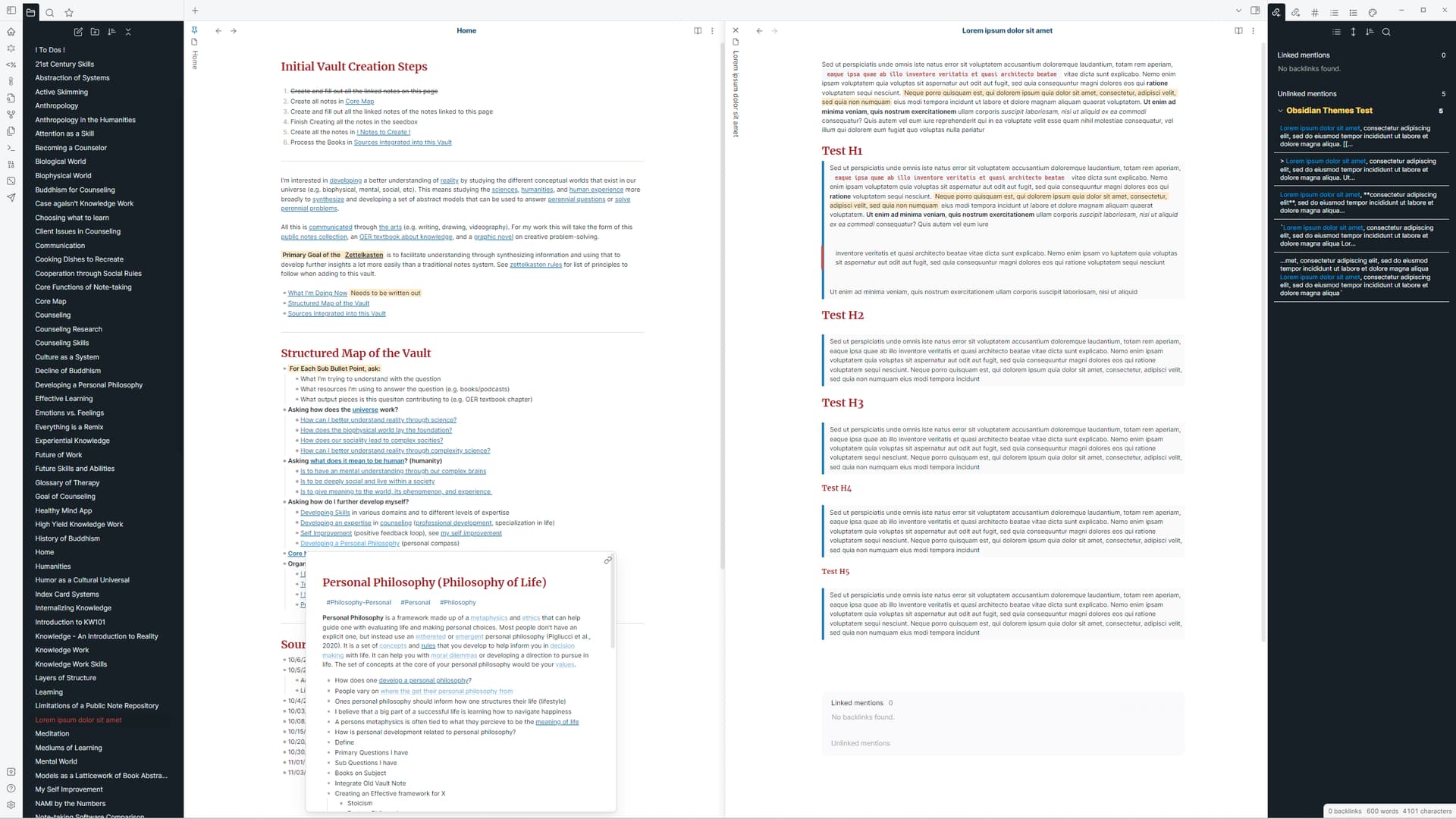
Would people prefer I style the notes that get put into the sidebar to thematically match the other panes in the sidebar (file explorer, search, tag pane, backlinks pane) OR have the notes in the sidebar look just like they normally do?
- Style Notes in Sidebar similar to other Sidebar Tabs
- Style Notes in Sidebar similar to Notes in Center pane
0 voters
Great stuff, thank you for your work!
Another problem that as come now is that when doing a horizontal split (as I like to see backlinks below the note) it is not possible to resize the bottom pane. Nor is there a visible divider between the panes in that case.
@Gnopps You just made me realize that I need to change a lot of stuff… didn’t realize you can move around the backlinks pane and tags pane like that. So I have to rework all the panes. It’ll probably take me a couple days so check back in at the end of the week.
2 Likes

Parts of the theme broke during the last update. If you don’t want to wait until I get around to fixing it, go into the CSS file and search for “graph”. I believe I have the different colors for the graph options labeled.
@Nan so I recreated the problem. It seems like a bug with Obsidian itself. To fix it just click on a different note and open graph view again. Might want to submit the screen shot into the bugs seciton.
It works now! Thanks a lot.
Headings arent visible in Page Preview when hovering 
@Kuncy that is because I hide them for my workflow, try deleting this line in your obsidian.css file
.markdown-embed h3, .markdown-embed h2, .markdown-embed h1 {
display:none !important;
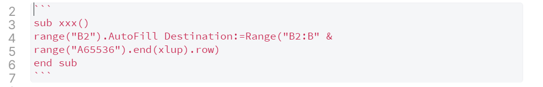
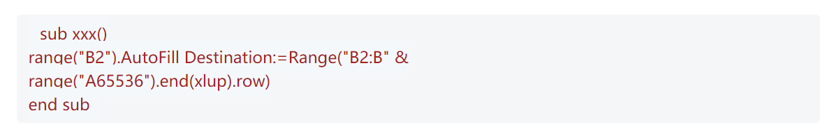
}Code blocks are not aligned in preview mode.
And “g” is not displayed correctly.
Edit Mode
Preview Mode
Hello,
First of all, thank you very much for this beautiful theme.
I noticed that the code snippets do not use the usual font, as well as they are not aligned as noticed by Nan.
Is there any fix for this issue?
@Servais looks fine to me. I’m not sure if I can have people download the font I use (Hack Font) as part of the CSS?
Or are you referring to the offset at the start of the paragraph? Even when I remove the font it seems to work fine with the prior font used. Are you using an older version of this theme or the latest one?
If you want to adjust that part of the CSS, search for this
.markdown-preview-view code
Hello @lizardmenfromspace, thank you very much for coming back to me.
The font issue was indeed due to the lack of the Hack font on my machine, sorry for that…
And I have indeed removed the issue by removing the “padding” section
If anyone still uses this theme or is interested, let me know. I have updated the theme to work with the Obsidian overhaul, but am still deciding on some final stylistic choices before submitting it.
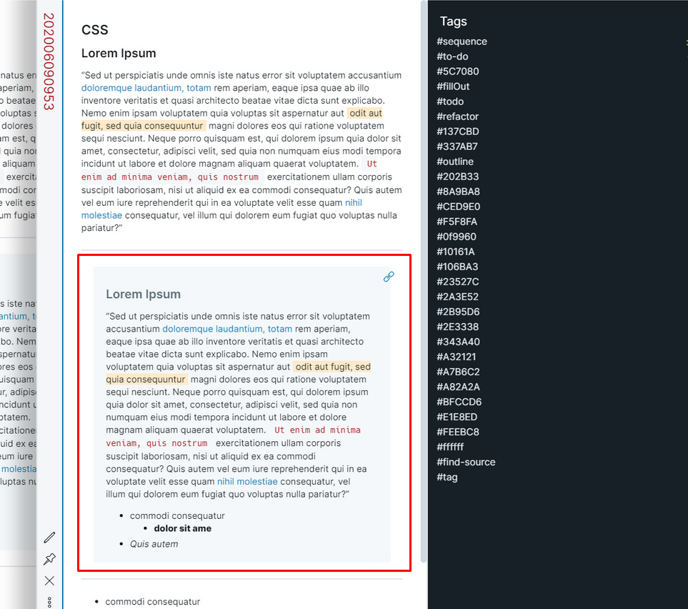
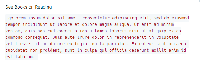
For example I am unsure if I want to keep the quote block background color the same as the image above, which is currently off-white/red.