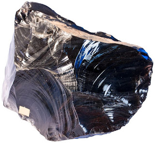
The new icon is more like a real obsidian, in fact, the old icon looks like a coffin⚰️
2 Likes
I don’t love the look of the new logo, but I think the idea is awesome. It’s a play on early stone tools. Search for Clovis obsidian tools.

1 Like
Agreed! Like, I don’t even use this app (I’m looking for Evernote alternatives) and I’m irrationally angry. It looks fine as a favicon, but when I see the logo enlarged, I get very upset. Maybe it’s because of the curves.
Might even create a web extension in the future that replaces all instances of this icon with the older version in the website, forum, communities, etc. That’s how angry I am at this new logo.
2 Likes
I gotta say that I’ve changed my mind and now I like the icon, although in my opinion it’s still a bit too flat on the bottom.
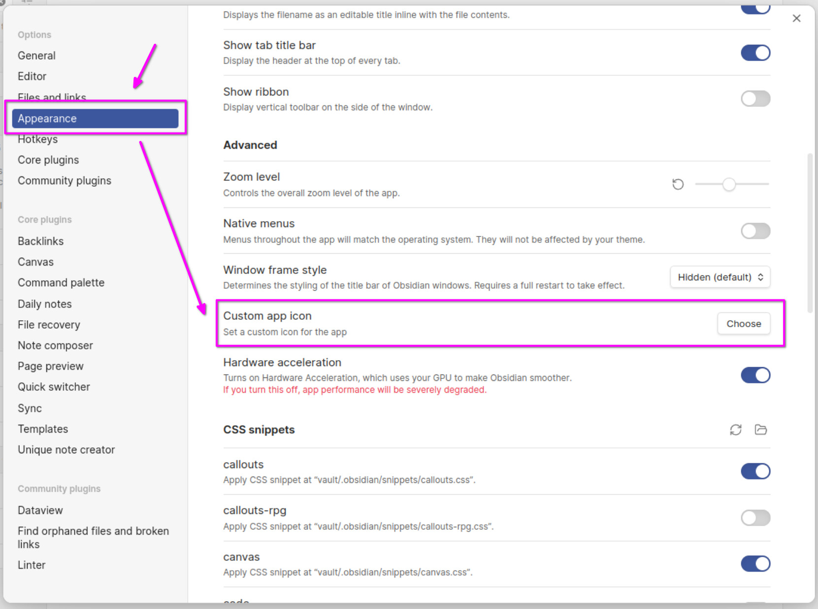
It would be nice to be able to change the color or the icon directly within the app, because if we manually change it, then when you launch the app it will still show the purple color during the loading phase.
Anger can be such a powerful driver! ![]()
But I’m genuinely curious: what exactly is causing this anger? (If you don’t mind sharing/ exploring this feeling.)
Anger typically arises when social norms or expectations are violated, more specifically, when someone perceives that their rights have been infringed upon or they have been treated unfairly.
I can see how this may be the case for Obsidian users who have become attached to the old logo when it is changed without consulting them, i.e. someone with a sense of belonging to the Obsidian community might feel it is unfair when the very icon of their community is modified without consulting them. Expectations regarding what kind of community this is are broken. For those who like (or are indifferent to) the new logo, this “unfair treatment” is not a big deal, but those who don’t like the new logo may feel a kind of double betrayal: not only was I not consulted, but as an obsidian user I’m now also forced to be part of a community that likes ugly logos.
This realization creates a conflict: I love Obsidian and I thought I love the people who use it (they’re like me!) but now they seem to like this logo, which means they’re not like me.
The logical reaction is to raise the question in the community, hoping that the discussion will resolve the conflict one way or another, either by changing my mind about the logo (unlikely, but not impossible), or by revealing that most people, in fact, also dislike the logo).
In any case, none of the above will apply to you if you are not even using Obsidian yet. That’s why I’m curious to understand where the anger is coming from.
1 Like
I very rarely do any such personalisation, but in this case I will.
I don’t care about ugly, but do care about effective.
And I find this revised icon harder to pick out in browser tabs (I’ve had to put it next to AeonTimeline so I know where to look) and from other program icons.
3 Likes
Looks like a special item found on the ground of a grind Korean video game. Mix work symbols with game symbols = not good.
If mixing things with work was to be a good thing, people would communicate in the job with whatsapp and iMessages instead of microsft teams
2 Likes
I don’t understand the rancor expressed in this thread against the new icon. It’s an icon that identifies a software application, not an icon that expresses your identity. Why is there so much emotional investment in an image that symbolizes nothing about yourselves? As long as Obsidian continues as the best tool for doing what you need it to do (and it certainly is for what I need it to do), why should the icon matter?
And if you must criticize it, avoid being discourteous to the Obsidian team. They really are superstars in a world saturated with editors.
2 Likes
When a program becomes a core part of one’s daily life, one feels some attachment to it. When something as visible as the app icon changes drastically without warning or permission (or ability to fully revert to the original icon), I think it’s quite understandable why some people might be frustrated with that.
1 Like
As they say “beauty is in the eye of the beholder.” You may not like it but others do.
I really think Obsidian’s team should think for an option to let the user decide which icon he wants (options for old / new)
since this thread isn’t locked yet, I’m still a fan of the old icon, and still use it by replacing the new one on any shortcuts.
I wouldn’t call the new ugly but I agree it looks overly complicated compared to the OG icon ![]()
Would be great to include it as a choice ![]()
It’s more recognizable, yes. I personally prefer the old icon as well. But I can totally understand why they chose for this design.