Disclaimer
Is this theme/snippet open source? Yes
Is this theme/snippet completely free? Yes
Is this theme/snippet vibe-coded beyond the author’s ability to comprehend how it works? No
Theme Link In Community Directory: https://community.obsidian.md/themes/tela
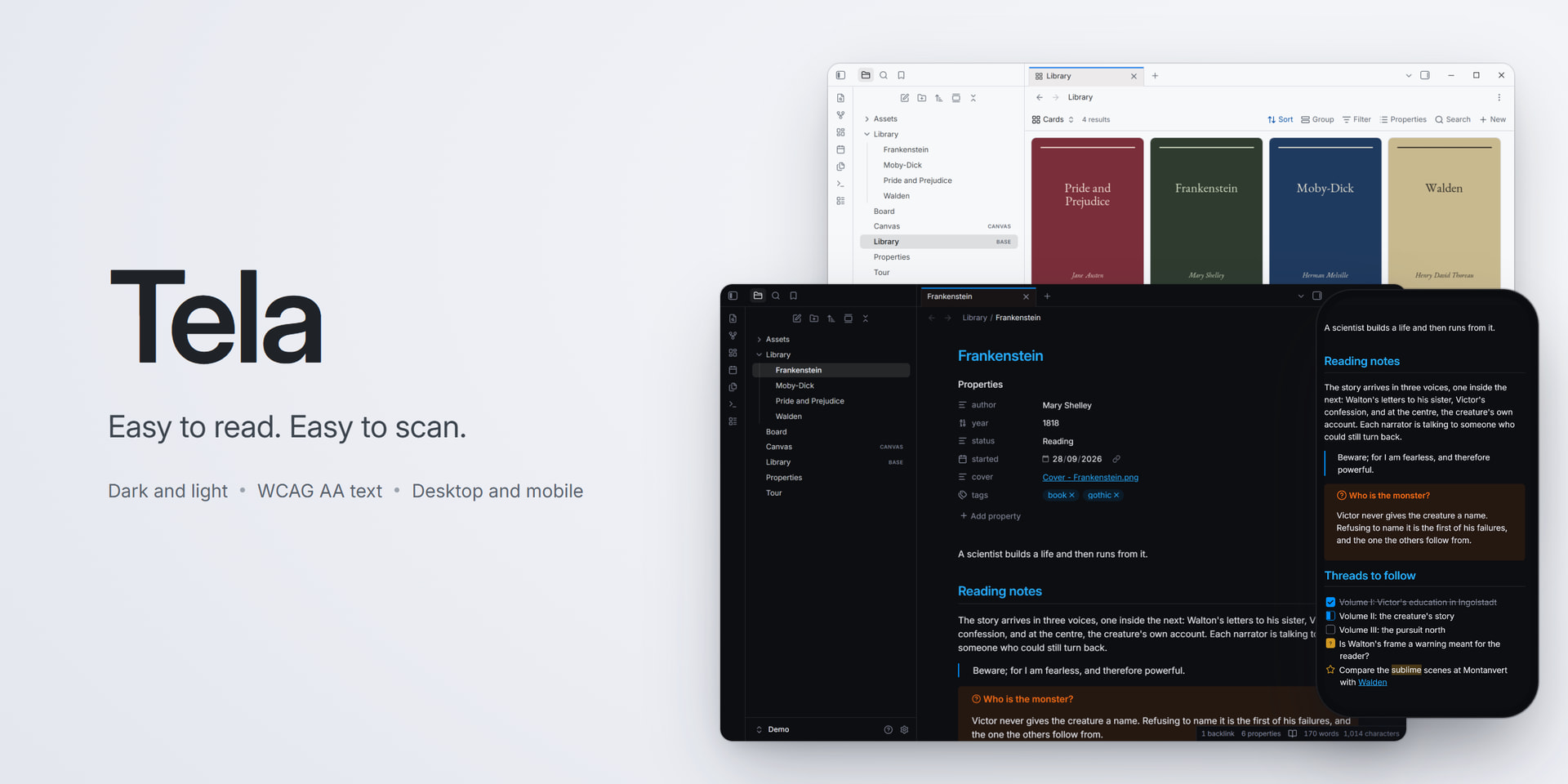
Hi all - I’ve just published a theme called Tela.
I built it around two things: text that’s easy to read, including the small grey stuff (menus, counts, settings), and headings you can tell apart at a glance.
- Contrast: I didn’t want to trust my eyes, so I run axe (an accessibility checker) on 346 screens - notes, canvas, bases, search, menus, settings, dark and light, desktop, phone and tablet. Right now nothing falls below WCAG AA. The one thing it can’t judge is text sitting on top of images.
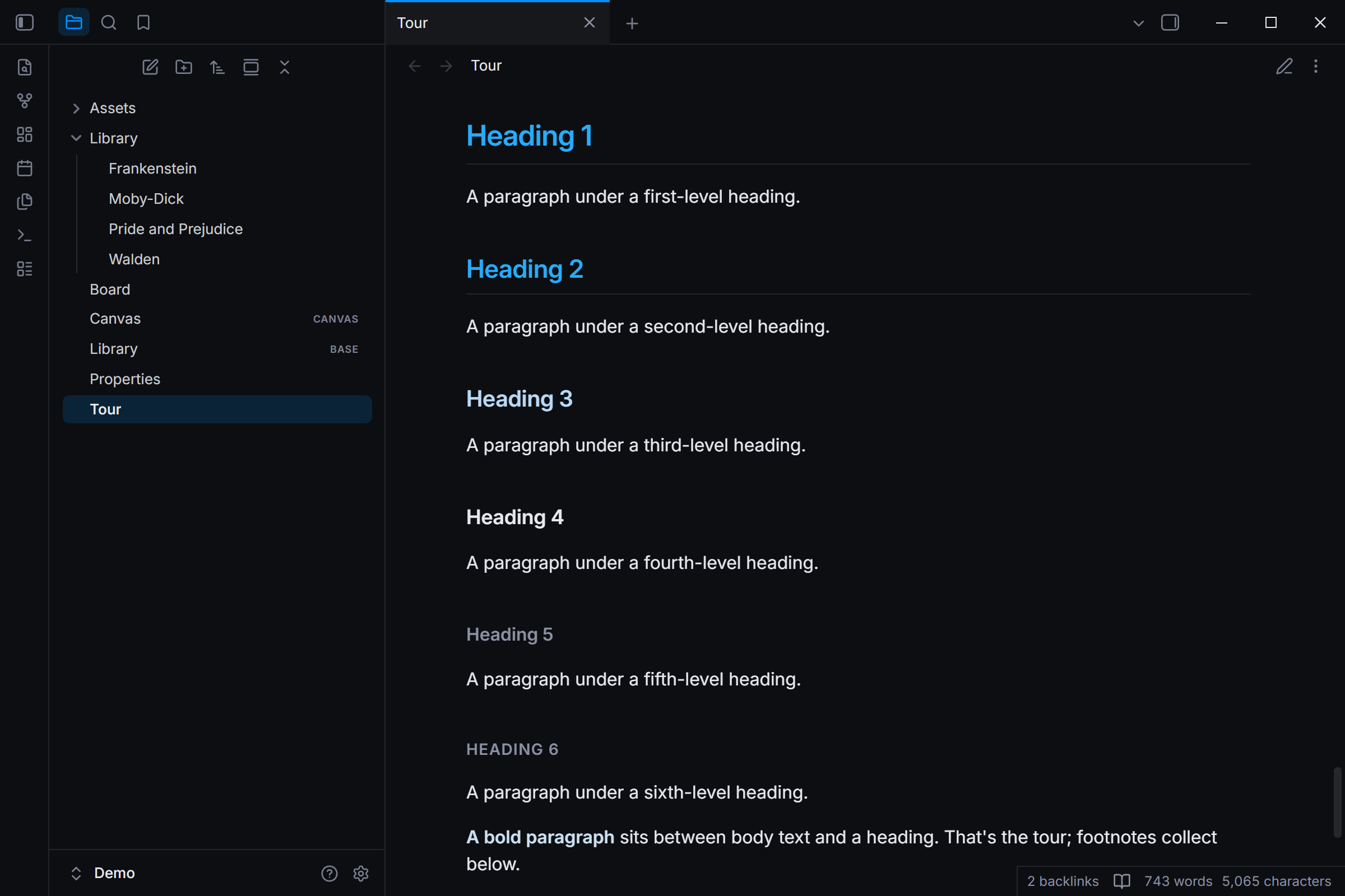
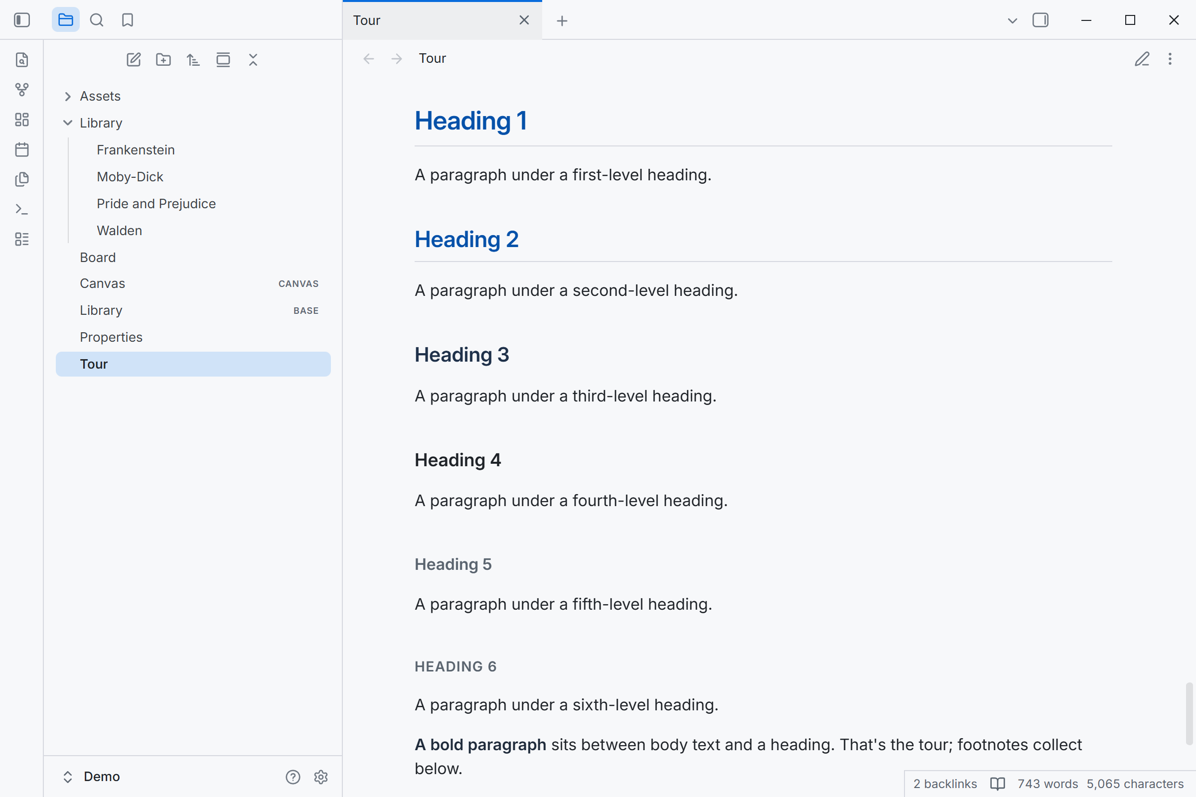
- Headings step down by colour as well as size, so H1, H2 and H3 don’t blur together.
- Nothing to set up. One optional setting (distinct sidebars) and that’s it.
- Updates: it works mostly through Obsidian’s own variables instead of fragile selectors, and a weekly check tells me if a new release changes something it relies on.
Small extras: task marks for [!] [?] [-] [/], readable code colours, unresolved links with a dashed underline, and PDF export that doesn’t split callouts and tables across pages.
Install: Settings → Appearance → Themes → Manage, search “Tela”.
Directory: https://community.obsidian.md/themes/tela
Source: https://github.com/rbartoli/obsidian-tela-theme
It’s 1.0, so I’m sure I’ve missed things, especially with plugins - let me know here or open an issue on GitHub.
1 Like
What a great basis for a theme! First time in a while I’ve been tempted to try one.
It would be helpful if the screenshots showed the different colors of heading levels in action. Also I wouldn’t make headings the same color as links.
Edit: Looks like the theme also supports [>] as a task mark. Nice!
Thanks, glad it tempted you!
- Heading screenshots: good point - the current ones don’t show anything below H2. I’ll add one with the full step-down: H1 and H2 in the accent colour, H3 tinted, H4 in the body colour, H5 and H6 muted.
- Headings vs links: fair - H1 and H2 share the links’ blue right now, and only the underline tells them apart. I’ll look at giving headings their own shade.
[>]: yes! It’s one of 20 task marks.
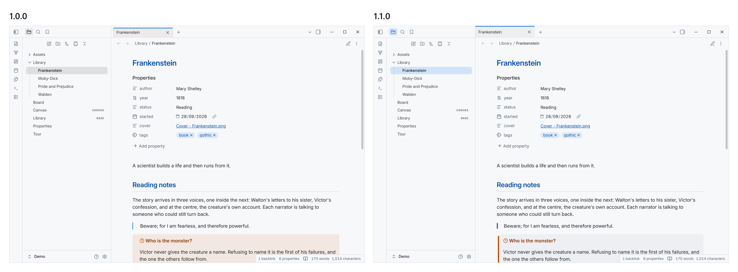
Tela 1.1.0 is out - update it from Settings → Appearance.
- The accent marks where you are. The open note, the open settings page and the active sidebar view sit on a blue wash, as in the Tela app. Hover stays grey, so the row under your pointer never looks selected. Menus and the command palette highlight in blue too.
- Callouts and quotes get a bar. Callouts are a quiet card with a rounded bar in their colour, instead of a tinted box. Quotes get the same bar in grey. Code inside a callout keeps its box.
- Tabs meet the edges. Document tabs sit flush with the tab bar, the active tab’s blue line reaches the top, and with the sidebar collapsed the first tab lines up with the note.
- Fixes: on Android, the calendar icon no longer covers the date in date fields. In light mode, accent buttons and the file-type badges on multi-selected rows now pass AA contrast.
The contrast audit still finds 0 problems, now across 378 screens.
@CawlinTeffid the heading screenshots are in, H1 to H6 in dark and light (below). The dark one is now second in the directory listing, and both are in the README:
On headings vs links: I’m keeping the blue for now. Links are underlined and headings aren’t, so they still read differently. If more people trip over it, I’ll give headings their own shade.
Release notes: https://github.com/rbartoli/obsidian-tela-theme/releases/tag/1.1.0
1 Like
Tela 1.2.0 is out - update it from Settings → Appearance.
Two new options in Style Settings, both off by default:
- Dim images in dark mode. Images in notes show at 70% and come to full brightness under the pointer. Phones and tablets have no hover, so there they stay dimmed.
- Tinted italics. Italics take bold’s colour, a hint of the accent, so they stand out while you scroll.
Both were asked for by a commenter on Reddit.
1.1.1 on Monday was fixes only: headings after a folded section keep their space, bold and italics in a heading keep the heading’s colour, settings cards no longer vanish in light mode on phones and tablets, and macOS inputs keep Tela’s 6px corners.
The contrast audit still finds 0 problems, now across 414 screens.
Release notes: https://github.com/rbartoli/obsidian-tela-theme/releases/tag/1.2.0
I wrote up how the audit works: what it caught that a colour check misses, and how 22 other themes did on the same run.
https://rblab.com/how-i-check-every-screen-of-my-obsidian-theme/