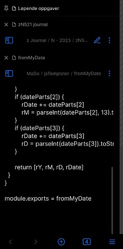
I’m mighty impressed, and very thankful. This is already going to be on for sure on mobile. I don’t have a wide phone, it’s rather narrow and high, so I’ve turned off the scroll area/shadow. ![]()
The only strangeness I see now is that occasionally the tab bar header doesn’t fold away, as shown in image below.
The notes doesn’t always focus on the new tab opened, but I can easily scroll down to find it so it’s just a minor thingy.
I also tried to add 5-6 tabs, and discovered that (even when fully folded) they do take up some screen estate. But yet again, a really minor thing, and I did open more files than I usually do.
But all in all, I stand in awe for this snippet, and will try to adapt some of the ideas related to style settings plugins in my other CSS stuff.
