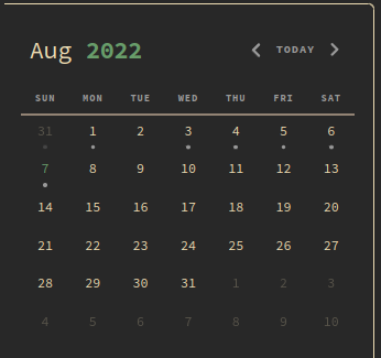
I’ve been using AbsoluteGruv(authored) for a while now and recently noticed that there is an annoying border on the sidebar panes (file explorer, calender etc) both left and right only when they are in focus.
Things I have tried
I’ve been tinkering with the theme but am currently unable to find a solution for this. nav class in theme’s css could be the answer, but nothing has worked.
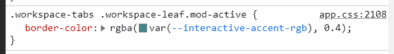
it’s this class selector .workspace-leaf.mod-active, which is only applicable when that particular pane has the focus. in your case, this is what makes the border as such. i guess removing it is sufficient.
.workspace-tabs will make it apply to both leaf (left and right) but not the note’s pane/leaf.
but i guess u need an alternative for users to know which tab/pane is active. just good ui/ux practice.
then it is better to leave .mod-active from the class modifier. This makes the border transparent in all instances. Having .mod-active there makes toggling between active-unactive visually undesirable.
It is best to try both once and settle on one that’s more desirable.