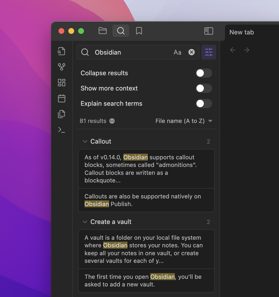
From the screenshot provided (see below), it appears that the new design takes up a lot of space.
Whenever possible, I only want to see my own words on the screen; interface words are distracting.
I wish all computer interfaces would move away from using words whenever possible and use iconography instead. Icons are a universal language that don’t need to be interpreted (although they might need to be defined in a central repository).
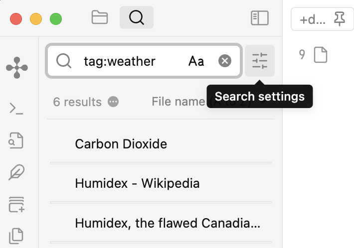
Completely agree with you, but in this case, the “Search settings” button collapses most of it. Can’t find anything to remove the “6 results” or file sorting options.
So to see the options, users have to click on Search settings and are then presented with the toggle switches? Extra clicks are needed? Doesn’t sound like a great user experience, but if the words can be hidden (as in your screenshot) that’s a plus point.
Hope the developers will rethink this or offer an option to use the current interface (won’t hold my breath).
I totally love the new search experience. However, I use it many times a day and, admittedly, was taken aback last night when it arrived. Not sure how one would make the experience any better.
Each time I search is a different use of the plugin.
Often, I am refining the query and use explain, but when the query is proven, I can hide it.
If I’m searching for note files, I do want to collapse; a simple hover reveals the note content.
If I’m searching by section or block, I do want to show more content.
Two things would make it better for my use:
add “sort by result count” to the sort function
the ability to drag a section or block out of the search results onto a note or canvas as an internal link.
With bookmarks now, the search experience is on steroids. Looking forward to what will be enhanced in this space.
The update has broken (for now) the Query control plugin in Search and embedded search. Very unfortunate. Here’s the FR for bringing some of its functionality into Obsidian proper →
Icons do have to be interpreted by the user and are often unclear without words. But I think an icon-only option would be good (I’m sure you’re not the only person who prefers them).
I rarely change my search settings so putting them behind a switch works for me.
All of the following is personal to me, of course:
I prefer seeing icons (with on-hover tooltips) rather than text-based toggles.
UI text distracts from my text in ways that icons don’t.
With icons, all users across all languages get the same interface.
With words, users get different interfaces in terms of space because some languages require more space to say the same thing (and of course some need less).
From the widest-possible standpoint, iconography can be a universal language. It is the reason why most road signs are displayed as icons rather than words. Icons are quicker and easier for native and non-native speakers to comprehend and most importantly take action on.
Of course, a central repository of definitions would be needed for all the different languages, but that means just one place (separate from the UI) where words are needed.
We already have this to some extent at an OS level with icons that pretty much everyone understands, such as arrows, sharing icons, plus and minus signs to add and remove objects, home icons, history icons, new-file icons, new-folder icons, etc. I wish IT companies would create more universal icons and completely move away from interfaces that use words.
Languages create demarcations between people: the subtleties of what is said, what is meant, and what is understood can create chasms between us. I long for a planet where there is one spoken / written language because I believe it would remove some of the barriers to and discrimination around education and lifestyle opportunities that many people face.
And in terms of computers and apps, I think all app makers need to work on creating a UUI: a universal user interface that is accessible to everyone irrespective of all the different languages that we currently speak.
With universality, app makers won’t have to think about translating their interfaces and they won’t end up inadvertently discriminating against those people whose languages they don’t translate into.
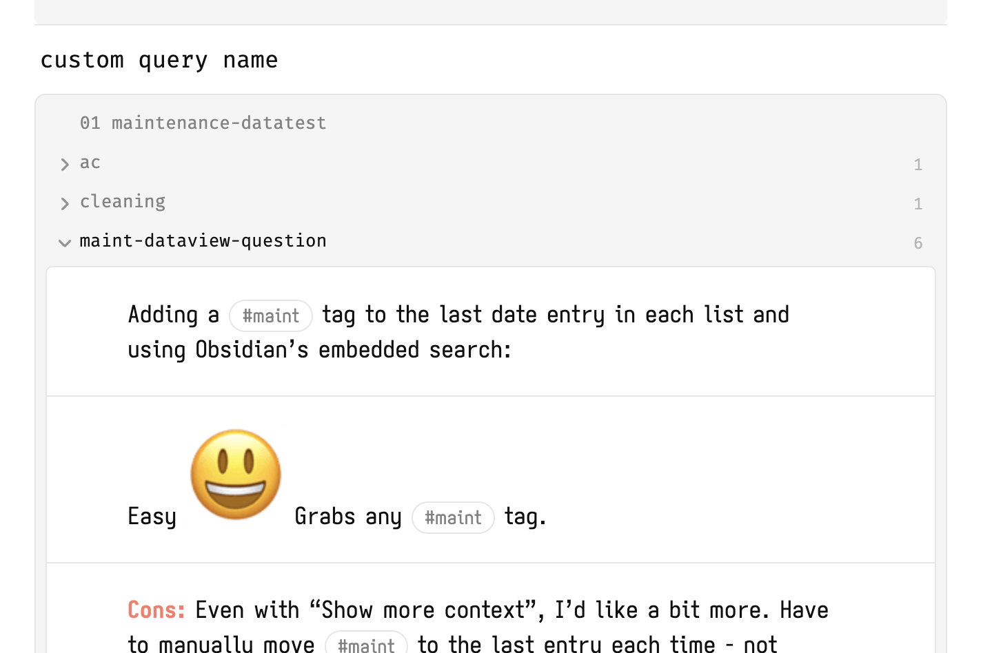
I would ABSOLUTELY love for the preview render ability of Query Control to be brought to Obsidian properly. I’m frankly surprised this hasn’t been a thing — it makes reviewing backlinks and searches SO MUCH EASIER.
Love Markdown, but as with standard previewing, not having to read in markdown-ese makes reading search results + backlinks so easy.
Long-time fan of Query Control, but as noted it now failed in embedded and main searches — still works in backlinks.
Other thing about Query Control was that you can turn the preview off and on, so it’s not something you were stuck with if you don’t want.
Take a look at these Tweets I’ve posted about it to see the beauty:
So, it’s been about a month now without Query Control working. I miss the rendered markdown option and am working around that (see below), but I really miss the embedded search options. A lot. I only have ~15 embedded searches scattered around, but they all used the query control syntax. A lesson in not relying on community plugins continuing to just work.
For anyone missing the markdown+image rendering from Query Control, Hover Editor works great. Hadn’t really used it in Search before, but it’s quite good. Can make quick edits as well. Works with Outgoing links, Backlinks, and Bookmarks too!