Popup toolbar obscures the group heading in Canvas

(deleted previous post on this topic as it didn’t display all the info I entered)
Once you’ve done the above, delete everything above this line.

Steps to reproduce

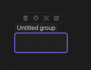
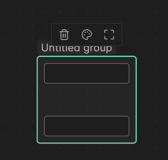
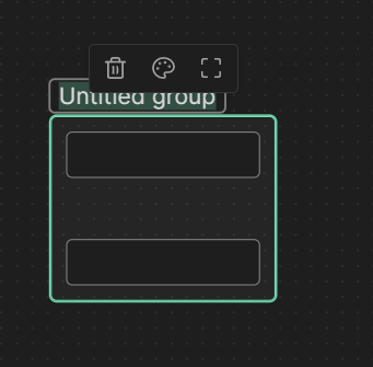
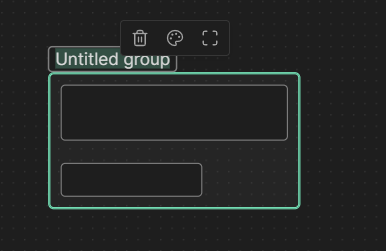
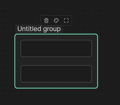
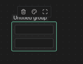
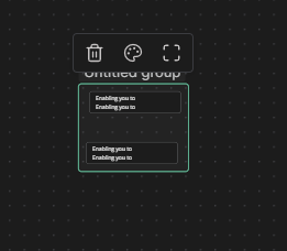
When creating a group in Canvas the popup toolbar appears over the group name, obscuring it. This makes it difficult to read and edit.

Expected result

Actual result

image

Environment

  • Operating system: Win 10
  • Debug info:
    SYSTEM INFO:
    Obsidian version: v1.1.9
    Installer version: v1.1.9
    Operating system: Windows 10 Pro 10.0.19045
    Login status: not logged in
    Insider build toggle: off
    Live preview: on
    Legacy editor: off
    Base theme: dark
    Community theme: Minimal v6.2.0
    Snippets enabled: 2
    Restricted mode: off
    Plugins installed: 23
    Plugins enabled: 22
    1: Calendar v1.5.10
    2: Dictionary v2.22.0
    3: Dynamic Table of Contents v0.0.27
    4: Note Refactor v1.7.1
    5: Dataview v0.5.55
    6: cMenu v1.1.2
    7: Advanced Tables v0.18.1
    8: DB Folder v3.2.4
    9: Style Settings v0.4.12
    10: Kanban v1.5.1
    11: Minimal Theme Settings v6.2.0
    12: Local REST API v1.5.2
    13: Templater v1.16.0
    14: Plugin Update Tracker v1.4.5
    15: Commander v0.4.9
    16: Recent Files v1.3.5
    17: Image Gallery v1.1.1
    18: Hotkeys for specific files v1.2.1
    19: Force note view mode v1.1.1
    20: Excalidraw v1.8.11
    21: Outliner v4.2.1
    22: Obsidian Git v2.16.0

RECOMMENDATIONS:
Custom theme and snippets: for cosmetic issues, please first try updating your theme and disabling your snippets. If still not fixed, please try to make the issue happen in the Sandbox Vault or disable community theme and snippets.
Community plugins: for bugs, please first try updating all your plugins to latest. If still not fixed, please try to make the issue happen in the Sandbox Vault or disable community plugins.


Additional information

Hmm. Are you getting this in the default theme? Can you try it in the Sandbox Vault? I’m seeing slightly better UI:

CleanShot 2023-01-28 at 15.42.16

I’m using the Minimal/Things theme.

With the Default theme I see something similar to yours:
image
Slightly improved, but it could still use more room between those elements.

1 Like

I’m not able to reproduce this with the default them. Can you try opening the canvas with Restricted mode enabled? A plugin like Style Settings might be interfering with the spacing here.

Hi Liam

With the default theme and Restricted mode I still get this:
image

It improves slightly if the horizontal width is a bit bigger by creating more room to the left of the group Title box, but still needs more vertical space between toolbar and title box:
image

Hello, can you post a screen recording of this happening in the sandbox vault. Also let us know you have custom zoom at obsidian or os-level.

I think we have an answer here - the zoom level does have an effect.

My system (Win 10) zoom level is 125%(recommended) and Obisidian zoom is 100%.

HOWEVER
When I hit the canvas zoom level reset button I get this:
image

And when I zoom out to work on the bigger picture (canvas) it goes to this:
image

Until I get a nice big 4K monitor I need to zoom out on bigger canvases, so this isn’t really a bug, just an inconvenience under certain conditions. But a bit more space, even at “neutral zoom”, would be nice.

1 Like

let me know if this still happens when you get 1.1.13+

Will do, thanks.

This topic was automatically closed 90 days after the last reply. New replies are no longer allowed.