# H1 - first

# H1 - second

## H2 - Example 1

## H2 - Example 2

# H1 - third

# H1 - fourth
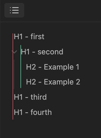
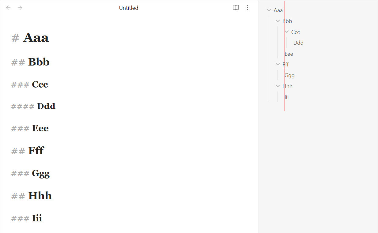
Currently, this is rendered like this: (colored lines added for emphasis)
It makes it appear as if H1 - second is a child of H1 - first, when in fact it isn’t. I don’t know if this can be fixed with CSS or if it requires under the hood changes.
This is seriously confusing. And at least on Mac and iOS, it also goes against the system standard (see how Finder and Files does it). (EDIT, 2023-02-27: Actually, I think Files — and maybe iOS — just doesn’t use expanding folders.)
The problem seems to be fixed in note bodies, but not in the file explorer.
Here’s the snippet I was using. I’ve been meaning to try to adapt it to the file explorer, but maybe someone else (preferably the developers) will get to it first.
/* Move folding arrows out of the flow so items on the same level have the same indentation. */
/* Source: sailKite @ https://discord.com/channels/686053708261228577/702656734631821413/1034243460930207774 */

.tree-item-inner:first-child {
    position: relative;
    padding-left: calc(2 * var(--size-2-3));
}
.tree-item-inner:first-child::before {
    content: "";
    position: absolute;
    height: calc(100% + (2 * var(--size-4-1)) + 1px);
    left: 0px;
    top: calc(-1 * var(--size-4-1) - 1px);
    width: 2px;
    border-left: var(--nav-indentation-guide-width) solid var(--nav-indentation-guide-color);
}
.is-collapsed + .tree-item .tree-item-inner:first-child::before,
:is(.is-collapsed + .tree-item) ~ .tree-item .tree-item-inner:first-child::before {
    content: none;
}
SYSTEM INFO:
	Obsidian version: v1.1.9
	Installer version: v0.15.8
	Operating system: Windows 10 Home China 10.0.22000
	Login status: not logged in
	Insider build toggle: off
	Live preview: on
	Legacy editor: off
	Base theme: dark
	Community theme: none
	Snippets enabled: 0
	Restricted mode: off
Are there any plans to change this in future updates, or does this post’s relocation to FR imply it was intentional and here to stay?
In my opinion, the outline has lost some of its value as a quick reference.
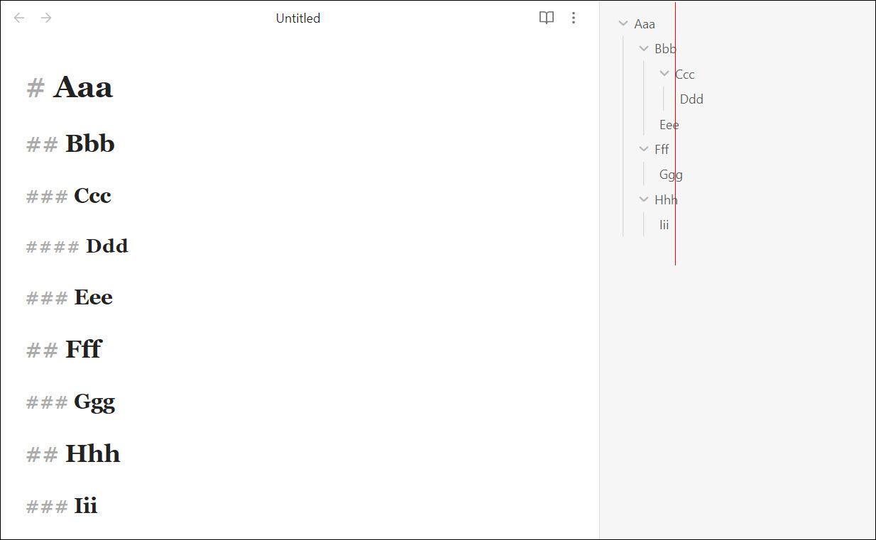
In theory, left-justifying the text of #H1 with the dropdown arrow of #H2 seems reasonable as you’re aligning the first character of each row, but that discounts the effects of visual perception. The text chunks are perceptually grouped because they share similar qualities (shape, spacing, color, etc) and those groups are interpreted as vertical lines… lines which are no longer straight, which doesn’t accurately convey the hierarchy.
The devs use a narrow definition of “bug”. There’s no guarantee this will be addressed, or addressed soon, but if they rejected the idea it would be closed, archived, or moved to Help.
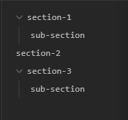
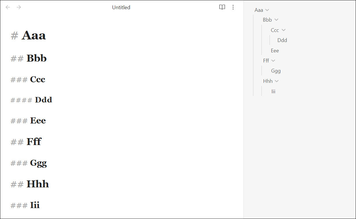
This has been hurting my brain recently. I made a mockup to show a potential solution:
I really hope this can be fixed BEFORE Obsidian Publish is updated to match the new v1.0 default theme - I foresee this being very confusing to my readers.
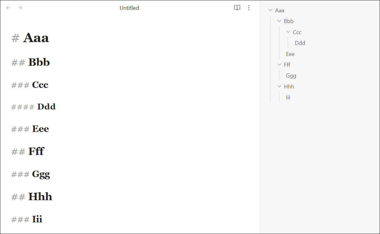
Ccc (h3) should be on same level as Eee, Ggg, and Iii, but instead, Ccc’s arrow icon is aligned with those headings, which IMO is very visually confusing:
Slicing it another way: Bbb, Eee, Fff, Ggg, Hhh, and Iii are all almost aligned, even though they are a mix of h2 and h3. Meanwhile, Ccc, another h3, is way out on its own (and it’s almost aligned with Ddd, an h4…):